
The Hunger Hue: Why Fast Food Chains Dominate with Yellow, Orange, and Red
Warm colors such as yellow, orange and red make you hungry - Which is why many fast food restaurants are yellow, orange and red.


The Hunger Hue: Why Fast Food Chains Dominate with Yellow, Orange, and Red
Have you ever wondered why you feel a sudden craving when you spot a McDonald's sign? Those bright yellow arches against a red background grab your eye fast. Fast food spots like Burger King and Wendy's use yellow, orange, and red on purpose. These warm colors make you hungry. They push you to order quick and eat up. Color psychology plays a big role in marketing. In the food world, it stirs your appetite. Let's dive into why these shades rule the fast food game.
The Science of Sensation: How Warm Colors Trigger Hunger
Warm colors hit you on a deep level. They tap into your body's basic responses. Science shows they can boost your hunger signals. Yellow, orange, and red stand out more than cool tones like blue or green.
Red: The Color of Urgency and Energy
Red gets your heart pumping. It raises your pulse and sparks adrenaline. That rush makes you feel urgent, like you need to act now. In fast food, this leads to speedy orders.
Red also pulls your gaze right away. Studies say it links to ripe fruits and fresh meat in our minds. Think of a juicy burger or hot sauce. Cultures often tie red to food that excites the senses. It warns of danger too, but here it flips to appetite. Fast food chains use it to say, "Come in and grab a bite fast."
Your brain sees red as bold and alive. It can make saliva flow more. That's key for hunger. Next time you see a red sign, notice how it draws you closer.
Yellow: Optimism, Visibility, and Quick Decisions
Yellow jumps out first to human eyes. It's the most visible color from far off. That's why drive-thru signs scream in yellow. You spot them on busy roads without a second thought.
This shade brings feelings of joy and energy. It makes you smile and decide quick. Who wants to linger when happiness calls? Fast food thrives on that speed.
Yellow evokes the sun and fresh lemons. It hints at tasty treats like fries or cheese. Brands use it for instant recall. Picture the golden arches—they stick in your head for life.
Orange: The Blended Power of Warmth and Action
Orange mixes red's fire with yellow's cheer. It feels warm and inviting, yet pushes you to move. That's perfect for spots where you eat and go.
This color screams affordability and fun. It says good food without the fancy price. Orange ties to snacks like carrots or citrus fruits. Your mouth waters at the thought.
In stores, orange labels grab impulse buys. It blends energy and comfort. Fast food menus often highlight orange items like sauces or drinks. This hue makes meals seem approachable and yummy.
Branding Blitz: Real-World Fast Food Case Studies
Fast food giants nail color use. They test shades for max impact. These choices build empires on quick hunger cues. Let's look at top players.
McDonald's and the Golden Arches Strategy
McDonald's bets big on yellow arches over red. This combo shines worldwide. It cuts through clutter on any street.
The yellow draws eyes from blocks away. Red adds urgency to order now. Tests show this pair boosts visits by 20% in some spots. People recognize it in seconds—no thinking needed.
Their packaging keeps it simple. Red boxes with yellow logos make you grab and go. It lowers mental effort for busy folks. That's why lines form fast.
The Fiery Combination: Wendy's and Burger King
Wendy's mixes red with white and checkers. It feels fresh yet urgent. The red logo screams hot, square burgers ready now.
Burger King goes for deep reds and oranges. Their flame grill ads tie to orange fire. It hints at sizzling food that hits your spot quick.
Both chains use warm tones for speed. Unlike slow cafes with soft blues, these say "eat here and leave happy." Reds imply bold flavors. Oranges add warmth to the rush. Customers feel the pull without words.
Wendy's red: Builds trust in fresh beef.
Burger King's orange: Sparks thoughts of grilled taste.
Shared goal: Turn heads and empty wallets fast.
Beyond Fast Food: Warm Colors in the Culinary Landscape
Warm shades pop up everywhere food sells. They shape how we shop and eat. From diners to shelves, they drive choices.
Restaurants and Cafes: Targeted Appetite Stimulation
Italian spots love terracotta walls and red checkered tables. These hues make pasta seem cozier. Warm lights amp up the hunger for garlic bread.
Diners use orange booths and yellow signs. It invites you to sit, chat, and munch. Unlike fast food's rush, this encourages a bit more time. Still, appetite rules.
Cool fine dining picks navy chairs and dim grays. It slows you down for wine sips. Warm colors, though, keep the food focus sharp. They say "enjoy this meal now."
Retail and Packaging: Driving Impulse Buys
Cereal boxes blast yellow and orange fronts. They scream fun breakfast from the shelf. Kids grab them without a pause.
Snack bags in red yell "open me." Grocery ends cap with warm displays pull you in. Stats show warm packaging lifts sales by 15%. It creates buzz around treats.
Think chips or candy—orange wrappers win. They mimic spicy or fruity flavors. Your cart fills faster with these eye-catchers.
The Counterpoint: When Cool Colors Dominate
Not every food spot goes warm. Some pick calm shades for different vibes. Cool tones shift the mood away from rush.
The Association with Health and Calm
Health stores stock green labels for fresh vibes. Greens say natural and clean, like veggies. Blues hint at calm waters or sky—peaceful eats.
Yoga cafes use soft blues to soothe. It fits slow smoothies over burgers. These colors cut hunger pangs for junk.
Blue rarely shows in food ads. Old studies link it to poison or calm stomachs. Sushi bars add blue accents for chill waves. It avoids the warm fire of fast eats. Health brands want you thoughtful, not starved.
Greens: Boost fresh fruit thoughts.
Blues: Slow down snack urges.
Why? They fit wellness over speed.
Conclusion: Mastering the Hue of High Turnover
Warm colors like yellow, orange, and red spark hunger fast. They raise your pulse, grab your eye, and push quick bites. Fast food chains win big with this trick.
Science backs it—red energizes, yellow cheers, orange warms. From McDonald's arches to Burger King's flames, these shades build loyalty. Even beyond burgers, they fill shelves and seats.
Next time you crave a fry run, thank the colors. They shape our eats in sneaky ways. Try spotting warm hues on your next outing. What fast spot pulls you in most? Share your thoughts below—we'd love to hear.
About the Creator
Story silver book
I'm a freelance writer. I'm a great communicator, with excellent writing skills and the ability to adapt to any situation.
Keep reading
More stories from Story silver book and writers in Feast and other communities.
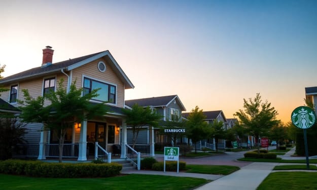
Living near a Starbucks increases your home's value.
Living Near a Starbucks: How Proximity Can Boost Your Home’s Value Introduction Starbucks has become more than just a coffee shop; it's a cultural icon worldwide. Millions of people rely on it for their daily caffeine fix and social gatherings. But did you know that living close to a Starbucks might actually make your home more valuable? Yes, proximity to popular retail spots like Starbucks can boost what your property is worth. This article digs into how being near a Starbucks can make your neighborhood more appealing, increase resale prices, and attract future buyers.
By Story silver book 10 months ago in Feast
Eat During Chinese New Year
The Chinese New Year feast is traditionally abundant with meat dishes, but these 15 vegetarian recipes prove that plant-based eating can be just as festive, flavorful, and meaningful. Each dish carries auspicious symbolism while delivering incredible taste that will have everyone reaching for seconds—even the meat lovers at your table. From crisp greens to creative vegetable transformations, these recipes are designed to impress.
By yue . shuia day ago in Feast
Sales For Filet-O-Fish Sandwiches Are On The Rise At McDonald's During Lent
During the Lenten season, McDonald’s restaurants worldwide are seeing a familiar seasonal shift. Even though the Filet-O-Fish sandwich is on the menu year-round, managers say they sell more during Lent when people eat fish, especially on Fridays.
By Margaret Minnicks6 days ago in Feast


Comments
There are no comments for this story
Be the first to respond and start the conversation.