
The Vertigo Swirl
A Work Of Art On A Record Label


Introduction
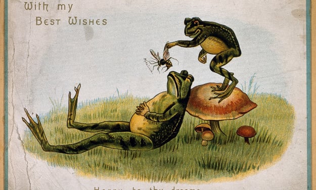
I wasn't sure how to do this. At first, I thought of a poem, and thought the Vertigo Swirl is a work of art, the most impressive record label I have ever seen, because of the three-dimensional effect when you see it spinning.
I referenced it in a previous piece here (I borrowed the image from there as well):
I then took an Instagram video of it to share here:
The music I used was Beggars Opera's take on Mason Williams' "Classical Gas", and in a piece of synchronicity, the YouTube video I have shared is "Poet and Peasant (Dichter and Bauer)", by Beggars Opera.
I am a member of the Vertigo Swirls group on Facebook that appreciates this iconic design.
There are not many CDs that use the full label design, but I am awaiting a CD single by Kerbdog ("Earthworks") and will share that here when it comes through my letterbox. It doesn't really work when it plays though:
The Vertigo Swirl
Vertigo ditched the design for a "spacier" art design, but I still prefer the original. I used to have a pair of watches with the designs on, but they are lost somewhere in my house. If I find them, I will add photographs to this piece.
The Vertigo Swirl logo was designed by Philips' in-house art directors Linda Glover (later Nicol) and Mike Stanford, based on an idea from Olav Wyper, who was responsible for creating the Vertigo Records label. The design's concept was to create a hypnotic, dizzying effect when the record spun, and it was influenced by the work of artists like Marcel Duchamp and Marina Apollonio.
Conclusion
Thank you for reading/ This is just a short piece about my favourite record label design
About the Creator
Keep reading
More stories from Mike Singleton 💜 Mikeydred and writers in Art and other communities.
The Art Of Man
Introduction You may think this should be in the beat community, but this is about a superb example af album artwork by the Welsh group Man. Coincidentally, I have also discovered several Welsh poetry forms and shared some Welsh folk music.
By Mike Singleton 💜 Mikeydred 5 months ago in Art
'Till Death We Do Art
There would be nothing divine in this world without art. Nature may surpass the divine to all intents and purposes, but like everything it absorbs and is absorbed by, it remains here, stuck on the surface of this world, ever-present, physically bound to the universe.
By Avocado Nunzella BSc (Psych) -- M.A.P 13 days ago in Art
THE MYSTICAL RELATIONSHIP BETWEEN BACH AND BEETHOVEN - ALEXIS KARPOUZOS
THE SECRET OF THE DIALECTICAL RELATIONSHIP BETWEEN BACH AND BEETHOVEN Music, as an art of time, constitutes the deepest field where consciousness meets the universe in its primordial ontological dimension, in its uninterpretable form. In this ontological dimension, the forms of music are not mere aesthetic expressions but ways of revealing Being. Two of the most pivotal ways of this revelation emerge through the music of Johann Sebastian Bach and Ludwig van Beethoven. Their comparison cannot be external; it constitutes a comparison of two anthropological and cosmological principles, two forms of relationship between Humanity and the World, two primordial possibilities of existence: necessity and freedom, cosmic order and human transformation.
By alexis karpouzos2 days ago in Art
Pearl
1980 something. we all hung out at Pearl and you and i were nothing special, or so i thought. i mean we all danced, drenched in our own sweat, our own saline solution of fear, too many beers, shots, laughter, tears, fucks in the bathroom and i don't know when we began to be afraid. do you?
By ROCK aka Andrea Polla (Simmons)5 days ago in Fiction


Comments (2)
Are you trying to hypnotize your readers with this short article? These spirals make me cross-eyed. Good job.
I can understand why you like this design, Mike. It sort of pulls you in.