
Tiny Africa, Massive Europe
The Distorted Truth Behind World Maps

Imagine trying to draw a map of the Earth. At first, it might seem simple—until you realize you're trying to flatten a sphere. Our planet is round, but maps are flat, which makes representing it accurately a huge challenge. Think of it like peeling an orange and trying to lay the peel flat on a table without tearing or stretching it. That’s impossible, and so is making a flawless flat map of the globe. As a result, nearly all world maps are wrong and some are misleading by design.
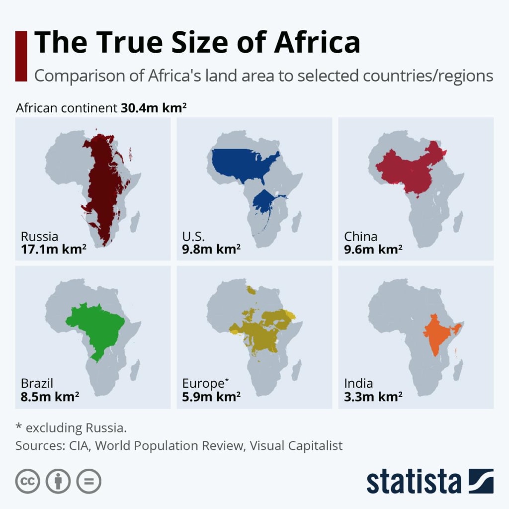
Chances are, the world map you grew up with made you believe that Greenland is almost as big as Africa. It isn’t. In fact, Africa is about 14 times larger. You might also think Alaska is bigger than Mexico, or that Europe is larger than South America. Again, these ideas are false. So, where do they come from?
They come from a map called the Mercator projection, created in 1569 by Flemish cartographer Gerardus Mercator. Originally intended to help sailors navigate the seas, this map was designed to preserve accurate compass directions, not geographical size. As a navigation tool, it was revolutionary. But as a world map, it's deeply flawed. Despite this, it became the most commonly used world map found in classrooms, atlases, textbooks, and even on modern platforms like Google Maps.
The Mercator projection severely distorts the size of land masses, especially near the poles. It stretches the northern parts of the Earth and compresses the southern parts. This means countries in the Global North such as the U.S., Canada, and European nations appear much larger than they actually are, while countries in Africa, Latin America, and South Asia appear significantly smaller. This is not just a cartographic flaw, it’s a distortion that subtly affects how people view the world.
This distortion has far-reaching consequences. When large, wealthy nations are drawn bigger than they really are, and developing countries are drawn smaller, it reinforces outdated power structures and perpetuates colonial-era thinking. It sends a subconscious message about importance, dominance, and influence. Over time, these visuals have influenced how people perceive economic strength, cultural significance, and political relevance.
Experts have long argued that such map distortions influence real-world outcomes. They can affect business strategies, foreign policy, and even educational content. For instance, students learning geography from a distorted map may grow up with skewed understandings of global demographics and land distribution. Tourists may be more inclined to visit countries that seem larger or more prominent. And international organizations might prioritize regions that appear more "central" or "significant" on the map, regardless of their actual size or population.
So why is the Mercator map still so widely used? The answer lies in tradition, convenience, and familiarity. It’s been the default for centuries, and it’s difficult to change something that is so deeply embedded in our institutions, from schools to digital navigation tools. People are used to it, and change—especially change that challenges long-standing worldviews—is often met with resistance.
But there are better options. One such alternative is the Equal Earth projection, developed in the 21st century by cartographers seeking a fairer, more accurate depiction of the world. This map maintains relative land sizes more accurately, especially in the Southern Hemisphere. It still involves some distortion no flat map is perfect but it offers a significant improvement in visual balance. Organizations such as NASA and the World Bank have already adopted this projection, and many educators in Africa, South America, and Asia are advocating for its broader use in schools.
Other projections, like the Gall-Peters, Robinson, and Winkel Tripel, have also gained attention for their attempts to correct historical biases. Each comes with its strengths and trade-offs, depending on what the user values shape accuracy, size accuracy, or visual appeal.
The truth is, we may never be able to create a perfect flat map of our round world. Every projection involves trade-offs: some distort distance, others direction, and others area. But what we can do is make intentional choices about which maps we use and why. We can decide to move away from outdated standards and toward tools that reflect a more accurate and equitable view of the Earth.
Maps don’t just show geography, they shape our worldview. They influence how we relate to other countries, how we perceive global power, and even how we define ourselves. By embracing more accurate and inclusive projections, we’re not just changing how the world looks on paper, we’re changing how we think about it.
And that change, while slow, is long overdue.
About the Creator
Francis Osei
“Tom bele has been working with writing challenged clients for over four years. He provides ghost writing, coaching and ghost editing services.
Keep reading
More stories from Francis Osei and writers in History and other communities.
The Sole Survivor Of Air India Boeing 787
It was a day of heartbreak in Ahmedabad. Outside the Civil Hospital, scenes of anguish unfolded as grieving families gathered, waiting—some with hope, others in despair—for news about their loved ones. This was the hospital where victims of the catastrophic Air India plane crash had been brought, many of them lifeless. Throughout the day, the air was filled with cries, hushed prayers, and the endless shuffle of feet as people searched for answers.
By Francis Osei9 months ago in History
The Invasion of Kuwait: Saddam’s Four-Day ‘Revolutionary Republic
On August 2, 1990, the world woke up to a geopolitical earthquake. Under the orders of Saddam Hussein, over 100,000 Iraqi troops, backed by hundreds of tanks, surged across the border into the tiny, oil-rich emirate of Kuwait. While history remembers this as the spark for the Gulf War, the first few days of the occupation featured a bizarre political theater: the creation of a short-lived puppet state known as the **"Republic of Kuwait."**
By Irshad Abbasi 7 days ago in History
Hottest in the Office
Dear Rafi, You’re very distracting to work around. For the first second I saw you the other day, I thought you were some type of executive. It took a moment to realize no, you were just the new guy, dressed up for the job he wants. Be still, my heart.
By Gabriel Shames3 days ago in Pride


Comments
There are no comments for this story
Be the first to respond and start the conversation.