
Yellowfin BI
Bio
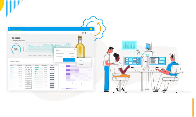
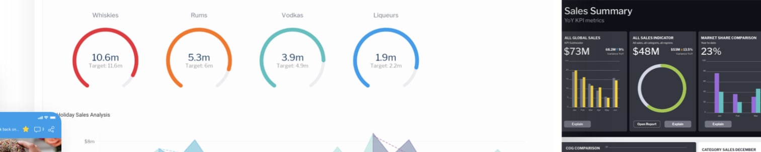
Yellowfin is a leading BI and analytics provider, combining dashboards, automated monitoring, data storytelling, and collaboration. Trusted by 29,000+ organizations in 75 countries for innovation.
Stories (10)
Filter by community
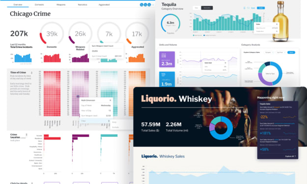
BI Reports Made Simple: What They Are, Why They Matter, and How to Use Them
If you’ve ever tried to make sense of a pile of spreadsheets or been stuck in a meeting with someone reading out numbers from a slide deck — you already know this: data is everywhere, but insights are rare.
By Yellowfin BI4 months ago in Futurism
Why Are JavaScript Charts the Best Choice for Web & Mobile?
Data is everywhere these days. From websites and apps to reports and dashboards, we’re surrounded by numbers. But let’s face it—most people don’t enjoy scrolling through endless spreadsheets. They want to see the story behind the numbers.
By Yellowfin BI4 months ago in Futurism
The 4 Approaches to Embedded Analytics
Data is no longer just a tool for analysts. In today’s fast-moving digital world, people expect insights to be available inside the applications they use every day. That’s the promise of embedded analytics. Instead of jumping between external dashboards, spreadsheets, or business intelligence platforms, users can access reports, charts, and insights directly where they work.
By Yellowfin BI4 months ago in Futurism
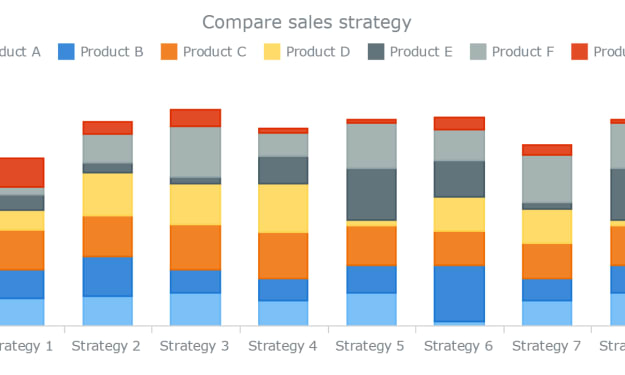
Column Charts: A Simple Yet Powerful Tool in Data Visualization
In the world of data visualization, clarity is king. The best visualizations don’t just look good—they make data easier to understand, explore, and act on. Among the many types of charts available, one of the most universally used and intuitively understood is the column chart.
By Yellowfin BI4 months ago in Futurism
How Augmented Analytics Is Changing the Way We Use Data
We’re surrounded by data—tons of it. Every click, every transaction, every customer interaction generates a trail of information. But for most businesses, the real challenge isn’t collecting data. It’s knowing what to do with it. How do you turn a mountain of raw numbers into real, actionable insight?
By Yellowfin BI4 months ago in Futurism
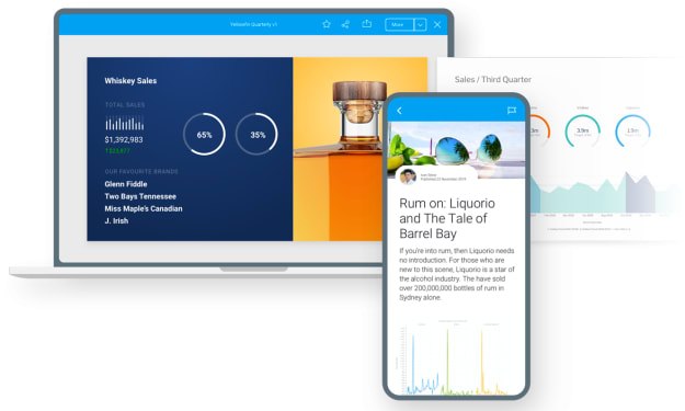
What Is Data Storytelling and Why Does It Matter in Analytics?
In today’s data-driven world, we’re surrounded by numbers, charts, dashboards, and reports. But even with all this information at our fingertips, one essential ingredient is often missing: understanding.
By Yellowfin BI4 months ago in Futurism
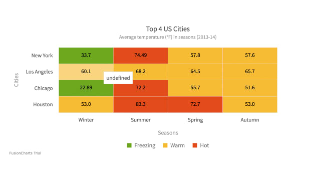
What Is a Heat Chart? Visualizing Data Density and Patterns with Color
In the world of data visualization, clarity is everything. As datasets grow in size and complexity, traditional charts like bar graphs and line charts sometimes fall short. That’s where heat map charts come in—a visual tool that uses color to represent data intensity, enabling faster pattern recognition and decision-making.
By Yellowfin BI4 months ago in Futurism
How Can Business Intelligence and Data Visualization Improve Your Business?
In today’s world, businesses generate more data than ever before. From sales figures to customer feedback, from website visits to social media interactions, data is everywhere. But having data alone isn’t enough. The real challenge is understanding it and turning it into decisions that help your business grow. This is where Business Intelligence (BI) and data visualization platforms play a key role. Together, they help businesses make sense of complex data and use it to make smarter decisions.
By Yellowfin BI5 months ago in Futurism
Understanding Bar and Column Charts: A Comprehensive Guide
In the world of data visualization, bar and column charts are fundamental tools that help in presenting data in a clear and concise manner. While both serve the purpose of displaying data comparisons, they differ in orientation and are suited for different types of data analysis. This guide delves into the nuances of bar and column charts, providing examples, use cases, and insights to help you choose the right visualization for your data.
By Yellowfin BI5 months ago in Futurism