
Why Are JavaScript Charts the Best Choice for Web & Mobile?
Let's Dive in!

Data is everywhere these days. From websites and apps to reports and dashboards, we’re surrounded by numbers. But let’s face it—most people don’t enjoy scrolling through endless spreadsheets. They want to see the story behind the numbers.
That’s where charts come in. And if you’re building for both the web and mobile, you’ve probably wondered: What’s the best way to create charts that work everywhere? The answer many developers turn to is simple—JavaScript charts for web & mobile.
In this post, we’ll look at why JavaScript is such a good choice, what types of charts you can use, and how to make sure they look great on every screen.
Why Use JavaScript for Charts?
JavaScript has become the go-to language for creating interactive charts, and here’s why:
It runs everywhere – Whether your users are on a laptop, a tablet, or a phone, JavaScript works across devices.
It’s interactive – Charts can come alive with hover effects, tooltips, animations, and zooming.
It’s lightweight and fast – Modern browsers can render charts smoothly, even with large amounts of data.
It’s flexible – Every part of a chart, from colors to labels, can be customized to match your design.
It’s reliable – Being built for the web means charts will display consistently across different platforms.
In short, JavaScript makes charts more than just images—it makes them part of the user experience.
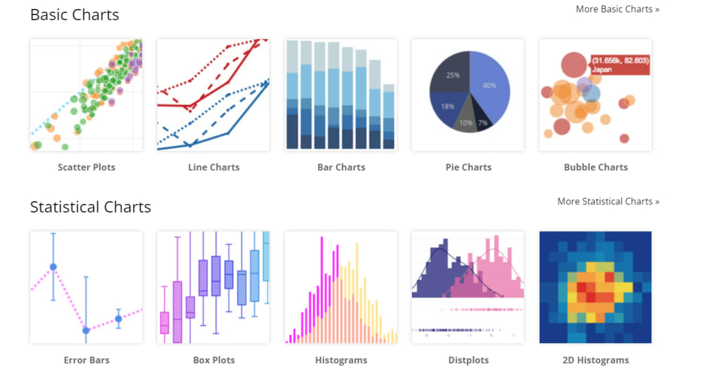
What Types of Charts Work Best?
The type of chart you choose depends on the story you want to tell. Here are a few common ones:
Line charts – Perfect for showing changes over time, like sales or growth.
Bar charts – Great for comparing categories, such as monthly revenue.
Pie and doughnut charts – Ideal for showing parts of a whole in simple percentages.
Scatter plots – Helpful for spotting patterns and relationships between two values.
Heatmaps – Best for showing intensity or density, like activity levels during the week.
Candlestick charts – Popular for tracking movements and trends in financial data.
Picking the right chart ensures your audience understands the data without confusion.
How Do You Make Charts Work on Mobile?
One challenge with charts is making them easy to read on smaller screens. A chart that looks perfect on a desktop can feel cramped on a phone. Here are a few ways to fix that:
Keep it simple – Focus only on the most important data.
Use responsive layouts – Design charts that adjust automatically for smaller screens.
Make text readable – Labels and values should remain clear even on small devices.
Test across devices – Always preview your charts on different screen sizes before sharing.
The goal is to make sure your charts are useful and readable no matter how people view them.
How Do Others Do It?
If you're looking for a step-by-step example of combining charts with other elements like grids or tables on a web page, this tutorial walks you through exactly that: How to Build a Web Page with JavaScript Chart and Grid. It’s a great real-world reference for how charts can live inside more complex layouts.
What’s the Real Benefit of JavaScript Charts?
The real benefit is this: they help people understand data quickly and clearly. On the web, charts make dashboards and reports easier to explore. On mobile, they make information accessible at a glance. And because they’re built with JavaScript, they adapt to both worlds seamlessly.
Whether you’re tracking performance, visualizing progress, or simply making information easier to digest, JavaScript charts for web & mobile turn numbers into stories people can actually connect with.
Final Thoughts
Data on its own can feel overwhelming. But when presented through clear, interactive charts, it suddenly makes sense. JavaScript gives developers the flexibility to design visuals that not only look good but also work perfectly across devices.
So, if you’re asking yourself how to share data in a way that’s both simple and powerful, the answer is clear: JavaScript charts for web & mobile.
About the Creator
Yellowfin BI
Yellowfin is a leading BI and analytics provider, combining dashboards, automated monitoring, data storytelling, and collaboration. Trusted by 29,000+ organizations in 75 countries for innovation.
Keep reading
More stories from Yellowfin BI and writers in Futurism and other communities.
The 4 Approaches to Embedded Analytics
Data is no longer just a tool for analysts. In today’s fast-moving digital world, people expect insights to be available inside the applications they use every day. That’s the promise of embedded analytics. Instead of jumping between external dashboards, spreadsheets, or business intelligence platforms, users can access reports, charts, and insights directly where they work.
By Yellowfin BI4 months ago in Futurism
About Binding Prometheus
I want to start actively advocating on behalf of my own work, and the most valuable part of my canon is, without a doubt, Binding Prometheus, the play I have been working on since 2019 and only finished in 2023 as part of my MA. The play itself is an amalgamation of a million different inspirations. On one end, it evokes the Ancient Greek myth-play, deriving its own title from the earliest extant work of Western drama we have, Aeschylus’s Prometheus Bound. On the other end, it borrows significantly from the sci-fi bulwarks from over the years, namely Mary Shelley’s Frankenstein and Karel Capek’s Rossum’s Universal Robots. The play could be an episode of Black Mirror, I fear. I don’t know. I’ve only ever seen one episode of Black Mirror.
By Steven Christopher McKnight23 days ago in Futurism
U.S. AI in Healthcare Market Set to Surge to USD 43.30 Billion by 2030
The U.S. artificial intelligence (AI) in healthcare market is entering a decisive expansion phase, driven by structural workforce shortages, escalating operational complexity, and urgent demand for automation and clinical precision. Valued at USD 5.98 billion in 2024 and USD 8.65 billion in 2025, the market is projected to grow at a resilient CAGR of 38.0% from 2025 to 2030, reaching USD 43.30 billion by the end of the forecast period.
By Jennifer Reynoldsa day ago in Futurism


Comments
There are no comments for this story
Be the first to respond and start the conversation.