
What Is a Heat Chart? Visualizing Data Density and Patterns with Color
Let's Dive in!

In the world of data visualization, clarity is everything. As datasets grow in size and complexity, traditional charts like bar graphs and line charts sometimes fall short. That’s where heat map charts come in—a visual tool that uses color to represent data intensity, enabling faster pattern recognition and decision-making.
A heat chart—also known as a heatmap—is not just eye-catching. It’s one of the most effective ways to represent large sets of data across two dimensions, especially when the goal is to detect trends, outliers, or areas of concentration. In this post, we’ll break down what a heat chart is, how it works, when to use it, and what makes it such a powerful data tool.
What Is a Heat Chart?
A heat chart is a graphical representation of data where individual values are represented using colors within a grid or matrix. Instead of displaying numerical values directly, the chart applies a color gradient—such as blue to red or light to dark—to show variations in data intensity.
Each cell in the chart corresponds to a specific combination of two categories (like time and region), and the color in the cell reflects the value associated with that combination.
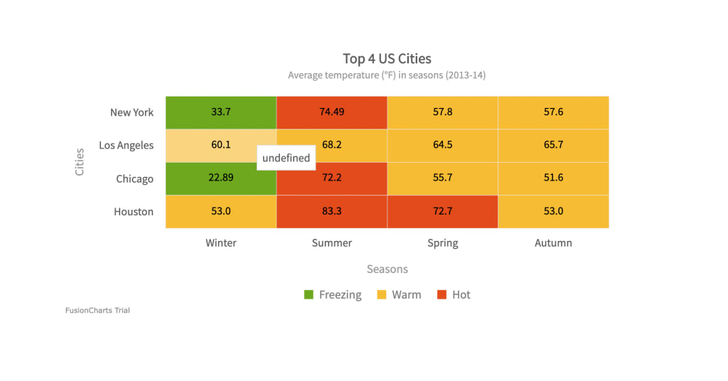
For example, in a sales heat chart:
Rows might represent different regions.
Columns might represent months of the year.
Colors within each cell show how high or low the sales were for that region in a given month.
At a glance, the viewer can spot performance trends across time and location without needing to read exact numbers.
How Does a Heat Chart Work?
Heat charts rely on a color scale that’s mapped to numeric values in the dataset. Typically:
Low values are represented by cooler colors (e.g., blue or green).
Medium values may appear in yellow or orange.
High values are represented by warmer or more intense colors like red or dark purple.
These colors make it easy to visualize:
Clusters of high activity (hotspots)
Areas of low engagement or performance
Outliers or sudden shifts in data
Some advanced heat charts include tooltips, drill-down capabilities, or interactive filters so users can explore the data in more depth.
When Should You Use a Heat Chart?
Heat charts are ideal when you're working with data that meets the following conditions:
Two-Dimensional Layout
The data must be structured in a grid, matrix, or table format—usually with one variable on the X-axis and another on the Y-axis.
Visualizing Density or Intensity
Heat charts shine when showing how intense or frequent something is, such as traffic levels, usage rates, or temperature variations.
Pattern Detection
Use heat charts to highlight repeating patterns or correlations over time or across categories.
Common Use Cases for Heat Charts
Heat charts are used across a wide variety of industries and domains:
1. Business Analytics
Visualize sales performance across regions and months.
Identify underperforming products or overperforming sales reps.
2. Website and App Analytics
Heatmaps can show where users click the most on a webpage.
Analyze scroll depth, engagement zones, or dead areas on a site.
3. Healthcare
Track disease outbreaks across geographical locations.
Compare patient vitals over time to detect trends.
4. Education
Monitor student performance across subjects and semesters.
Identify topics where students frequently struggle.
5. Finance
Visualize fluctuations in stock prices or market indices.
Spot volatility across time and sectors.
6. Scientific Research
Present temperature changes, gene expression levels, or chemical activity in experiments.
Advantages of Using Heat Charts
Here’s why heat charts are so popular among data professionals and analysts:
Fast insights: You can spot trends and anomalies immediately.
Color-coded clarity: Even complex data becomes more digestible through visual representation.
Compact and scalable: They condense large datasets into a small, readable space.
Comparative: Easily compare values across different categories without clutter.
Limitations of Heat Charts
As useful as heat charts are, they’re not always the best choice. Here are a few things to watch out for:
Not great for exact values: Heat charts emphasize patterns, not precision.
Color interpretation: Poor color schemes can confuse viewers or become inaccessible to colorblind users.
Overcrowding: Too many cells or categories can make the chart unreadable.
To avoid these pitfalls, always include:
A clear legend
An accessible color palette
Optional interactivity for deep dives
Best Practices for Creating Heat Charts
If you want to make your heat charts both useful and user-friendly, follow these tips:
Choose your color scale wisely
Stick to intuitive gradients (like light to dark or cool to warm) and test your chart for readability.
Simplify your data
Avoid overcrowding by limiting the number of categories on each axis.
Include a legend
Users should instantly understand what the colors represent.
Consider interactivity
Enable hover effects or filtering to help users explore the data further.
Make it responsive
Ensure your chart adapts to various screen sizes, especially for dashboards or mobile reports.
Final Thoughts
A heat chart is more than just a colorful data display—it’s a strategic tool for visual storytelling. By mapping values to colors, heat charts allow users to instantly detect trends, monitor performance, and identify problem areas without wading through spreadsheets or raw numbers.
Whether you're tracking sales, analyzing user behavior, or exploring scientific data, heat charts offer a visually engaging and efficient way to reveal insights that might otherwise go unnoticed. So, next time you’re dealing with large, two‑dimensional data—consider using a heat chart. Your eyes (and your stakeholders) will thank you.
For more detail on what makes an effective heat map and how to use ranges, legends, and gradients to communicate your data clearly, see A Guide to the Heat Map Chart.
About the Creator
Yellowfin BI
Yellowfin is a leading BI and analytics provider, combining dashboards, automated monitoring, data storytelling, and collaboration. Trusted by 29,000+ organizations in 75 countries for innovation.
Keep reading
More stories from Yellowfin BI and writers in Futurism and other communities.
How Can Business Intelligence and Data Visualization Improve Your Business?
In today’s world, businesses generate more data than ever before. From sales figures to customer feedback, from website visits to social media interactions, data is everywhere. But having data alone isn’t enough. The real challenge is understanding it and turning it into decisions that help your business grow. This is where Business Intelligence (BI) and data visualization platforms play a key role. Together, they help businesses make sense of complex data and use it to make smarter decisions.
By Yellowfin BI5 months ago in Futurism
About Binding Prometheus
I want to start actively advocating on behalf of my own work, and the most valuable part of my canon is, without a doubt, Binding Prometheus, the play I have been working on since 2019 and only finished in 2023 as part of my MA. The play itself is an amalgamation of a million different inspirations. On one end, it evokes the Ancient Greek myth-play, deriving its own title from the earliest extant work of Western drama we have, Aeschylus’s Prometheus Bound. On the other end, it borrows significantly from the sci-fi bulwarks from over the years, namely Mary Shelley’s Frankenstein and Karel Capek’s Rossum’s Universal Robots. The play could be an episode of Black Mirror, I fear. I don’t know. I’ve only ever seen one episode of Black Mirror.
By Steven Christopher McKnight23 days ago in Futurism
How Pain Clinics Can Seamlessly Transition to EMR
Managing chronic pain is hard enough without paperwork getting in the way. Picture a busy clinic where clinicians scrambling through piles of paper charts, handwritten notes scrawled on clipboards, lost files delaying follow-ups, and billing errors from illegible scribbles. Each lookup or data entry is inefficient and process prone to mistakes. No wonder, practices feel constant pressure to modernize.
By Sergey Laptick4 days ago in Futurism


Comments
There are no comments for this story
Be the first to respond and start the conversation.