
Column Charts: A Simple Yet Powerful Tool in Data Visualization
Let's Dive in!

In the world of data visualization, clarity is king. The best visualizations don’t just look good—they make data easier to understand, explore, and act on. Among the many types of charts available, one of the most universally used and intuitively understood is the column chart.
Whether you’re a data analyst, a marketer reviewing campaign results, or a product manager presenting quarterly KPIs, you’ve likely worked with column charts. And while they might seem basic at first glance, column charts are incredibly versatile, powerful, and—when used correctly—capable of delivering high-impact insights with minimal complexity.
In this article, we’ll explore what column charts are, where they excel, their different types, best practices for using them effectively, and some of the common mistakes to avoid.
What Is a Column Chart?
A column chart is a type of data visualization that displays data using vertical bars or columns. Each column represents a single category, and the height of the column corresponds to the value or frequency of that category. It’s a direct, visual way to compare discrete data across multiple categories.
The beauty of the column chart lies in its simplicity. Our brains are naturally good at comparing heights, which is why column charts are so effective for comparing values side by side. From sales reports and website analytics to public health statistics and budget breakdowns, column charts are a go-to format for quickly conveying comparative data.
Why Column Charts Work So Well
Column charts are widely used for one reason: they get the message across, fast. They allow the viewer to instantly see differences between categories and understand data distribution at a glance.
Let’s say you’re comparing the monthly revenue of four product categories. A column chart will show each category as a vertical bar, making it easy to see which product is outperforming the rest—and by how much.
Column charts also work particularly well when:
You need to compare categorical data like departments, regions, or product types.
You’re tracking performance over time across a small number of periods.
You want to highlight trends or shifts in behavior, spending, or outcomes.
You’re aiming for simplicity and clarity in reports or dashboards.
In short, column charts simplify comparative analysis—an essential task in nearly every industry.
The Many Flavors of Column Charts
While the basic column chart is well-known, there are several variations designed to meet different visualization needs.
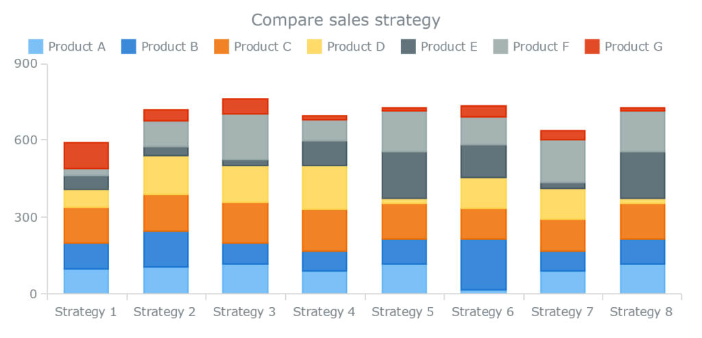
One of the most common enhancements is the grouped column chart, where multiple bars are grouped together for each category. For instance, if you're comparing sales across four regions for two different years, you can use two columns per region—one for each year—placed side by side. This format allows you to compare both across and within categories.
Another variation is the stacked column chart, where values are stacked on top of one another instead of placed side by side. This is useful when you want to show the total value of a category as well as the contribution of its sub-categories.
There’s also the 100% stacked column chart, which shows percentage contributions instead of absolute values. This is helpful when you want to compare proportions across categories, regardless of their total values—great for survey results or market share visualization.
To explore these chart types with interactive examples, check out this detailed breakdown of column chart variations here. You'll find real-world use cases, demos, and guidance on choosing the right one for your needs.
Some tools offer scrollable column charts, useful when there are too many categories to fit into a single view. Instead of shrinking each bar to fit the space (which can ruin readability), a scrollable chart keeps the columns legible and allows the user to explore the data smoothly.
And finally, there are 3D column charts, often used for visual impact. While they may look appealing, it’s important to be cautious: the added depth can sometimes make it harder to accurately interpret the data.
Column Chart vs Bar Chart: What’s the Difference?
It’s easy to confuse column charts with bar charts. After all, they both use rectangular bars to represent values. The main difference lies in orientation: column charts use vertical bars, while bar charts use horizontal bars.
So when should you use one over the other?
Column charts are great when you have time-based data, or when your category names are short and few in number. The vertical orientation makes trends easier to see from left to right, which matches how we read timelines and sequences.
Bar charts, on the other hand, are more suitable when you have long category names or a large number of categories. Since horizontal space is more abundant on most screens, bar charts avoid crammed labels and overlapping elements.
Still, the decision often comes down to layout and personal preference. Both are powerful tools in the data visualization toolbox.
Best Practices for Designing Effective Column Charts
Like any visual tool, column charts can be used well—or poorly. Here are some best practices to keep in mind when creating column charts for reports, dashboards, or presentations:
1. Always Start from Zero
The human eye interprets the height of columns relative to the baseline. If your chart doesn’t start from zero, it can exaggerate differences between values and mislead your audience. Starting from zero ensures visual accuracy and integrity.
2. Keep It Simple
Avoid overloading your column chart with too many colors, series, or effects. Stick to 2–5 categories where possible, and keep the visual style clean. If you need to include more data, consider interactive features like tooltips or filters.
3. Use Consistent Colors
If your column chart has multiple data series (like grouped or stacked columns), use consistent and meaningful color schemes. Avoid random color choices—opt for gradients or shades that align with the narrative.
4. Label Clearly
Make sure axis labels, titles, and data labels are easy to read. Don’t rely on viewers to guess what they’re looking at. Good labeling improves both usability and accessibility.
5. Sort Your Data Thoughtfully
Sort categories in a logical order—alphabetically, by value, or chronologically—depending on the story you want to tell. Proper sorting can draw attention to key insights and make trends more apparent.
Common Mistakes to Avoid
While column charts are simple, they’re not foolproof. Here are some common pitfalls to avoid:
Overcrowding: Too many columns make the chart hard to read. If you have more than 10–12 categories, consider using a scrollable chart or filtering the data.
Inconsistent baselines: Always maintain a consistent baseline across multiple charts when comparing data.
Too many series: Grouped column charts can become overwhelming with more than 3–4 series. Avoid visual clutter.
Misleading axis scaling: Don’t manipulate axis ranges to exaggerate or downplay differences.
Avoiding these traps ensures that your charts are both honest and helpful.
Real-World Applications of Column Charts
Column charts are used across nearly every domain. In business, they’re used to compare sales by region, profit by product line, or customer acquisition by channel. In education, column charts track attendance, performance, or enrollment. In healthcare, they show cases per condition, patient recovery rates, or resource usage.
The versatility of the column chart makes it a staple for any dashboard or report that seeks to offer quick, comparative insights.
Final Thoughts
Column charts may not be flashy, but they’re one of the most effective and reliable tools in data visualization. Their ability to clearly show comparisons, trends, and proportions makes them indispensable for anyone working with data.
When used correctly, a column chart can turn a confusing spreadsheet into a compelling story. And with modern tools offering interactive, responsive, and customizable charts, it’s easier than ever to build clear, impactful visuals that help teams make better decisions.
About the Creator
Yellowfin BI
Yellowfin is a leading BI and analytics provider, combining dashboards, automated monitoring, data storytelling, and collaboration. Trusted by 29,000+ organizations in 75 countries for innovation.
Keep reading
More stories from Yellowfin BI and writers in Futurism and other communities.
How Augmented Analytics Is Changing the Way We Use Data
We’re surrounded by data—tons of it. Every click, every transaction, every customer interaction generates a trail of information. But for most businesses, the real challenge isn’t collecting data. It’s knowing what to do with it. How do you turn a mountain of raw numbers into real, actionable insight?
By Yellowfin BI4 months ago in Futurism
About Binding Prometheus
I want to start actively advocating on behalf of my own work, and the most valuable part of my canon is, without a doubt, Binding Prometheus, the play I have been working on since 2019 and only finished in 2023 as part of my MA. The play itself is an amalgamation of a million different inspirations. On one end, it evokes the Ancient Greek myth-play, deriving its own title from the earliest extant work of Western drama we have, Aeschylus’s Prometheus Bound. On the other end, it borrows significantly from the sci-fi bulwarks from over the years, namely Mary Shelley’s Frankenstein and Karel Capek’s Rossum’s Universal Robots. The play could be an episode of Black Mirror, I fear. I don’t know. I’ve only ever seen one episode of Black Mirror.
By Steven Christopher McKnight23 days ago in Futurism
Gas Chromatography Market: Pharmaceutical Quality Control & Innovation Momentum
Rising pharmaceutical research, stricter regulatory testing standards, expanding environmental monitoring, and technological advancements in analytical accuracy and automation are accelerating adoption across laboratories and industrial applications worldwide. According to IMARC Group's latest research publication, the global gas chromatography market size reached USD 3.2 Billion in 2024. Looking forward, IMARC Group expects the market to reach USD 4.7 Billion by 2033, exhibiting a growth rate (CAGR) of 4.06% during 2025-2033.
By Andrew Sullivan2 days ago in Futurism
🅼🅸🅳🅽🅸🅶🅷🆃 🆂🅽🅰🅲🅺🆂
"It's 10 in Tuscon! We all know what that means... It's Time for Midnight Snacks with your man, Gerald Gee! Ready to spend the night together? Me too! I'm full of snacks and can't wait to regurgitate them all back into your hungry ears. Crack a brew! Pop some corn! Anything to get ready for one hell of a show where the talk maybe cheap but the words cut deep...
By Lamar Wigginsa day ago in Fiction


Comments
There are no comments for this story
Be the first to respond and start the conversation.