
Everyone’s Saying the Same Thing About Trump’s Board of Peace Logo
A symbol meant to represent global unity is instead sparking global ridicule


When former U.S. President Donald Trump unveiled the logo for his newly announced Board of Peace, it was meant to project authority, stability, and international cooperation. Instead, the logo quickly became the center of online debate, satire, and criticism. Across social media platforms, design forums, and political commentary spaces, people kept repeating the same observation: it looks suspiciously familiar.
What should have been a quiet branding moment turned into a viral discussion about symbolism, power, and perception. And in today’s digital age, perception often matters as much as policy.
What Is Trump’s Board of Peace?
The Board of Peace was announced during Trump’s appearance at the World Economic Forum in Davos. According to its stated mission, the board aims to serve as an international body focused on conflict resolution, post-war stabilization, and diplomatic oversight in volatile regions.
While initial discussions centered on Gaza and Middle East ceasefire efforts, the board was framed as something broader — a new global peace structure operating alongside existing international institutions.
However, critics quickly questioned its legitimacy. Membership reportedly requires significant financial commitments, leadership remains tightly controlled, and the organization appears closely tied to Trump himself. These concerns set the stage for skepticism even before the logo entered the public eye.
The Logo That Sparked a Thousand Tweets
Once the Board of Peace logo was revealed, attention shifted almost instantly from policy to presentation.
The most common reaction?
“It looks like the United Nations logo… but gold.”
People across the internet pointed out several similarities:
A globe centered within the design
Olive branches wrapping around the world
A symmetrical, seal-like structure typical of international bodies
But unlike the UN emblem, which features a neutral world map, the Board of Peace logo prominently emphasizes North America. Add in the metallic gold color scheme, and critics argue the design feels less about global inclusion and more about dominance and prestige.
Within hours, memes flooded social platforms. Some users joked that the logo looked like it was made in Microsoft Paint. Others claimed it resembled an AI-generated image with no real design intention behind it. The consensus was loud and clear: the logo didn’t inspire confidence — it inspired jokes.
Why People Are Reacting So Strongly
Logos aren’t just decoration. In politics, symbols carry weight. They communicate values without words.
The United Nations emblem, for example, has become globally recognized as a sign of neutrality and cooperation. When another organization adopts a similar visual language, comparisons are inevitable.
Critics argue the Board of Peace logo sends mixed messages:
America-centric imagery suggests limited global representation
Gold tones imply power and hierarchy rather than equality
Close resemblance to the UN symbol raises questions about originality and intent
For an organization claiming to promote peace, the design struck many as tone-deaf.
Social Media: Where the Verdict Was Immediate
If there’s one place political branding doesn’t survive quietly, it’s social media.
Designers criticized the logo’s balance and execution. Political commentators saw it as symbolic of Trump’s broader leadership style — bold, flashy, and controversial. Everyday users simply laughed.
Some recurring online reactions included:
“This feels like a parody, not a peace organization.”
“Why does peace need to be gold?”
“It’s the UN logo with main-character energy.”
The phrase “everyone’s saying the same thing” wasn’t an exaggeration. Rarely do political opponents, casual observers, and design professionals align so quickly in their reactions.
More Than a Design Problem
While the logo itself drew attention, it also reopened deeper debates about the Board of Peace as a whole.
Human rights advocates have questioned whether the board aligns with established international law. Diplomacy experts worry it could undermine existing global institutions rather than complement them. Others see it as an attempt to rebrand global leadership through personal branding rather than consensus.
The irony, many pointed out, is that while the board claims to focus on conflict zones like Gaza, the logo’s imagery doesn’t even highlight the regions it claims to prioritize.
In that sense, the logo became a visual summary of the criticism: ambitious messaging, unclear execution.
Branding in the Age of Memes
This controversy highlights a reality modern political leaders can’t ignore — branding lives or dies online.
A logo is no longer just for letterheads and podiums. It’s instantly analyzed, remixed, and judged by millions. Once the internet decides something looks ridiculous, it’s almost impossible to reverse that narrative.
For Trump supporters, the logo’s bold gold styling may feel strong and presidential. For critics, it reinforces concerns about ego, control, and symbolism over substance.
Both reactions coexist — but the louder one, for now, is mockery.
Final Thoughts: A Logo That Says Too Much
The Board of Peace logo was intended to represent unity and authority. Instead, it became a case study in how visuals can undermine credibility.
Whether the board itself succeeds or fades remains to be seen. But the logo has already cemented its place in political pop culture — not as a symbol of peace, but as a reminder that how something looks can shape how seriously it’s taken.
In a world driven by images, symbols speak louder than speeches. And judging by the reaction, this one spoke volumes.
About the Creator
Muhammad Hassan
Muhammad Hassan | Content writer with 2 years of experience crafting engaging articles on world news, current affairs, and trending topics. I simplify complex stories to keep readers informed and connected.
Keep reading
More stories from Muhammad Hassan and writers in The Swamp and other communities.
Your Lookahead Horoscope: January 25, 2026
Astrology isn’t about predicting a fixed fate—it’s about understanding energies, patterns, and timing. As January 25, 2026 approaches, the planetary movements suggest a powerful mix of reflection and forward momentum. With the Sun settled in Aquarius, the collective mood leans toward innovation, honesty, and breaking away from outdated routines. This is a day to think differently, speak clearly, and act with intention. Whether you’re planning a big move or simply trying to understand your emotions better, this lookahead horoscope offers insight into how the day’s cosmic energy may influence each zodiac sign. Aries (March 21 – April 19) January 25 brings a strong focus on your social life and long-term goals. You may feel drawn to group activities, online communities, or conversations that spark new ideas. This is a great time to reconnect with people who inspire you. Financially, avoid impulsive decisions—patience will serve you better than speed. Emotionally, honesty strengthens your relationships. Lookahead tip: Listen more than you speak—you’ll gain valuable insight. Taurus (April 20 – May 20) Career and public image take center stage. You might receive recognition or be asked to step into a leadership role. While this can feel exciting, it may also bring pressure. Stay grounded and don’t rush major commitments. At home, balance is key—work shouldn’t overshadow personal peace. Lookahead tip: Trust steady progress over quick wins. Gemini (May 21 – June 20) Your curiosity is heightened, making this an excellent day for learning, planning travel, or exploring new philosophies. Conversations may challenge your beliefs—but that’s not a bad thing. Be open to seeing situations from a different perspective. Avoid scattering your energy across too many tasks. Lookahead tip: Focus on depth, not just variety. Cancer (June 21 – July 22) This day highlights emotional transformation and shared resources. You may reflect on trust, boundaries, or financial agreements. It’s a good time to clear emotional baggage and have honest conversations. Vulnerability can be powerful if handled with care. Lookahead tip: Let go of what drains you emotionally. Leo (July 23 – August 22) Relationships are in focus—romantic, professional, and personal. January 25 encourages compromise and clarity. If tensions have been building, this is a chance to reset the dynamic. Avoid pride-driven reactions and aim for mutual understanding. Lookahead tip: Strength lies in cooperation, not control. Virgo (August 23 – September 22) Your attention shifts to health, routines, and productivity. This is an ideal day to reorganize your schedule or adopt better habits. Small changes can lead to big improvements. Be mindful not to overanalyze—progress matters more than perfection. Lookahead tip: Take care of your body as well as your to-do list. Libra (September 23 – October 22) Creativity and self-expression are highlighted. Whether through art, writing, or meaningful conversation, you’ll feel the urge to express your authentic self. Romantic energy is also strong, but clarity is essential—don’t ignore red flags for the sake of harmony. Lookahead tip: Choose authenticity over approval. Scorpio (October 23 – November 21) Home, family, and emotional foundations come into focus. You may feel the need to retreat, reflect, or address unresolved family matters. This is a powerful time for emotional healing. Avoid controlling outcomes—allow space for understanding. Lookahead tip: Inner peace starts with emotional honesty. Sagittarius (November 22 – December 21) Communication is your strength on January 25. You may have important conversations, make plans, or share ideas that spark change. It’s a good day for writing, networking, and learning. Just be mindful of how your words affect others. Lookahead tip: Speak with purpose, not impulse. Capricorn (December 22 – January 19) Money, values, and self-worth take priority. You might rethink spending habits or long-term financial goals. This is a favorable day for planning rather than action. Emotionally, remind yourself that your value isn’t measured only by productivity. Lookahead tip: Invest in what truly matters to you. Aquarius (January 20 – February 18) With the Sun in your sign, this is your moment to reset intentions. You may feel more confident and ready to take initiative. Others notice your originality and leadership. Use this energy wisely—don’t rush decisions that need time. Lookahead tip: Lead with vision, not pressure. Pisces (February 19 – March 20) This is a reflective and intuitive day for you. You may feel drawn to solitude, meditation, or creative pursuits. Pay attention to dreams and gut feelings—they hold valuable messages. Avoid absorbing others’ stress; protect your emotional boundaries. Lookahead tip: Rest is productive too. Final Cosmic Note January 25, 2026 carries an energy of clarity, innovation, and emotional awareness. It’s not about dramatic moves, but about aligning your actions with your values. Whether you’re starting something new or releasing what no longer serves you, the stars encourage thoughtful, conscious choices. Remember: astrology guides—but you decide how to move forward. 🌙✨
By Muhammad Hassan2 days ago in The Swamp
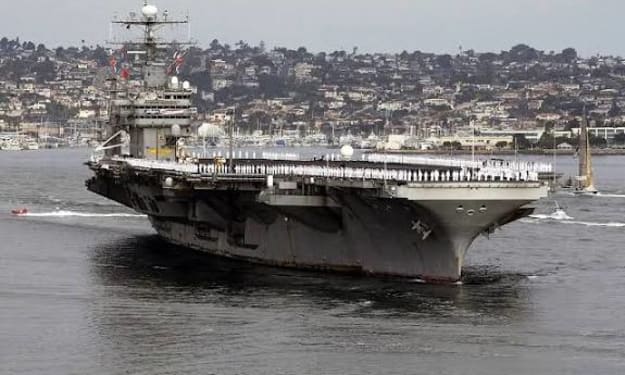
Ghost Mode or Electronic Spoofing? How USS Abraham Lincoln Can Confuse Iran’s Surveillance
Advanced naval tactics keep aircraft carriers one step ahead The USS Abraham Lincoln, one of the United States Navy’s most advanced aircraft carriers, is not just a floating fortress—it is also a master of electronic deception and stealth tactics. With rising tensions in the Persian Gulf, analysts are examining how the carrier can confuse Iranian surveillance and maintain operational security while projecting power in sensitive regions. Through a combination of ghost mode maneuvers, electronic spoofing, and advanced radar countermeasures, the USS Abraham Lincoln can operate effectively in contested waters while minimizing risk to its crew and aircraft. Understanding “Ghost Mode” Ghost mode is a term used to describe maneuvers that make a ship less visible to enemy radar and tracking systems. Techniques include: Adjusting speed and heading to reduce detectability Using radar-absorbent materials or coatings Operating in ways that blend with natural sea clutter For Iran’s surveillance systems, a carrier in ghost mode becomes harder to track, creating uncertainty about its location and intended operations. This can provide a strategic advantage, especially in regions where adversaries rely heavily on radar and satellite intelligence. Electronic Spoofing Explained Electronic spoofing involves sending false signals to enemy sensors, making them believe a ship is somewhere it is not. The USS Abraham Lincoln can deploy: Decoy signals that mimic radar reflections from a larger or smaller vessel Simulated electronic footprints that confuse tracking systems Jamming or misleading communications to prevent accurate detection By combining these measures, the carrier can mask its movements and protect high-value operations from surveillance and targeting. Why These Tactics Matter In the Persian Gulf and surrounding waters, tensions between the US and Iran have been high due to regional conflicts, strategic chokepoints, and contested waters. Advanced surveillance technology allows Iran to monitor naval activity, but the Abraham Lincoln’s countermeasures reduce the risk of being tracked or targeted. The benefits of these tactics include: Crew Safety – By avoiding detection, the ship reduces the risk of missile or drone attacks. Operational Flexibility – Commanders can plan exercises or patrols without revealing intentions. Strategic Advantage – Confusing adversaries forces them to allocate more resources to tracking, creating openings for US operations elsewhere. Integration with Carrier Capabilities The USS Abraham Lincoln is equipped with advanced radar, sensors, and aircraft, which all contribute to its ability to operate in contested environments. Ghost mode and electronic spoofing are integrated with: Fighter jet sorties for surveillance and defense Electronic warfare aircraft that extend the carrier’s reach and disrupt adversaries Communication networks that remain secure while spoofing enemy systems These combined capabilities allow the carrier to project power while staying largely undetected. Regional Implications For Iran, the presence of a stealthy and deceptive carrier can complicate decision-making and risk assessment. Surveillance systems may indicate a threat where none exists or fail to detect real operations. Experts note that these tactics are part of a broader strategy of deterrence, signaling that the US can maintain superiority without direct confrontation. They also emphasize that such operations help protect vital shipping lanes and allied interests in the region. The Role of Electronic Warfare Electronic warfare (EW) plays a central role in the Abraham Lincoln’s ability to confuse surveillance. EW capabilities allow the carrier to: Jam or disrupt radar systems Deploy decoys to mimic ship movements Communicate securely while creating false signals for adversaries In modern naval conflict, EW can be as important as traditional firepower, allowing forces to operate undetected and maintain the upper hand in high-risk scenarios. Training and Operational Readiness These tactics require highly trained personnel and coordination. Pilots, sailors, and electronic warfare specialists practice simulated scenarios to ensure the ship can respond to real-world threats. Routine exercises test the carrier’s ability to: Confuse multiple radar systems simultaneously Operate in high-density maritime environments Coordinate with escort ships and aircraft while maintaining stealth By continuously refining these skills, the USS Abraham Lincoln remains ready for unpredictable regional tensions. Global Significance While this discussion focuses on Iran, the techniques used by the Abraham Lincoln are relevant globally. Modern aircraft carriers operate in regions where adversaries may have advanced surveillance, and the ability to mask movements and protect assets is a critical component of national security. Allies also benefit indirectly, as the carrier’s presence and capability enhance maritime security and strategic stability across key trade routes and international waters. Conclusion The USS Abraham Lincoln demonstrates that modern naval power is more than firepower—it’s information, deception, and technology. Ghost mode and electronic spoofing allow the carrier to confuse adversaries like Iran, protect its crew and aircraft, and maintain operational flexibility in sensitive regions. As surveillance technology advances worldwide, the importance of electronic warfare, stealth tactics, and strategic training will continue to grow. For the US Navy, combining these capabilities ensures that carriers like the Abraham Lincoln remain formidable, adaptable, and ready for any challenge on the high seas.
By Fiaz Ahmed about 7 hours ago in The Swamp
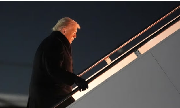
The Latest: Trump’s Plane Delayed on the Way to Second Day of Davos Economic Forum
In an unexpected twist early Wednesday morning, U.S. President Donald Trump’s trip to the prestigious World Economic Forum (WEF) in Davos, Switzerland was temporarily derailed after a minor electrical malfunction forced his official aircraft to return to the United States shortly after departure. The incident — though described by the White House as a precaution — delayed Trump’s arrival as he prepared to participate in the second day of the summit, where global leaders are debating pressing economic, geopolitical and security concerns.
By Salaar Jamali7 days ago in The Swamp


Comments
There are no comments for this story
Be the first to respond and start the conversation.