Jillur Rahaman
Bio
Jillur Rahman is the creative mind behind FontOrbit. This website is a vibrant hub for typography enthusiasts. With a CSE degree and over a decade of experience in web design & development, Jillur got passion for sharing knowledge.
Stories (76)
Filter by community
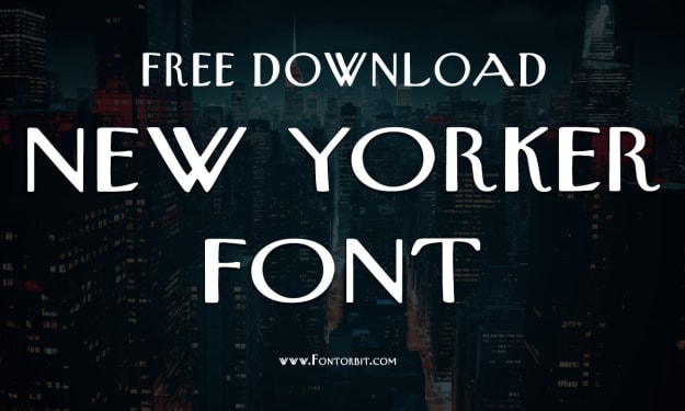
Toy Story Font: The Iconic Typeface Behind the Beloved Franchise. Content Warning.
When you think of Disney’s “Toy Story,” a flood of nostalgia likely comes rushing back. From Woody’s cowboy charm to Buzz Lightyear’s intergalactic adventures, the franchise is a cultural phenomenon.
By Jillur Rahamanabout a year ago in Art
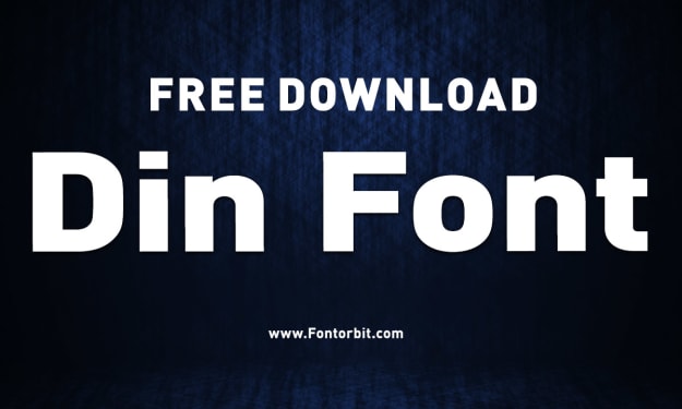
The DIN Font: A Legacy of Precision and Clarity. Content Warning.
The DIN font family has been a cornerstone of modern typography since its inception. Known for its clean, functional design, it has become a favorite in various industries, including transportation, advertising, and design.
By Jillur Rahamanabout a year ago in Art
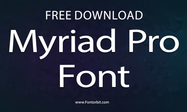
Myriad Pro Font: A Timeless Typeface for Modern Designs. Content Warning.
In the realm of typography, few fonts stand the test of time while maintaining a contemporary appeal. Myriad Pro is one such typeface that has captured the hearts of designers across the globe.
By Jillur Rahamanabout a year ago in Art
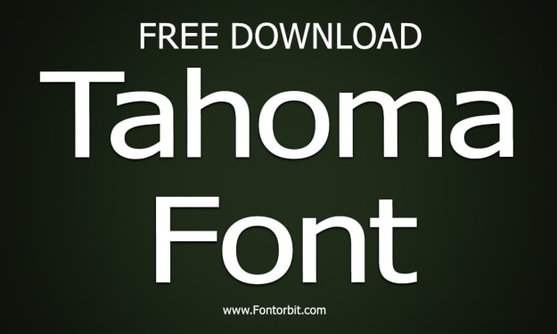
Tahoma Font: A Timeless Sans-Serif Typeface. Content Warning.
Tahoma is one of the most widely recognized sans-serif typefaces, celebrated for its clean lines and excellent legibility. Designed by Matthew Carter and released by Microsoft in 1994, Tahoma has become a staple font in both digital and print design. Its simplicity and versatility have made it a favorite among designers, developers, and everyday users alike.
By Jillur Rahamanabout a year ago in Art
KaiTi Font: A Timeless Classic in Chinese Typography. Content Warning.
Typography is an integral part of design and communication, shaping how information is perceived and understood. Among the myriad of fonts available for Chinese script, KaiTi (楷体) stands out as a timeless and elegant typeface.
By Jillur Rahamanabout a year ago in Art
Spotify Font: A Deep Dive into Its Typography. Content Warning.
Spotify, the world-renowned music streaming platform, has always been a forerunner in delivering exceptional user experiences. One of the key elements contributing to its visual identity is its typography.
By Jillur Rahamanabout a year ago in Art
Avant Garde Font: A Modern Typographic Marvel. Content Warning.
The Avant Garde font, a prominent sans-serif typeface, holds a significant place in the world of typography. Its clean lines, geometric forms, and striking visual appeal make it a go-to choice for designers seeking a modern, bold, and elegant font. In this article, we’ll explore the origins, characteristics, and uses of Avant Garde, along with tips for incorporating it into your designs.
By Jillur Rahamanabout a year ago in Art
Gotham Narrow Font: A Comprehensive Guide. Content Warning.
The Gotham Narrow Font is a condensed variation of the classic Gotham typeface, renowned for its clean lines, modern aesthetic, and versatile application. Developed by Hoefler & Co., this font family has carved a niche for itself in design projects where space is a constraint but style and readability cannot be compromised.
By Jillur Rahamanabout a year ago in Art
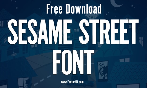
Sesame Street Font: A Journey into Nostalgia and Design. Content Warning.
Few things evoke childhood memories quite like the colorful and educational programming of Sesame Street. For over five decades, this beloved show has educated and entertained children around the world, and its iconic visual elements, including the Sesame Street font, have played a pivotal role in its branding and charm. Let’s dive into the story behind the Sesame Street font and its impact on design and nostalgia.
By Jillur Rahamanabout a year ago in Art