
Exploring the Lato Font: A Timeless Typeface for Modern Design
Lato Font

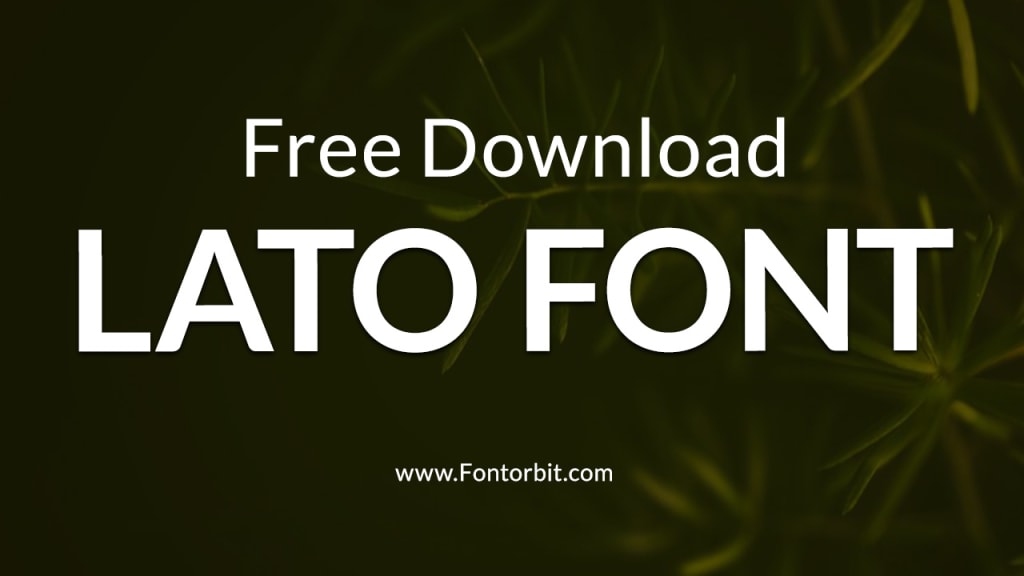
Lato is one of the most popular sans-serif typefaces in the design world, admired for its versatility, readability, and elegant simplicity.
Originally designed in 2010 by Łukasz Dziedzic, a Polish designer, Lato—which means "summer" in Polish—was created with the intent of combining warmth and stability in its design. Over the years, it has become a staple for web designers, graphic artists, and branding professionals alike.
The Origins of Lato Font
Łukasz Dziedzic developed Lato while working on a corporate project that required a professional yet friendly typeface. When the project’s scope changed, he decided to release the font to the public under the Open Font License, allowing it to be freely used in personal and commercial projects.
Since its release, Lato has undergone multiple updates, expanding its weight and style options to accommodate various design needs. Today, it is available in multiple weights, including Thin, Light, Regular, Bold, and Black, as well as corresponding italics.
Key Features of Lato Font
Lato stands out for several reasons, making it a go-to choice for designers:
Humanist Style: Despite being a sans-serif font, Lato retains subtle humanistic traits that make it approachable and warm.
Clean and Modern Design: Its geometric shapes and consistent strokes provide a clean, modern aesthetic suitable for a variety of applications.
Versatility: The broad range of weights and styles allows for both headings and body text, ensuring seamless design consistency.
Highly Readable: The spacing and proportions of Lato make it incredibly legible, even at smaller sizes.
Cross-Platform Compatibility: Lato is optimized for both digital and print use, ensuring it looks sharp on screens and in print materials.
Popular Uses of Lato Font
Lato’s flexibility has led to its adoption across numerous industries and platforms. Here are some common applications:
Web Design: Many websites use Lato for its clean and readable qualities.
Corporate Branding: Companies appreciate its professional yet friendly aesthetic.
Mobile Applications: Its readability makes it ideal for UI/UX design.
Printed Materials: Brochures, flyers, and reports often incorporate Lato for its clarity and elegance.
Presentation Slides: Lato’s consistent stroke weight ensures slides look polished and professional.
Advantages and Limitations of Lato
Advantages:
Free to Use: Available under the Open Font License.
Extensive Weight Options: Suitable for diverse design contexts.
Highly Legible: Perfect for both headings and long-form text.
Limitations:
Overuse in Web Design: Due to its popularity, Lato can sometimes feel overused, reducing its uniqueness.
Limited Personality: Its neutrality might not suit highly expressive or artistic projects.
Conclusion
Lato font strikes a delicate balance between professionalism and warmth, making it a versatile choice for designers. Its clean design, readability, and adaptability ensure it remains a top pick for various creative and functional projects.
However, designers should use it thoughtfully to maintain originality and uniqueness in their work. As an open-source font, Lato continues to empower creativity across the globe, a testament to its timeless appeal.
FAQs about Lato Font
Is Lato font free to use?
Yes, Lato is free to use for both personal and commercial projects under the Open Font License.
What makes Lato different from other sans-serif fonts?
Lato’s unique blend of humanistic elements and geometric precision sets it apart from other sans-serif fonts.
Where can I download Lato font?
Lato can be downloaded from Google Fonts or the designer’s official website.
Can Lato be used for print projects?
Absolutely! Lato’s high readability and clean design make it suitable for both print and digital formats.
What are some good font pairings for Lato?
Lato pairs well with serif fonts like Georgia or Times New Roman, as well as other sans-serif fonts like Open Sans.
Is Lato suitable for body text?
Yes, Lato’s proportions and legibility make it an excellent choice for body text.
How many weights does Lato offer?
Lato offers multiple weights, including Thin, Light, Regular, Bold, and Black, with matching italics.
About the Creator
Jillur Rahaman
Jillur Rahman is the creative mind behind FontOrbit. This website is a vibrant hub for typography enthusiasts. With a CSE degree and over a decade of experience in web design & development, Jillur got passion for sharing knowledge.
Keep reading
More stories from Jillur Rahaman and writers in Art and other communities.
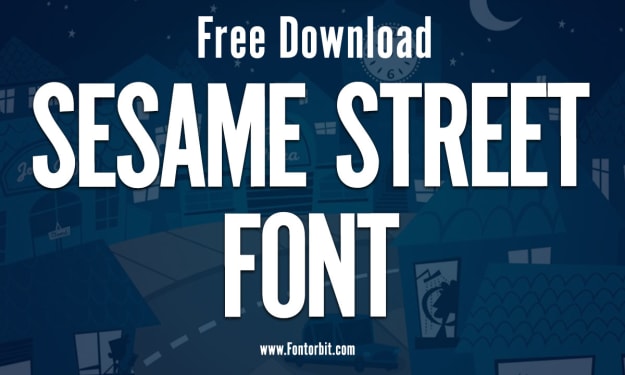
Sesame Street Font: A Journey into Nostalgia and Design
Few things evoke childhood memories quite like the colorful and educational programming of Sesame Street. For over five decades, this beloved show has educated and entertained children around the world, and its iconic visual elements, including the Sesame Street font, have played a pivotal role in its branding and charm. Let’s dive into the story behind the Sesame Street font and its impact on design and nostalgia.
By Jillur Rahamanabout a year ago in Art
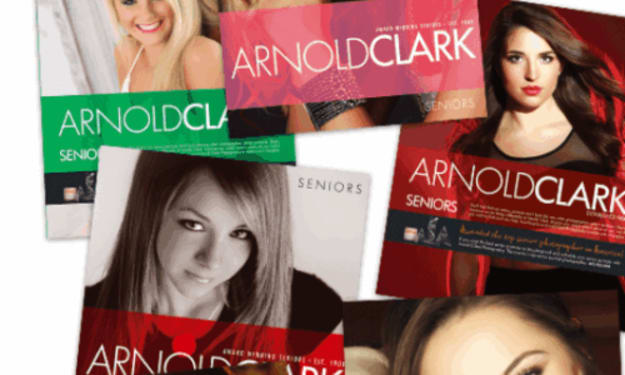
Arnold Clark Photography… The Pinnacle in High School Senior Portraits
Arnold Clark Photography sits on 24th Street in Omaha Nebraska, its front windows glowing softly long after most shops have gone dark. From the outside, it looks timeless with clean lines and framed portraits that hint at decades of stories. Inside, it is anything but stuck in the past.
By ArnoldClark Photography6 days ago in Art
🅼🅸🅳🅽🅸🅶🅷🆃 🆂🅽🅰🅲🅺🆂
"It's 10 in Tuscon! We all know what that means... It's Time for Midnight Snacks with your man, Gerald Gee! Ready to spend the night together? Me too! I'm full of snacks and can't wait to regurgitate them all back into your hungry ears. Crack a brew! Pop some corn! Anything to get ready for one hell of a show where the talk maybe cheap but the words cut deep...
By Lamar Wiggins4 days ago in Fiction


Comments
There are no comments for this story
Be the first to respond and start the conversation.