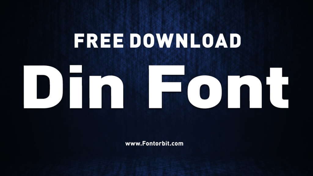
The DIN Font: A Legacy of Precision and Clarity
The DIN Font

The DIN font family has been a cornerstone of modern typography since its inception. Known for its clean, functional design, it has become a favorite in various industries, including transportation, advertising, and design.
This article delves into the history, characteristics, applications, and enduring relevance of the DIN font, providing a comprehensive overview of its impact on typography.
History of the DIN Font
The DIN (Deutsches Institut für Normung) font traces its origins back to Germany in the early 20th century. Developed initially as a standardized typeface for technical applications, it was part of the DIN 1451 standard introduced in 1936. The typeface was designed to ensure legibility and uniformity, making it suitable for road signs, technical drawings, and administrative documents.
Over time, the DIN font evolved beyond its utilitarian roots. Designers recognized its aesthetic appeal and versatility, leading to its adoption in branding and graphic design. Various modern iterations, such as DIN Next and DIN Pro, have expanded the font’s range while preserving its core characteristics.
Characteristics of the DIN Font
The DIN font is renowned for its:
Geometric Simplicity: The typeface features clean, straight lines and uniform proportions, reflecting a minimalist design philosophy.
High Legibility: Its clear and unadorned letterforms make it easy to read, even from a distance or at small sizes.
Versatility: The font’s adaptability allows it to work seamlessly in various contexts, from signage to digital interfaces.
Neutral Aesthetic: The lack of decorative elements gives the font a timeless and professional appearance.
Applications of the DIN Font
The DIN font’s clarity and functionality have made it a popular choice across multiple domains:
Transportation: Used extensively for road and railway signage worldwide.
Corporate Branding: Favored by companies seeking a modern and professional image.
Editorial Design: Ideal for headlines, captions, and body text in print and digital media.
User Interfaces: Frequently employed in apps and websites for its legibility and clean appearance.
Why Choose the DIN Font?
The enduring popularity of the DIN font lies in its ability to balance form and function. Its neutral yet striking design makes it a reliable choice for projects requiring clarity and precision. Additionally, its extensive character set and multiple weights provide designers with the flexibility to adapt it to various purposes.
Conclusion
The DIN font stands as a testament to the power of simplicity in design. From its origins as a utilitarian typeface to its current status as a design staple, it continues to influence typography and communication.
Whether you are designing a brand identity or creating user-friendly interfaces, the DIN font offers a blend of precision, versatility, and timeless appeal.
FAQs about the DIN Font
What does DIN stand for?
DIN stands for "Deutsches Institut für Normung," which translates to the German Institute for Standardization.
When was the DIN font created?
The DIN 1451 font was first introduced in 1936 as part of a standard for German technical applications.
What makes the DIN font unique?
Its geometric simplicity, high legibility, and neutral aesthetic make it stand out as a versatile and functional typeface.
Is the DIN font free to use?
Some versions of the DIN font are available for free, while others, like DIN Pro or DIN Next, require licensing.
Where is the DIN font commonly used?
It is widely used in road signage, branding, editorial design, and digital interfaces due to its clarity and adaptability.
Who designed the original DIN font?
The DIN 1451 typeface was developed as part of the DIN standardization effort, but its design is attributed to German engineers rather than a single individual.
Can I use the DIN font for personal projects?
Yes, depending on the licensing terms of the specific DIN font version you choose. Always check the font’s license agreement before use.
About the Creator
Jillur Rahaman
Jillur Rahman is the creative mind behind FontOrbit. This website is a vibrant hub for typography enthusiasts. With a CSE degree and over a decade of experience in web design & development, Jillur got passion for sharing knowledge.


Comments
There are no comments for this story
Be the first to respond and start the conversation.