
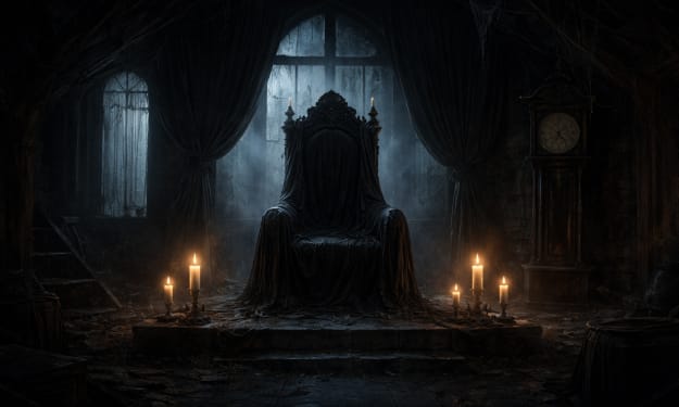
How to Mix Tiles and Paint Colors for a Cohesive Look by Americo Ricky Migliore
Achieving Harmony: How to Mix Tiles and Paint Colors for a Cohesive Look by Americo Ricky Migliore


Introduction
Achieving a cohesive and visually appealing design in any space requires a delicate balance between various elements. One of the most essential components of interior design is the integration of tiles and paint colors. Both tiles and paint serve as foundational elements that set the tone and atmosphere of a room, and when combined thoughtfully, they can elevate the entire aesthetic of your home.
Americo Ricky Migliore, an expert in tile and stone installation based in New York, offers valuable tips on how to successfully mix tiles and paint colors for a seamless, harmonious look.
The key to achieving a cohesive look is understanding the relationship between tiles, paint, and the space itself. By considering the room's size, lighting, and function, as well as the colors, textures, and patterns of both the tiles and paint, you can create a space that feels balanced and visually appealing.
In this article, we’ll explore various strategies and insights from Americo to help you mix tiles and paint colors with confidence, ensuring that your home feels unified and stylish.
1. Understanding the Role of Tiles and Paint in Design
Before diving into mixing tiles and paint, it’s essential to understand the distinct role each element plays in a room. Tiles are often used for their durability, texture, and visual impact, while paint sets the mood and provides a backdrop for the entire space.
Tiles, especially those used for flooring, backsplashes, or accent walls, add color, pattern, and dimension to a room. Paint, on the other hand, can create a sense of openness or intimacy, depending on the chosen hue and finish.
Americo Ricky Migliore emphasizes the importance of acknowledging the functionality of each material. Tiles tend to be more practical, offering protection to walls and floors, whereas paint can be used to define the atmosphere and enhance the visual appeal of a space. Therefore, it’s crucial to mix the two in a way that allows each to shine while maintaining a harmonious flow.
2. Selecting a Base Color for Walls
When mixing tiles and paint colors, one of the first steps is to select a base color for the walls. This base color will serve as the foundation for the rest of the design and should complement the tiles you choose. According to Americo, neutral colors such as whites, greys, beiges, and soft pastels are excellent options for creating a flexible backdrop. These tones provide a versatile canvas that can pair well with a wide range of tile colors and patterns.
If you’re using bold, patterned tiles, a neutral wall color helps balance the visual weight of the tiles. For example, if you have a kitchen backsplash made from vibrant mosaic tiles or intricate geometric patterns, a soft, neutral paint color on the walls allows the tiles to take center stage. This approach ensures that the room doesn’t feel too busy or overwhelming.
On the other hand, if you prefer a minimalist aesthetic with subtle tiles, such as white subway tiles or light marble, you can opt for a slightly bolder wall color to introduce some contrast. Rich tones like navy blue, deep green, or charcoal can add depth and drama to the space while still maintaining a cohesive look. Americo’s advice is to test paint samples in the room’s natural lighting before making a final decision, as the lighting can significantly influence how the colors interact.
3. Balancing Bold Tiles with Subtle Paint Colors
For those who love bold, statement-making tiles, the key to achieving balance is to pair them with more subdued paint colors. Bold tiles, such as brightly colored ceramics or intricate patterned tiles, can easily dominate a space if not paired with the right wall color. To prevent the design from feeling overwhelming, Americo recommends selecting a paint color that is neutral or muted, allowing the tiles to shine without competing for attention.
For example, in a bathroom with a striking patterned tile floor in rich blues and oranges, opting for a soft grey or off-white paint color for the walls creates a harmonious balance. The walls remain understated, letting the tiles become the focal point of the room without feeling too chaotic. Additionally, choosing a matte or satin finish for the paint can help soften the contrast between the tiles and walls, creating a more cohesive and comfortable look.
4. Creating Contrast with Complementary Colors
In some design situations, creating contrast between the tiles and paint can lead to a striking and energetic look. Americo suggests using complementary colors to create visual interest while ensuring that the overall design still feels balanced. Complementary colors are those that are opposite each other on the color wheel, such as blue and orange or red and green.
When using complementary colors, it’s essential to use them thoughtfully to avoid overwhelming the space. For example, if you choose warm-toned tiles, such as terracotta or golden-yellow stone tiles, pairing them with a cool-toned paint color like sage green or soft turquoise can create a dynamic contrast that energizes the room.
The key is to choose one element (either the tiles or the paint) to be the dominant color, with the other acting as an accent. By limiting the use of complementary colors to one area or element, you ensure that the space doesn’t feel too disjointed.
Americo advises that when opting for complementary colors, it’s important to also consider the finishes of both the tiles and the paint. A high-gloss paint finish, paired with matte or textured tiles, can create an interesting visual contrast without competing for attention.
5. Using Texture to Add Depth and Interest
Another way to mix tiles and paint colors successfully is by considering the texture of both materials. Texture can add dimension and richness to a room, even when the color palette is relatively simple. Tiles themselves offer various textures, from smooth polished surfaces to rough, natural finishes. Likewise, paint can also have texture, from matte finishes to glossy or satin sheens.
Americo Ricky Migliore emphasizes the importance of using textures to create depth in a space. For instance, pairing a glossy subway tile backsplash with a matte wall paint creates a tactile contrast that draws the eye. Similarly, in an entryway or hallway, you could use textured stone tiles for the floor and pair them with a soft matte paint color to create a balanced, multi-dimensional look.
When working with different textures, it’s essential to maintain a balance. Too many contrasting textures can make the space feel cluttered, while too much uniformity can make it feel flat. Americo’s approach is to allow one element—either the tiles or the paint—to take precedence in terms of texture, while the other element complements it in a more subtle way.
6. Matching Tile and Paint Patterns for a Unified Look
While tiles and paint are often used in distinct areas, it’s possible to use patterns in both to create a unified and visually stimulating design. Mixing patterns can be challenging, but when done thoughtfully, it can lead to a highly personalized and stylish space.
For example, you can pair patterned tiles, such as floral or geometric tiles, with a wall color that features a subtle pattern or texture. Softly patterned wallpaper or a subtle paint effect like strié (a textured faux finish) can add depth without overpowering the room.
Americo recommends keeping the patterns within the same theme or color family to maintain cohesion. If your tiles feature bold patterns, consider opting for a simple, solid color with a slight texture for the paint to ensure the overall design doesn’t become too busy.
A great example of this approach is using patterned tiles for a kitchen backsplash and pairing them with painted walls that feature a soft, geometric texture. The key is to maintain a balance between the scale of the patterns—large patterns on the tiles paired with smaller, subtle patterns in the paint can create a layered, interesting effect without overwhelming the space.
Conclusion
Mixing tiles and paint colors is a powerful way to create a cohesive and harmonious look in any room. By considering the role of each material, selecting complementary or contrasting colors thoughtfully, and paying attention to textures and patterns, you can achieve a beautifully balanced design.
Americo Ricky Migliore’s insights emphasize the importance of testing colors in the actual space and considering the functionality of both tiles and paint to enhance the atmosphere of the room. Whether you are renovating your kitchen, bathroom, or living room, mixing tiles and paint is an art that, when done correctly, can transform your space into a stunning, unified environment.
About the Creator
Americo Migliore
Americo Migliore Jr, a 36-year-old of Italian descent, is a distinguished leader in the New York tri-state area’s commercial interior stone and tile installation industry.
Keep reading
More stories from Americo Migliore and writers in Motivation and other communities.
The Role of Tiles in Enhancing Natural Lighting in a Room by Americo Migliore jr
Introduction Natural lighting is a key element in creating an inviting and visually appealing living space. It not only contributes to the ambiance of a room but also has numerous health benefits, such as improving mood and productivity. In interior design, natural light can be manipulated through various techniques to optimize the flow of light throughout a space.
By Americo Miglioreabout a year ago in Motivation
“This Story Will Change the Way You Think”
Ethan had always felt like life was moving forward without him. Every morning, he woke up with plans and went to bed with disappointment. He worked hard, stayed honest, and tried to do the right things, yet nothing seemed to work. Promotions went to others. Opportunities appeared for people who seemed less deserving. Over time, Ethan began to believe that effort didn’t matter—that success was reserved for a lucky few. He often told himself, “Maybe I’m just not meant for more.” One evening, after another long and tiring day, Ethan missed the last bus home. With no other choice, he started walking. The city was unusually quiet, and the streets felt longer than usual. As he passed a small tea stall near a closed bookstore, he noticed an elderly man sitting alone, slowly turning the pages of an old notebook. The notebook caught Ethan’s attention. Its pages were yellow, but every line was written carefully, as if each word mattered. “Are you writing a story?” Ethan asked. The old man looked up and smiled. “No,” he said gently. “I’m rewriting my life.” That answer confused Ethan, but he sat down anyway. “What does that mean?” Ethan asked. The old man closed the notebook. “For years, I blamed the world for everything I didn’t become. Then one day, I realized the story I kept telling myself was the real problem.” Ethan felt uncomfortable. The words felt personal. The old man continued, “Tell me, young man—what story do you tell yourself every day?” Ethan hesitated. Then he spoke honestly. “That no matter how hard I try, it won’t be enough.” The old man nodded slowly. “And so life agrees with you.” That sentence hit Ethan harder than he expected. “What do you mean?” he asked. “Life listens,” the old man replied. “Not to your words—but to your beliefs. If you believe effort is useless, you will unconsciously prove yourself right.” Ethan laughed nervously. “So you’re saying my thoughts control my life?” “No,” the old man said. “Your thoughts control your actions. And your actions shape your life.” The rain started falling lightly. People rushed past, but Ethan stayed. For the first time in a long while, he felt like someone was speaking the truth he had been avoiding. The old man opened his notebook and showed Ethan a page. It had two columns. On the left side, it said: What I Fear On the right side, it said: What I Can Control “Most people,” the old man explained, “live on the left side. They fear failure, rejection, and judgment. Few people live on the right side—where effort, learning, and patience exist.” That night, Ethan walked home thinking deeply. He realized how often he replayed his mistakes, how often he compared his life to others, and how rarely he focused on what he could improve today. The next morning, Ethan made a small decision. He stopped saying, “Why does this always happen to me?” Instead, he asked, “What is this teaching me?” At work, he stopped waiting for motivation and started building discipline. He arrived earlier, learned skills outside his job, and asked questions instead of pretending to know everything. Some days were painful. Old habits tried to pull him back. There were moments when quitting felt easier than continuing. But Ethan remembered the notebook. What can I control? He couldn’t control promotions. He couldn’t control opinions. But he could control his effort. Months passed. Slowly, things began to shift—not dramatically, but meaningfully. Ethan gained confidence. His work improved. People started noticing his consistency. One afternoon, his manager called him into the office. Ethan expected criticism, but instead, he received an opportunity to lead a small project. It wasn’t a reward—it was a test. Ethan accepted. The project was difficult. Mistakes were made. Pressure was constant. But for the first time, Ethan didn’t run from responsibility. He faced it. The project succeeded. That success didn’t make him rich. It didn’t make him famous. But it changed something far more important. Ethan no longer saw himself as a victim of circumstances. Years later, Ethan walked past the same tea stall. The bookstore was still closed. The city still rushed. But the old man was gone. Ethan smiled, understanding the lesson at last. Life had never been against him. Life had been responding to the story he believed. When he changed the story, life changed the direction. Final Lesson Change the story you tell yourself—and your life will follow.
By Inayat khan5 days ago in Motivation


Comments