
How Colors Affect Your Mood and Productivity
Color is more than just a visual experience.
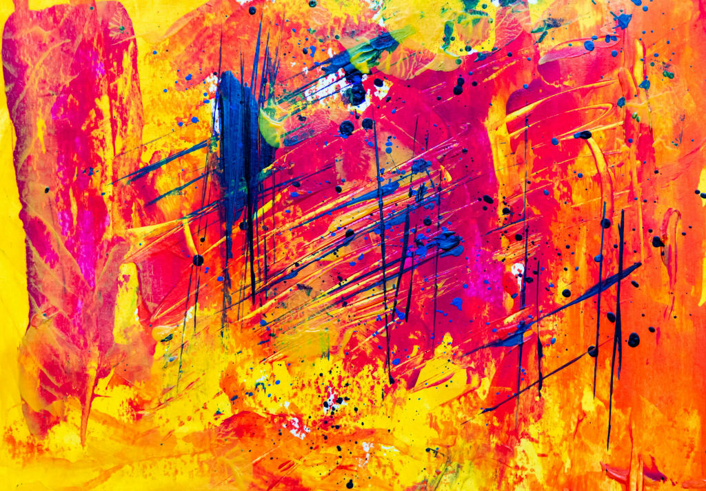
Color is more than just a visual experience; it has a profound impact on our emotions, behavior, and even productivity. From the calming blues of a serene beach to the stimulating reds of a high-energy workspace, colors shape our perceptions and influence our psychological state in ways we often don’t realize. But how exactly do different colors affect our mood and efficiency? And how can we use this knowledge to our advantage in everyday life?
The Psychology of Color: Why It Matters
The study of how color affects human behavior is known as color psychology. It is widely used in marketing, interior design, and branding to elicit specific responses from people. While individual color perception can be influenced by personal experiences and cultural backgrounds, research has shown that certain colors tend to evoke similar psychological effects across different populations.
Colors can be broadly categorized into two types:
Warm colors (red, orange, yellow) – Typically associated with energy, passion, and warmth.
Cool colors (blue, green, purple) – Often linked to calmness, relaxation, and concentration.
By understanding these associations, we can make informed choices about the colors we surround ourselves with at home, in the workplace, or even in clothing.
How Specific Colors Affect Mood and Productivity
1. Red: The Color of Energy and Urgency
Red is a stimulating color that raises energy levels and grabs attention. It increases heart rate and can create a sense of urgency, which is why it’s often used in sales and warning signs.
Best for: Environments requiring physical activity or high alertness (e.g., gyms, sales offices).
Avoid for: Spaces where relaxation and focus are key, as it can feel overwhelming.
2. Blue: The Color of Calm and Focus
Blue is known for its calming and intellectual effects. It helps lower stress levels, enhances concentration, and promotes mental clarity, making it a favorite for workspaces and study areas.
Best for: Offices, classrooms, meditation rooms.
Avoid for: Dining areas, as it is known to suppress appetite.
3. Yellow: The Color of Optimism and Creativity
Bright and cheerful, yellow stimulates creativity and optimism. It’s associated with happiness and can inspire innovation, but too much of it can cause anxiety or frustration.
Best for: Creative spaces, kitchens, and areas where brainstorming takes place.
Avoid for: Bedrooms, as its high energy may disrupt relaxation.
4. Green: The Color of Balance and Renewal
Green symbolizes nature, growth, and stability. It has a soothing effect and reduces eye strain, making it an excellent choice for long working hours.
Best for: Workspaces, hospitals, libraries.
Avoid for: High-energy environments that require urgency.
5. Orange: The Color of Enthusiasm and Socialization
Orange combines the excitement of red with the cheerfulness of yellow. It promotes social interaction and a sense of enthusiasm but can be overwhelming if overused.
Best for: Cafés, restaurants, social spaces.
Avoid for: Offices requiring deep concentration.
6. Purple: The Color of Luxury and Imagination
Associated with royalty, wisdom, and spirituality, purple can stimulate imagination and add a sense of sophistication to an environment.
Best for: Creative industries, luxury branding, meditation rooms.
Avoid for: Corporate settings where a more neutral palette is preferred.
7. White: The Color of Cleanliness and Simplicity
White is often used to create a sense of space and purity. It gives a clean and modern feel but can also appear cold or sterile if not paired with other colors.
Best for: Minimalist interiors, hospitals, technology spaces.
Avoid for: Cozy environments that require warmth.
8. Black: The Color of Power and Elegance
Black is often associated with sophistication and authority but can also evoke feelings of heaviness and sadness if overused.
Best for: Luxury branding, modern office spaces.
Avoid for: Small rooms, as it can make them feel smaller and darker.
How to Use Color to Your Advantage
Knowing how colors influence your mood and performance, you can make intentional choices to enhance different aspects of your life:
For Productivity: Use blue or green in your workspace to improve focus and reduce stress.
For Creativity: Incorporate yellow or purple in areas where you brainstorm or create.
For Relaxation: Choose soft greens, blues, or warm neutrals for your bedroom and meditation spaces.
For Social Spaces: Use orange or red in dining and entertainment areas to encourage conversation and energy.
For Branding and Marketing: Select colors that align with your business message (e.g., blue for trust, red for excitement, green for eco-friendliness).
Final Thoughts
Color is more than just decoration—it’s a powerful tool that influences our emotions, decisions, and productivity. By consciously choosing the colors we surround ourselves with, we can create environments that enhance our well-being, motivation, and overall quality of life. So, next time you repaint a room, buy new clothes, or design a workspace, remember: color matters more than you think!
About the Creator
Whiskey At Dusk
Guess the whiskey was more important to you in the end, wasn’t it? It was more than the well-being of your friends; more vital than showing up to the places you promised you would and could come to; more critical of a matter than fulfilling your damn responsibilities and getting the press off your back.
By Snarky Lisa5 days ago in Humans
Love Divided
I was scrolling through my emails recently when I noticed an interesting article posted by users on Quora entitled ”why do Men struggle mentally in relationships” normally like most people I take a quick glance and the email is confined to the bin, however something about this post captured my intrigue so I decided to take a look further, also to unashamedly see if I could draw comparisons to my own life and experiences. Then, out of surprise, I found a comment which threw me off guard, a topic rarely even discussed out in the open. The comment highlighted how racial differences can become the defining factor in mixed relationships which cause mental health issues.
By Malachai Houghabout 23 hours ago in Humans


Comments
There are no comments for this story
Be the first to respond and start the conversation.