
Why World Maps are a Lie
For the past 500 years, a certain type of world map has been used to teach children about our planet.


By Andre Wormsbecker / Quantum Dox
In this article, we will explore why some maps appear larger than others. Are the American continents really enormous? Or could what we were taught in history books be mistaken? Follow Mercator’s reasoning about these projections and how they can affect our initial perception of the true political and geographical divisions of our countries and continents. What is the truth that hasn’t been revealed to us?
For the past 500 years, a certain type of world map has been used to teach children about our planet. But forget everything you know. The world is not what it seems; humanity has been brainwashed by a Flemish cartographer, and we are (probably) living in a colonial Matrix. I hope you’re sitting down. That world map is wrong.
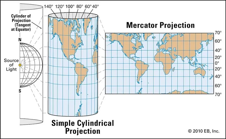
Most people recognize the old world map from faded school textbooks. It’s called the Mercator projection. In 1569, Gerardus Mercator created an entire world map drawn along colonial lines—literally. Every straight scribble between continents depicts a sea route for trade, with the largest economic powers getting the space on the paper to flex their border muscles.
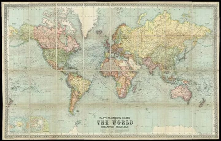
The problem? It’s nowhere near to scale. Europe isn’t the center of the universe—Mercator just moved the equator. North America isn’t nearly as large as it appears—although it might seem that way if you watch the news. In reality, South America should be twice the size of Europe. Greenland should be 14 times smaller than Africa and 3 times smaller than Australia, while Alaska looks 3 times bigger than its much larger neighbor, Mexico.
The Mercator projection greatly exaggerates the size of aging imperial powers at the expense of developing countries and continents like Africa, which are diminished into inferiority. There’s a reason why the Northern Hemisphere is associated with wealth and significance—it’s because it’s literally on top, permanently ingrained in our subconscious as superior from our earliest encounters with learning.
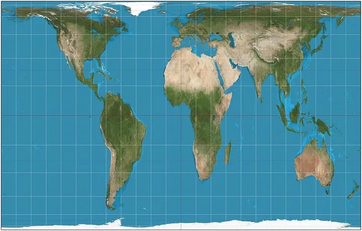
But there’s another map. A map that laughs in the face of the old world order, that is scaled without topographic bias, and actually tries to tell the truth. Say hello to our research savior: the Gall-Peters projection.
More commonly known as the Peters projection, it was published in 1974 by Dr. Arno Peters. It’s an “equal-area” map, borrowed from the work of 19th-century Scotsman James Gall, meaning it accurately scales the land according to surface area, creating a much more balanced reflection of what the world really looks like. It’s completely free from colonial bias.
And Boston public schools have made a big change— all new maps will be Peters projection. According to Colin Rose, assistant superintendent of opportunity and achievement gaps for Boston Public Schools, it’s “the start of a three-year effort to decolonize the curriculum in our public schools,” aimed at moving away from the cultural whitewashing of history in educational settings.
“Eighty-six percent of our students are students of color,” said Hayden Frederick-Clarke, director of cultural proficiency for Boston Public Schools, in an interview with WBUR. “Once students feel like the school is not being truthful, there is a tendency to shut down and reject information.”
No map is perfect — a two-dimensional reflection of a spherical world will always have flaws. Even the word “map” implies vulnerability; it comes from the Latin “mappa,” meaning “napkin,” to describe the surfaces first used to draw them. The Peters projection isn’t without its own issues — it looks a bit stretched, as there simply isn’t enough land to effectively translate onto a flat map.
If you’re still not sure what the heck we’re talking about, let The West Wing explain:
“In our society, we unconsciously equate size with importance and even power,” says The West Wing’s Notepad Man. Another staff member adds, “when Third World countries are misrepresented, they’re likely to be undervalued.”
Basically, it’s like Toblerone. If you make something appear smaller, everyone will think it’s worth less. But when it’s a continent you might never visit, it’s relegated to the dregs of forgotten dialogue that no one wants to talk about, loosely lumped in with the last season of Scrubs and the American reboot of The Inbetweeners.
But the issue extends far beyond the classroom. Incredibly, even Google Maps is stuck with the Mercator projection. When the internet inherits this internal bias, a bad idea can spread like an epidemic. The whispered notion that the West is somehow larger and better than the rest of the world persists—subtly, stealthily—until suddenly world leaders can turn this invisible precedent into rhetoric that sways between patriotism and reckless nationalism.
Every journey begins with a map. But if you start off on the wrong foot, disorientation can turn into disaster. It’s easy to get lost. The hard part is making sure no one else follows in your footsteps.
Sources:https://www.globalcitizen.org/en/content/world-map-wrong-mercator-peters-projection-boston/
https://medium.com/lessons-from-history/how-all-world-maps-have-lied-to-you-205cb0c14807
-----------
Did you enjoy this topic? How about staying in tune with our studies, tips, and curiosities?
We invite you to join us in a deep exploration of these themes. Follow us on social media (@quantumdox): Twitter, Instagram, Pinterest, and Telegram. Dive into our YouTube channel for inspiring content on these subjects. Learn more about our mission in the Bio. Stay connected with us by subscribing to our feed.
About the Creator
Quantum Dox
We are a study group aiming to awaken human consciousness to a new reality. Independent and non-profit, we explore research and studies to deeply understand existence and how the reality of the world and the universe operates.
Keep reading
More stories from Quantum Dox and writers in History and other communities.


Comments (1)
Fascinating! ⚡♥️⚡