
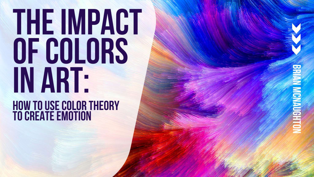
The Impact of Colors in Art
Brian McNaughton Explores How to Use Color Theory to Create Emotion

Color theory is a subject that humanity has spent countless years exploring and perfecting. The simple truth is that artists have been using colors to influence our emotions. However, it was only in recent centuries that we’ve begun to understand the full depth of this influence.
When addressing color theory, we must also address color psychology. Color psychology studies hues and how they determine or affect human behavior. These studies have many layers, including their artistic interpretation and real-life influences. With that in mind, let’s dive into color theory.
Historical Associations
Historically, humans tend to associate certain colors with specific emotions. The most iconic example of this association would be the color red and passion or anger. People automatically assume a painting full of red is either quite passionate - or angry.
Another iconic example of this association would be the connection between the color blue and the feeling of calmness or serenity. Blue is often the preferred color when looking to create a soothing or tranquil art piece.
Psychological Effects of Cool Colors
There are many different associated reactions and effects of colors. As mentioned above, blue is often associated with peace and calm. This makes it ideal for bedrooms and other calming environments. Color experts recommend using blue for rooms where people will spend much time (especially waiting rooms). Blue is also often used to portray sorrow and more somber tones. For example, look at Picasso’s The Old Guitarist (1903).
Conversely, green is often associated with nature and growth. Studies have shown that green has an important effect on our psychology, and even a little green in an office space can help with mental health. Green can also be used to portray serenity, success, or prosperity.
Purple has many associations, much like blue and green. It is historically used to portray royalty or luxury (as purple was the most expensive dye of the time and thus a status symbol). It’s also used to showcase and spark creativity. Other associations include relaxation and balance.
Psychological Effects of Warm Colors
Warm colors have their own set of associations. For example, yellow and orange can both be used to help stimulate appetites (yes, really - this is why so many fast-food restaurants rely on these colors).
Yellow is often used to portray cheer and brightness, as people see it as a happier color. That said, it can also showcase overstimulation when used in excess. So keep this in mind when designing.
As for orange, this color is often associated with energy and extravagance. It looks and feels warm and alive and thus is often seen as a more celebratory color. Naturally, the shade of orange matters quite a lot when setting the tone.
Finally, there’s red. As mentioned above, red has many strong associations, primarily passion and anger. But it can also be used to portray affection. For example, the next time you watch a romantic comedy, pay attention to the colors the love interests are wearing. Their ratio of red clothing will likely increase as they become more attracted to one another.
Marketing & Advertising Use
Unsurprisingly, marketing and advertising strategies have learned to take advantage of the psychological effects of colors and color theory. This goes beyond branding and into the realm of using our emotional responses to their advancement.
Do you need a few examples to understand how marketing can use this tactic? As mentioned above, nearly every fast food chain will utilize red, yellow, or orange in their color palettes. This helps to stimulate appetites but also discourages people from lingering too long (the point is for the food to go quickly - not have people hang out and take up space.)
Conversely, companies like Lowe’s and American Express utilize the color blue to make a bold impression and portray themselves as dependable and experts in the industry. Think about it - blue somehow always looks more professional, doesn’t it?
Now that you’ve learned a bit about color theory take some time to explore different stores and restaurants and see what you pick up. You’ll quickly find that color theory is everywhere.
About the Creator
Brian McNaughton
Brian McNaughton's career has been centered on pursuing pharmaceutical research and sharing his knowledge with students in higher education. He is currently living in Phoenixville, PA, where he enjoys spending time with friends and family.
Keep reading
More stories from Brian McNaughton and writers in Art and other communities.
Brian McNaughton Interview on Vocal Media
In the quaint town of Phoenixville, Pennsylvania, nestled among rolling hills and historic charm, lives a man whose work could reshape the future of medicine. Brian McNaughton, an educator and scientific professional, differs from your average small-town resident. His days are filled with the intricate dance of protein evolution, the mystery of intracellular biologics delivery, and the cutting-edge world of nanobody-based immunotherapeutic discovery.
By Brian McNaughtonabout a year ago in 01
What Happened to Keith Porter?
I am writing this letter with a heavy heart and an unwavering commitment to justice. On New Year’s Eve, our community lost a beloved father, son, and friend—Keith Porter Jr., a 43-year-old Black man whose life was tragically cut short at his Northridge apartment complex. Keith was not just a name in the news; he was a loving father, a “girl dad,” and a man who brought joy and kindness to everyone who knew him. His mother, Franceola Armstrong, described him best:
By Organic Products 6 days ago in Art


Comments
There are no comments for this story
Be the first to respond and start the conversation.