
Mastering Color Coordination: A Guide to Using the Color Wheel for Clothes
Mastering Color Coordination
Have you ever stood in front of your closet, feeling overwhelmed by the sea of colors staring back at you? Don't worry, you're not alone! Color coordination can be a real head-scratcher, but fear not – I'm here to help you unlock the secrets of the color wheel and transform your wardrobe game. So, grab a cup of coffee, and let's dive into the colorful world of fashion!
Understanding the Basics of Color Theory
Before we start mixing and matching like pros, let's take a step back and get to know our trusty friend: the color wheel. Think of it as your personal fashion consultant, always ready to give you a hand when you're in a style pickle.
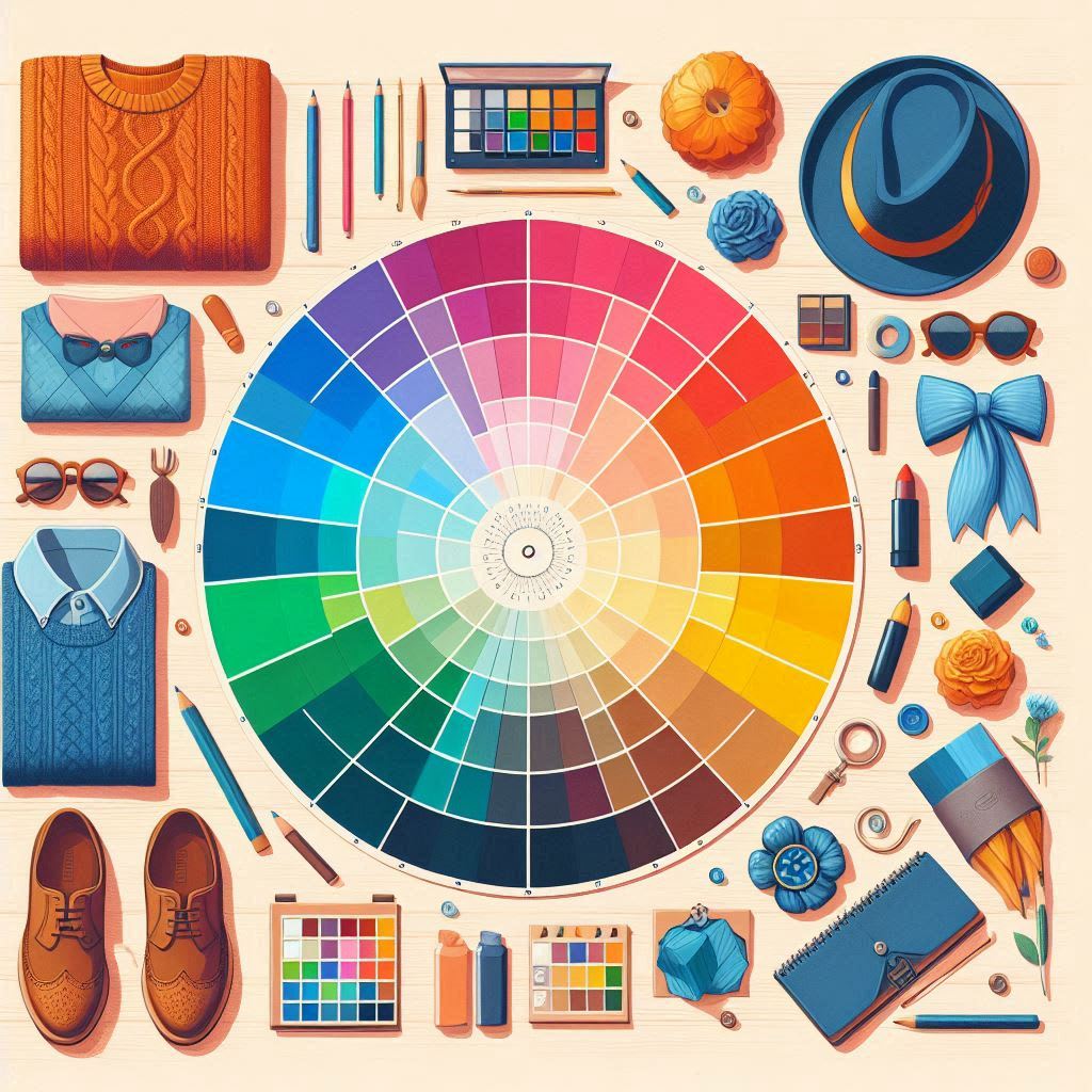
What is a Color Wheel?
Picture this: a circular rainbow that's not just pretty to look at but also incredibly useful. That's your color wheel in a nutshell. It's a visual tool that shows how different colors relate to each other. But don't worry, you don't need to carry one around in your pocket (unless you want to be that fashionista).
Primary, Secondary, and Tertiary Colors
Remember those art classes from school? Well, it's time for a quick refresher:
Primary Colors: These are the cool kids on the block – red, blue, and yellow. They're called primary because you can't create them by mixing other colors.
Secondary Colors: When primary colors hang out, they create secondary colors. Mix red and blue, and you get purple. Blue and yellow? Hello, green! Yellow and red? Orange you glad you know this now?
Tertiary Colors: These are the hipsters of the color world – a bit more complex but oh-so-interesting. They're created by mixing a primary color with its neighboring secondary color. Think red-orange or blue-green.
The Psychology of Colors in Fashion
Now that we've got the basics down, let's talk about how colors can mess with our minds (in a good way, of course).
How Colors Affect Mood and Perception
Colors aren't just pretty to look at; they can actually influence how we feel and how others perceive us. For instance:
Red: Passionate, energetic, and attention-grabbing. Wear this when you want to make a statement!
Blue: Calm, trustworthy, and professional. Perfect for that big meeting or when you need to chill out.
Yellow: Happy, optimistic, and creative. Slip on something yellow when you need a mood boost.
Green: Natural, balanced, and refreshing. Great for when you want to feel grounded.
Cultural Significance of Colors in Clothing
Here's where things get really interesting. Colors can mean different things in different parts of the world. For example, while white is often associated with purity and weddings in Western cultures, it's traditionally a color of mourning in some Eastern cultures. So, if you're a globe-trotter, it might be worth doing a quick color check before packing your suitcase!
Types of Color Schemes
Alright, fashion enthusiasts, it's time to level up your color game. Let's explore some killer color combos that'll make your outfit pop!
Monochromatic Color Scheme
Think of this as the "50 Shades of [Insert Color Here]" approach. It's all about using different shades, tints, and tones of the same color. For example, a light blue shirt with navy pants and a midnight blue jacket. Monochromatic looks are sleek, sophisticated, and super easy to pull off.
Analogous Color Scheme
Imagine colors that are next-door neighbors on the color wheel holding hands. That's an analogous color scheme. Think blue, blue-green, and green. This combo is harmonious and pleasing to the eye. It's like your outfit is giving a gentle nod to nature's color palette.
Complementary Color Scheme
Ready to make a statement? Complementary colors are opposite each other on the color wheel and create a bold, vibrant look when paired together. Think red and green, blue and orange, or purple and yellow. Just remember, with great power comes great responsibility – use these combos wisely!
Split-Complementary Color Scheme
This is the complementary color scheme's more laid-back cousin. Instead of using the direct opposite color, you use the two colors adjacent to it. For example, if you start with blue, you'd pair it with yellow-orange and red-orange. It's a great way to create contrast without screaming "Look at me!"
Triadic Color Scheme
If you're feeling adventurous, try a triadic color scheme. Choose three colors that are evenly spaced on the color wheel, like red, yellow, and blue. This combo is bold and balanced, perfect for those days when you want to channel your inner artist.
Applying Color Wheel Concepts to Your Wardrobe
Now that we've got the theory down, let's put it into practice. It's time to turn your closet into a masterpiece!
Creating a Versatile Base with Neutral Colors
Think of neutral colors as the blank canvas of your wardrobe. Black, white, gray, beige, and navy are your go-to neutrals. They play well with others and can be mixed and matched endlessly. Start by building a solid foundation of neutral pieces – they'll be your fashion BFFs.
Adding Pops of Color to Your Outfit
Once you've got your neutral base, it's time to have some fun! Use the color wheel to choose accent pieces that complement your neutral items. A vibrant scarf, a bold pair of shoes, or a statement bag can transform a simple outfit into a head-turner.
Mixing Patterns and Colors
Feeling brave? Try mixing patterns! The key is to keep the colors in the same family or use complementary colors. For example, pair a striped navy and white shirt with a floral skirt that has touches of navy. Just remember, when it comes to patterns, sometimes less is more.
Dressing for Your Skin Tone
Colors can be your best friend or your worst enemy, depending on how they interact with your skin tone. Let's figure out how to make them work for you!
Determining Your Skin Undertone
Your skin undertone is like the secret sauce of your complexion. It can be warm, cool, or neutral. Here's a quick test: Look at the veins on your wrist. If they appear green, you're warm-toned. Blue? You're cool-toned. Can't tell? You might be neutral.
Choosing Colors That Complement Your Complexion
Warm undertones: Earth tones are your jam. Think oranges, reds, yellows, and golden greens.
Cool undertones: Jewel tones will make you sparkle. Go for blues, purples, and emerald greens.
Neutral undertones: Lucky you! Most colors will look great on you. Experiment and have fun!
Seasonal Color Palettes
Just like nature changes its colors with the seasons, so can your wardrobe. Let's take a colorful journey through the year!
Spring: Fresh and Vibrant
When the flowers start blooming, it's time to break out the pastels and light, bright colors. Think soft pinks, baby blues, and mint greens. These colors reflect the freshness and new beginnings of spring.
Summer: Soft and Cool
As the temperature rises, cool down your palette with light, airy colors. Whites, light blues, and soft lavenders are perfect for those hot summer days. They reflect light and help keep you cool (in more ways than one).
Autumn: Warm and Rich
Fall is all about cozy, rich colors. Deep reds, burnt oranges, and mustard yellows mimic the changing leaves. These warm tones are perfect for layering and creating a snug autumn vibe.
Winter: Bold and Contrasting
Winter is the time to go bold or go home. Deep, rich colors like emerald green, royal blue, and burgundy stand out against the stark winter landscape. Don't be afraid to experiment with high-contrast looks during this season.
Common Color Coordination Mistakes to Avoid
Even fashion gurus make mistakes sometimes. Here are a few color faux pas to watch out for:
Overdoing it with too many bold colors
Ignoring your skin tone when choosing colors
Forgetting about the power of neutrals
Clashing patterns and colors
Not considering the occasion when choosing colors
Remember, fashion rules are meant to be broken, but it's good to know them first!
Advanced Color Coordination Techniques
Ready to take your color game to the next level? Let's explore some advanced techniques that'll have you styling like a pro in no time.
Color Blocking
Color blocking is like playing Tetris with your outfit. It involves pairing solid blocks of different colors together. The key is to choose colors that complement or contrast each other well. For example, pair a bright yellow top with cobalt blue pants for a bold, eye-catching look.
Ombre and Gradient Effects
Ombre, which means "shaded" in French, refers to the gradual blending of one color into another. This can be within a single piece of clothing or across your entire outfit. Try pairing a light blue top with medium blue pants and navy shoes for a cool, monochromatic ombre effect.
Building a Color-Coordinated Wardrobe
Now that you're a color coordination whiz, let's talk about how to build a wardrobe that puts all this knowledge to good use.
Essential Pieces for Every Color Palette
Start with a solid foundation of neutrals:
Black and white t-shirts
A great pair of jeans
A versatile blazer
Little black dress
Then, add pops of color based on your preferred color schemes:
A bold red sweater
A soft blue blouse
A vibrant green scarf
Accessories and Color Coordination
Accessories are like the cherry on top of your color-coordinated sundae. They can tie an outfit together or add that perfect pop of contrast. Don't be afraid to experiment with colorful jewelry, bags, or shoes to elevate your look.
Tools to Help You Choose Colors for Clothes Like a Pro
When it comes to mastering color coordination, sometimes you need a little extra help. Fortunately, there are several online tools that can guide you in selecting the perfect colors for your outfits. One such tool is Color Wheel for Clothes, which is specifically designed to help fashion enthusiasts create harmonious color schemes for their wardrobe. Let’s dive into how you can use this tool and others like it to step up your fashion game.
ImageToColor’s Color Wheel for Clothes: A Powerful Color Coordination Tool
ImageToColor offers a user-friendly Color Wheel for Clothes that helps you visualize how different colors work together. This tool is perfect for anyone who wants to effortlessly coordinate their outfits using professional color theory principles.
How to Use the ImageToColor Color Wheel for Clothes
Upload an Image: Start by uploading a photo of a piece of clothing or an accessory that you want to match. This could be anything from a shirt to a pair of shoes.
Extract the Dominant Colors: The tool will analyze your image and extract the primary colors. This helps you get a better understanding of the main colors in the piece.
Generate Color Schemes: Once the colors are identified, the tool will provide several color schemes based on popular color harmony rules such as complementary, analogous, or triadic combinations. You can use these schemes to find matching or contrasting colors for the rest of your outfit.
Experiment with Different Combinations: The tool also allows you to manually adjust the color combinations on the wheel, giving you full control over how you want to mix and match your clothes.
Conclusion
Congratulations! You've just completed a crash course in color coordination. Armed with your newfound knowledge of the color wheel, you're ready to take on your wardrobe with confidence. Remember, the most important rule in fashion is to wear what makes you feel amazing. So go ahead, experiment with colors, have fun, and let your personality shine through your clothes. After all, life's too short for boring outfits!
FAQs
Q: Can I wear black and brown together?
A: Absolutely! While this combo was once considered a fashion faux pas, it can look incredibly chic when done right. Try pairing a black top with brown leather pants for a sophisticated look.
Q: How can I make pastels work for fall and winter?
A: Pastels aren't just for spring! Try pairing them with deeper, richer colors for a fall or winter look. For example, a soft pink sweater can look great with deep burgundy pants.
Q: Is it okay to mix metals in jewelry?
A: Yes! Mixing metals like gold and silver can add depth and interest to your outfit. The key is to make it look intentional – try wearing a two-tone watch or layering necklaces of different metals.
Q: How can I use color to look taller or slimmer?
A: Wearing a monochromatic outfit (all one color) can create a long, lean line that makes you appear taller and slimmer. Dark colors also tend to have a slimming effect.
Q: Can I wear white after Labor Day?
A: Of course! This old fashion rule is outdated. Winter whites can be stunning, especially when paired with rich, deep colors or worn in luxurious fabrics like cashmere or wool.
About the Creator
Keep reading
More stories from Fatima Ali and writers in Art and other communities.
Top 5 Websites for Generating Perfectly Harmonized Color Palettes
Finding the perfect color combination can be tricky, whether you're a web designer, graphic artist, or just someone looking to add a bit of flair to a project. Fortunately, color palette generators have made it easier than ever to find harmonized colors that look great together. In this article, we'll cover the top 5 websites for generating perfectly balanced color palettes. Whether you're designing a website, creating a brand, or looking for inspiration, these tools will help you find the best color combinations effortlessly.
By Fatima Aliabout a year ago in Art
What Voice Cloning Technology Means for Creators and Digital Identity
The rise of artificial intelligence has reshaped the creative landscape in countless ways, from AI-generated visual art to automated music composition, and one of the most intriguing frontiers today is voice cloning. With tools that let users clone your voice using only a short sample of speech, creators and digital communicators are discovering new ways to produce audio content that feels natural and expressive.
By aliyashahzadi7 days ago in Art
“What If It Happens?”
Monday, 11 April 2022 Ishrat Jahan One of our friends, Mr. Farooq, is a middle-aged man, yet he has still not been able to free himself from his deeply suspicious and fearful nature. These days, I happened to have some free time, so I thought it would be a good idea to meet him and try to untangle the puzzle of his constant worries. By coincidence, he himself arrived at my humble home, jolting along in a rickshaw.
By Sudais Zakwanabout 22 hours ago in Art


Comments
There are no comments for this story
Be the first to respond and start the conversation.