
Master Graphic Design: Shape Psychology
How shapes play a role in triggering certain emotions in a human mind, and how businesses are using this in their website, apps and advertisements.


The shapes that you use for your designs can have a profound effect on the viewer from a psychological & a subconscious stand point.
In this article we’ll learn all about how the different shapes in Graphic Design have various psychological relevancy and how to utilize that relevancy to target an audience.
Today we’re diving into the stunning world of designing, something I have a fond passion for & at the very end I'm going to give a quick start tip on how to use psychology to target the right audience and end up with awesome & relevant Graphics.
Circle:
Firstly, let's take a look at circular shapes.
These tend to generate a positive response within the emotional centers of the brain when a viewer is looking at a design.
So, when people see a circular shape within a logo design they subconsciously related to –
- Love
- Friendship
- Community

The Olympics logo is a prime example of this as it's a unique coming together of different groups of people in one unity.
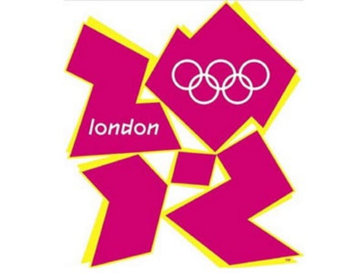
And now 😂 ...
I don't mean this logo design here, it's probably best not to talk about this one.
That isn't to say that every single layer that uses a circle is trying to evoke a sense of love or unity.
Circles also show perfection and also a quite attention seeking in nature.
Oval:
Moving into a slight variation of the circle we have the oval shape which suggests –
- Stability
- Endurance
- Sturdiness
Which is why a lot of car companies like Ford; Kia actually have their Legos enveloped with the shape of an oval.
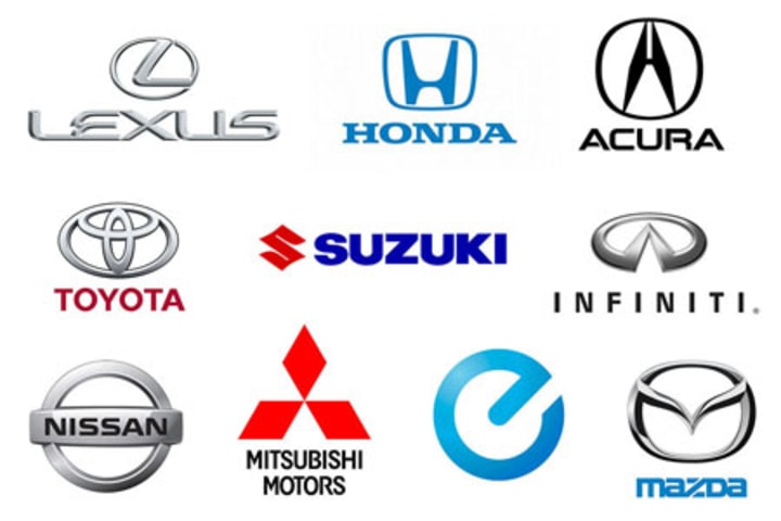
You’ll notice that numerous car companies utilize this shape and that’s one reason why because it is sturdy & stable.
There was a study back in 2015 that cited 50 top brands of the time & also the later designs of which 20% utilize a circle as the main focus of their logo design.
So, if you want to evoke a sense of togetherness unity love or maybe perfection you can experiment with circles.
Squares & Rectangles:
The use of squares & rectangles in logo design creates the new perception of:
- Power
- Strength
Take a look at the adidas logo.

You can see connotations of power and strength are so fitting and thinking of a sports brand because the consumer can buy into the notion that they're achieving such states within their performance and their bodies.

Lets take a website example:
And doing this by simply adhering to the brand as a consumer shape.
Straight Edge Lines:

Found in squares rectangles and triangles suggest –
- Stability
- Efficiency
- Professionalism
All appealing to the left part of the brain of an audience.
They create a remarkable balance of practicality and combined with colors like red or blue they can avert a perception of dynamic modernism.
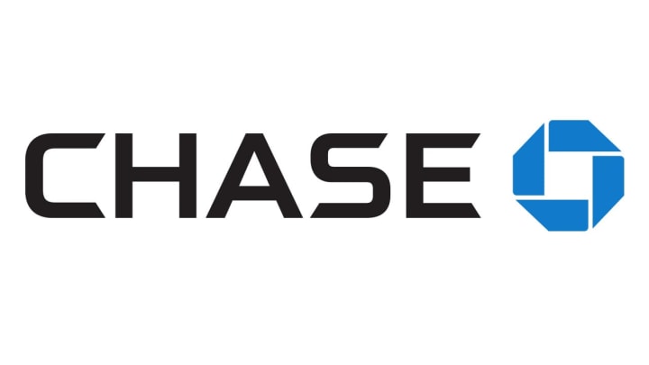
Now, financial logos such as banks and real estate agencies will utilize this to a huge extent. Just take a look at Barclays and Chase which really does define stability and practicality for the logo design.
Vertical Lines:
Vertical Lines impact the mind by creating a subconscious association with –
- Energy
- Strength
- Masculinity
SoundCloud logo uses vertical lines & yes, they do represent audio sound bars however match with the color orange which is a very energetic and positive.

Color psychologically speaking the overall feel of the design is very high energy orientated. If the lines were horizontal the logo would give off a unique emotional response to the audience.
Horizontal Lines:
Horizontal lines tend to create a sense of –
- Balance
- Calmness
- Tranquility
They project a natural sense of balance that can be used to influence audiences when used in logo design horizontal lines can help make your customers feel genuinely protected and settled.
And a great example of this is the IBM logo.

That massive Blue that connotes a very powerful sense of calmness & tranquility.
Angled Lines:
Angled Lines represent a feeling of Energy & Dynamic Movement.
So again, I drew your attention back to the adidas logo because the lines here are kind of on a slant which gives the unforgettable impression of motion and speed.
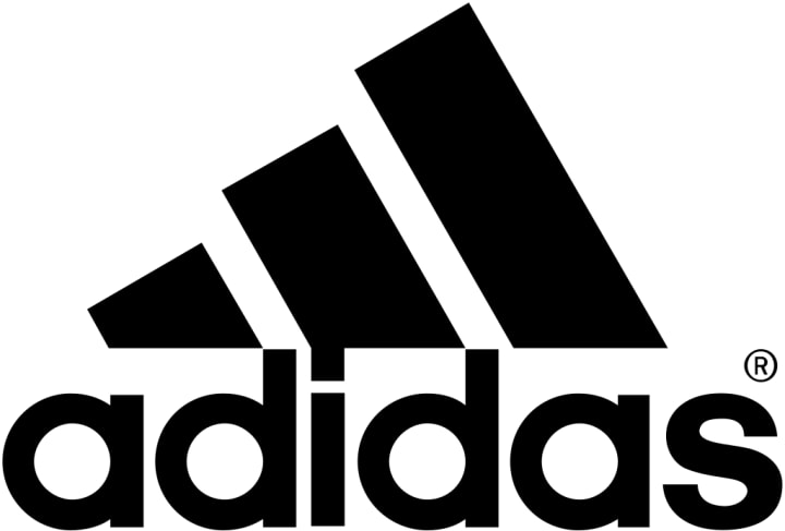
Something strongly linked to sports & athletics.

As you obviously see movement in various different forms.
So, as you can see these small psychological tricks are they're out in the open to be seen and they do resonate with most of the audiences if they realize it or not.
Curved Lines:
So lastly curved lines have a more feminine reaction suggesting –
- Happiness
- Generosity
- Sense of Rhythm
They're more free-flowing and they evoke pleasure. For example, 👇


And if used together with some angular lines they can represent Innovation such as the Nike logo & the swoosh.

So that's all well & good.
But how do I and how can you use this information in your very own later designs? 🤔
Now before designing a logo or anything for your clients, write down a list of words and feelings that a design should convey.
It’s because you need to know the client inside out as well as their audience. Once you have a list of feelings and words, associated with a brand message you would be able to look at how to match this up with not only any shapes but also the colors & the typeface.
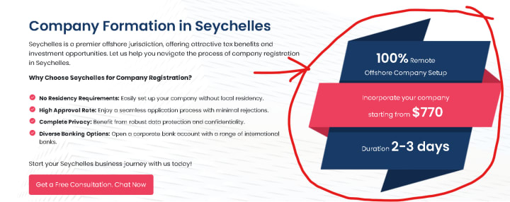
Lets do an interesting activity, I'm adding my BVI offshore company registration ... it is an old webpage. Go through it and tell me in the comments what are the emotions the brand is conveying. I will correct you if you are wrong, its going to be a constructive feedback and will enhance your learning.
Please remember: It’s a process & the design should be super relevant to the brand and the audience to super charge its effectiveness.
PS: I hope you better understand it and go ahead and make some stunning designs in your workflow.
Best Regards,
Nazir Mehrab
About the Creator
Nazir Mehrab
I'm a business consultant with 15+ years of experience working across the Middle East. So I'm helping business owners with their company formation and also imparting my wisdom garnered as an entrepreneur over the years.
Keep reading
More stories from Nazir Mehrab and writers in Art and other communities.
Beware of the Social Media Laws
If you are using someone's property, there are some rules to follow. This ensures the welfare of both the parties. But there are cases where we end up using it incorrectly without realizing it. The realization happens when you get the legal notice.
By Nazir Mehrababout a year ago in Geeks
Golden Journey
Once in a small town named Willow Creek, something extraordinary was about to happen. The sun was setting, casting long shadows and a golden glow across the landscape. Among the townspeople was a curious boy named Ethan. A dreamer with bright green eyes and messy brown hair, Ethan was often lost in his thoughts. He wanted to explore worlds beyond his own, driven by the tales of adventure his grandmother used to tell him.
By Hamad Afridi a day ago in Art


Comments
There are no comments for this story
Be the first to respond and start the conversation.