
Ken Wenrui Zhao: Deconstructing Design Through Collage, Collaboration, and Careful Consideration
Ken Wenrui Zhao, a graphic designer and video artist based in New York, originally hailing from China, approaches his craft with a deep understanding of the interplay between text and image.


Focusing on publication design, branding, and exhibition design, Ken Wenrui Zhao's work is characterized by its thoughtful exploration of how these elements can work together to create layered and meaningful experiences for the audience. His process often involves working with found images from magazines and books, which he meticulously photocopies, scans, and rearranges – a method that grants him the freedom to disrupt conventional hierarchies and uncover unexpected narratives.
Zhao's work transcends mere aesthetics, delving into the power of typography and imagery to complement or challenge each other, ultimately shaping the audience's perception. This careful consideration of the relationship between form and function is a hallmark of his design philosophy.
One pivotal moment that shaped Zhao's understanding of design was his experience watching Chris Marker's seminal film, Sans Soleil. The film's potent blend of personal storytelling, poetic visuals, and the intricate interplay of text and image served as a revelation, demonstrating the profound impact that such a combination can achieve. This influence is evident in Zhao's own work, whether he's designing a photo book or crafting a visual identity, suggesting a commitment to infusing projects with depth and emotional resonance.
Furthermore, Zhao draws inspiration from designers like Paul Elliman and Julie Peeters, whose unique approaches to photo books and materiality align with his own interest in recontextualizing found materials. For Zhao, design is a continuous exploration of the dynamic relationships between text, image, and meaning, leaving ample room for subtlety and individual interpretation.
We recently had the opportunity to delve into Zhao's diverse portfolio, exploring specific projects and gaining valuable insight into his creative process.
Foreign Object Debris: Echoing Tension Through Design
Zhao's collaboration with Berlin-based artist Yngve Holen on the art book, Foreign Object Debris, published in 2022 by DISTANZ Verlag, offers a compelling example of his design philosophy. As Zhao explains, his intention was to design a book that mirrored the inherent tension in Holen's work – the delicate balance between objecthood and transformation. Holen's sculptures often juxtaposed industrial precision with organic forms, and Zhao sought to capture that essence in the book's design.
"The book reflects that: a sterile, almost surgical layout that gives each image breathing room, punctuated with unexpected typographic gestures that create moments of friction," Zhao elaborates. The design intentionally avoids grand spectacle, opting instead for a "clinical stillness" that allows the artwork to speak for itself, highlighting the nuanced relationship between form and function. This restrained approach underscores Zhao's belief that design should serve to enhance, rather than overshadow, the artwork it presents.
KAP Company: Branding as Character Development
Zhao's work with KAP Company in Berlin showcased his ability to seamlessly blend design and storytelling. He collaborated on campaigns and visual identities that explored the themes of persona, image culture, and surface. One particularly notable project was "Gallery Girl," a fictional influencer brought to life through editorial visuals, social media content, and merchandise.
This project allowed Zhao to treat branding as character development, a testament to his innovative approach to design. "Working with KAP felt like making a publication in motion, constantly unfolding across platforms," he reflects, emphasizing the dynamic and multifaceted nature of the collaboration.
Exhibition Flyers: Clarity and Atmosphere
During his time as a graphic designer at the Yale University Art Gallery, Zhao honed his skills in flyer design for exhibitions. He emphasizes the importance of balancing clarity with the creation of a specific mood.
"A good flyer isn’t just information—it’s a handshake, a tone-setter," Zhao explains. His approach is to reflect the material or spatial feeling of the exhibition itself. This involves finding the right tension between legibility and atmosphere, whether it be through restraint, bold typography, or unexpected cropping. The goal is to create a visual representation that encapsulates the essence of the show and entices potential viewers.
Inspirations: The Tactile Experimentation of the Late 20th Century
When asked about the era that most inspires his aesthetic, Zhao points to the late 1980s to early 2000s, particularly in Europe and East Asia. He describes this period as a time of "quiet experimentation" where designers pushed the boundaries of analog production.
"There’s something about that pre-digital moment when designers were pushing the boundaries of analog production—layering transparencies, playing with distortion, trusting in slowness," Zhao observes. He finds this era deeply tactile, and its influence continues to inform his understanding of sequence, materiality, and rhythm.
Collage: Disrupting Hierarchy and Inviting Misreadings
Zhao's use of collage is a fundamental aspect of his graphic design work. He sees collage, the art of pasting together several visual ideas, as a powerful tool for disrupting hierarchy and creating multiple entry points for interpretation.
"Collage allows me to disrupt hierarchy. I often mix high and low imagery—technical drawings next to found photos, fragments of text from obscure manuals beside personal writing," he explains. For Zhao, collage is not just a style, but a method of thinking – a way to embrace contradiction and context within the same space.
The Classic Art Book: Documentation and Interpretation in Harmony
In Zhao's view, a classic art book strikes a delicate balance between documentation and interpretation. He cites examples such as Parkett and Wolfgang Tillmans's Truth Study Center, where the book transcends its role as a mere container and becomes an active participant in the artistic conversation.
"A classic art book respects the work while expanding it, letting the printed page become its own form of authorship," Zhao states.
The Evolution of Art Books: Fluidity and Intimacy
Over the past decade, Zhao has observed a significant evolution in the art book landscape. He notes a rise in hybrid forms, encompassing essays, interviews, QR codes, and pairings with installations or performances. Additionally, he highlights a trend towards intimacy, with smaller runs, self-publishing, and zines becoming increasingly prevalent.
"The art book is no longer just retrospective documentation—it’s often part of the artwork itself," Zhao concludes.
Photo Book Layouts: Resisting Uniformity
When it comes to photo book layouts, Zhao favors those that resist uniformity and embrace a shifting rhythm. He is drawn to layouts where images bleed across spreads, then retreat to tiny reproductions, creating a dynamic and engaging reading experience.
"That push and pull keeps the reader actively engaged. I often work with full-bleeds next to white space, letting the pacing mirror breathe and think," Zhao explains.
Overlaying Text on Photos: Respecting the Image
Zhao emphasizes the importance of respecting the image when overlaying text onto photos. He believes that text should feel like a layer of thought, not mere noise.
"Text should feel like a layer of thought—not noise. I look at contrast, proximity, and tone. Sometimes the best approach is minimal: a caption that feels whispered. Other times, bold typographic intervention can reframe the image. The key is intentionality," he maintains.
Collaboration: Listening and Building Together
Zhao approaches collaboration with artists by prioritizing active listening. He recognizes that each artist possesses a unique rhythm and vocabulary.
"I start by listening. Every artist has a different rhythm and vocabulary. I ask: what kind of distance do they want from the viewer? What references are in their head that haven’t made it into the work yet? From there, we build a structure together—one that doesn’t just reproduce their work, but offers a new frame for it," he explains.
The Next Chapter: There Is No Line in Lake Como
Looking ahead, Zhao is currently working on There Is No Line in Lake Como, a publication that emerged from an artist residency in Italy. This project combines essay, photography, and archival material, with Zhao contributing to both the design and editing.
"It’s a reflection on place, dislocation, and the politics of mapping—stitched together through fragmented narratives and layered images," Zhao shares, offering a glimpse into the themes and perspectives explored in his upcoming work.
Ken Wenrui Zhao's work demonstrates a deep commitment to thoughtful design, collaborative spirit, and a continuous exploration of the relationship between text, image, and meaning. His approach provides a valuable model for design professionals seeking to create impactful and meaningful experiences for their audiences. His dedication to understanding the artistic vision of others and his ability to translate that vision into compelling visual narratives solidify his position as a leading voice in the contemporary design landscape.
About the Creator
Lisa Rosenberg
I am a writer based in New York City writing about artists, creative leaders and entrepeneurs.
Keep reading
More stories from Lisa Rosenberg and writers in Art and other communities.
Brazilian Videographer Doug Lima On Redefining Storytelling In The Mobile Era
Doug Lima is a Brazilian-born videographer and content creator who has carved a niche for himself in the competitive Los Angeles market, producing high-quality visuals for a diverse range of clients, from global giants like Microsoft and Mattel to Latin Grammy Award-winning musician, Gee Rocha.
By Lisa Rosenberg11 months ago in Art
'Till Death We Do Art
There would be nothing divine in this world without art. Nature may surpass the divine to all intents and purposes, but like everything it absorbs and is absorbed by, it remains here, stuck on the surface of this world, ever-present, physically bound to the universe.
By Avocado Nunzella BSc (Psych) -- M.A.P 23 days ago in Art
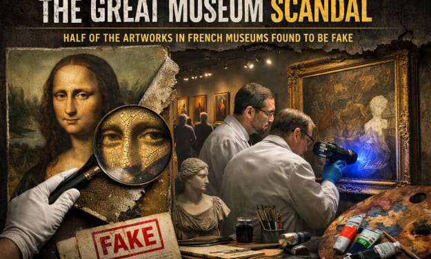
The Great Museum Scandal: Half of the Artworks in French Museums Found to Be Fake
France is home to some of the most famous museums in the world, attracting millions of visitors each year who come to admire priceless works of art and historical artifacts. However, a recent investigation has sent shockwaves through the art world after suggesting that a significant number of artworks displayed in certain French museums may actually be fake.
By Irshad Abbasi a day ago in Art


Comments