
Eurostile Font: A Timeless Modern Typeface
Eurostile Font


Eurostile is a geometric sans-serif typeface that has been a staple in design since its creation in the 1960s. Designed by Aldo Novarese and Alessandro Butti at the Nebiolo Type Foundry, Eurostile is celebrated for its clean, futuristic, and highly versatile aesthetic.
Over the decades, it has become synonymous with technological advancements and modernity, often featured in branding, sci-fi media, and architectural projects.
Historical Background
The Eurostile font was introduced in 1962 as a successor to the Microgramma typeface, which was also designed by Novarese and Butti. Unlike Microgramma, which only offered uppercase letters, Eurostile expanded its versatility by including lowercase characters, making it more adaptable to various design contexts.
This typeface quickly gained popularity due to its square shapes, rounded edges, and uniform stroke widths. Its design was inspired by the modernist movement, reflecting an era obsessed with progress, innovation, and sleek functionality.
Characteristics of Eurostile
Eurostile’s distinctive features set it apart from other sans-serif fonts:
Square Shapes with Rounded Corners: The font’s geometric design combines sharp angles with softened corners, creating a balance between precision and approachability.
Wide Letterforms: Eurostile has a horizontally extended structure, which gives it a bold and confident appearance.
Uniform Stroke Widths: The consistent thickness of strokes ensures a clean and harmonious look across all letters.
Futuristic Appeal: Its design embodies a forward-thinking aesthetic, making it a favorite for projects involving technology, science fiction, and innovation.
Applications of Eurostile
Eurostile’s versatility makes it a popular choice for a wide range of applications:
Technology and Sci-Fi Media: The font’s futuristic vibe has made it a staple in science fiction movies, television shows, and video games. It’s often used in titles, credits, and user interfaces to evoke a sense of advanced technology.
Corporate Branding: Many tech companies and organizations use Eurostile in their logos and branding materials to convey innovation and modernity.
Signage and Architecture: The font’s readability and sleek design make it ideal for building signage and architectural projects.
Automotive Industry: Eurostile’s bold and dynamic appearance aligns well with the branding needs of automobile manufacturers.
Variants and Adaptations
Over the years, Eurostile has seen several adaptations and variations to suit different design needs. Some notable variants include:
Eurostile Bold Extended: A wider and more pronounced version, often used for impactful headlines.
Eurostile Condensed: A narrower version suitable for compact spaces.
Eurostile Next: A modernized update by Linotype that retains the original essence while offering more contemporary refinements.
Why Choose Eurostile?
Designers often choose Eurostile for its:
Timeless Appeal: Despite being over six decades old, Eurostile remains relevant in modern design.
Versatility: Its adaptability to various media and industries makes it a go-to choice for many professionals.
Readability: The clear and legible design ensures effective communication, even from a distance.
Conclusion
Eurostile is more than just a typeface; it’s a symbol of modernity and innovation. Its geometric design, futuristic appeal, and wide-ranging versatility make it an enduring favorite among designers.
Whether you're working on a sci-fi project, corporate branding, or architectural signage, Eurostile offers a perfect balance of style and functionality.
FAQs about Eurostile Font
1. Who designed the Eurostile font?
Eurostile was designed by Aldo Novarese and Alessandro Butti at the Nebiolo Type Foundry in 1962.
2. What makes Eurostile different from Microgramma?
While Microgramma only features uppercase letters, Eurostile includes both uppercase and lowercase letters, making it more versatile.
3. What are the main characteristics of Eurostile?
Eurostile is known for its square shapes with rounded corners, wide letterforms, uniform stroke widths, and futuristic appeal.
4. In which industries is Eurostile commonly used?
Eurostile is widely used in technology, sci-fi media, corporate branding, signage, architecture, and the automotive industry.
5. Are there modern versions of Eurostile?
Yes, Eurostile Next is a modernized adaptation by Linotype, offering contemporary refinements while retaining the original essence.
6. Why is Eurostile popular in science fiction?
Eurostile’s futuristic and modern design aligns well with the themes of advanced technology and innovation commonly found in science fiction.
7. Is Eurostile a good choice for web design?
While Eurostile is primarily suited for print and branding, it can also work well in web design when used appropriately, especially for tech-oriented or futuristic themes.
About the Creator
Jillur Rahaman
Jillur Rahman is the creative mind behind FontOrbit. This website is a vibrant hub for typography enthusiasts. With a CSE degree and over a decade of experience in web design & development, Jillur got passion for sharing knowledge.
Keep reading
More stories from Jillur Rahaman and writers in Art and other communities.
Helvetica Font: A Timeless Typeface Revolution
Helvetica is more than just a font; it is a design phenomenon that has stood the test of time. Since its inception in 1957 by Swiss typeface designer Max Miedinger, Helvetica has revolutionized the world of typography with its clean, modern, and versatile design.
By Jillur Rahamanabout a year ago in Art
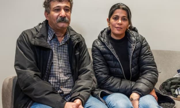
‘A Lot of Fear’: The Families Bearing the Brunt of Sweden’s Immigration Crackdown
Sweden, once widely regarded as one of Europe’s most welcoming destinations for refugees and migrants, is undergoing a profound shift in its immigration policy. In recent years, a tougher stance on asylum, residency, and deportations has taken hold, driven by political pressure, concerns over crime, and the rise of anti-immigration sentiment. While policymakers frame the changes as necessary to restore order and integration, families with migrant backgrounds say they are paying the highest price. For many, the new approach has created an atmosphere of fear, uncertainty, and emotional strain that reaches deep into everyday life.
By Salaar Jamalia day ago in Art


Comments
There are no comments for this story
Be the first to respond and start the conversation.