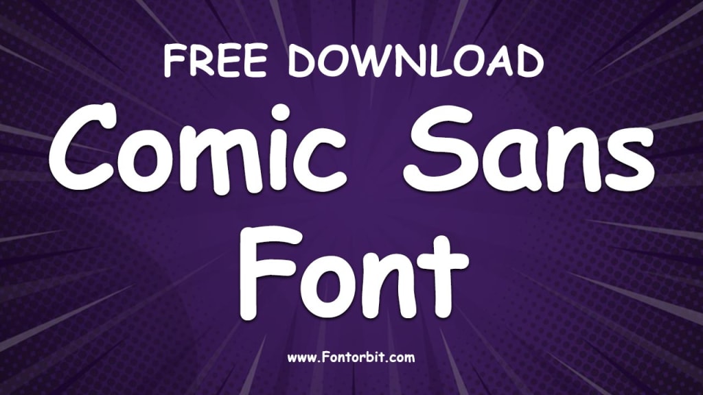
Comic Sans Font: The Tale of a Controversial Typeface
Comic Sans Font

Comic Sans is one of the most recognized and polarizing typefaces in the world. Designed in 1994 by Vincent Connare for Microsoft, this font was intended to mimic the handwritten style of comic book lettering.
Over the years, it has become a symbol of design debates and has elicited both admiration and disdain from users worldwide. Let’s delve into the origins, characteristics, applications, and controversies surrounding Comic Sans.
The Origins of Comic Sans
Comic Sans was born out of necessity. Vincent Connare, working at Microsoft, was tasked with creating a child-friendly font for software like Microsoft Bob.
The goal was to design a typeface that felt approachable and informal, unlike the stiff and formal Times New Roman. Connare drew inspiration from comic books like "The Dark Knight Returns" and "Watchmen," aiming to replicate the playful, hand-drawn style seen in speech bubbles.
Released with Microsoft’s Windows 95 operating system, Comic Sans quickly gained popularity due to its accessibility and casual vibe. It became a go-to choice for amateur designers and non-designers who wanted to add a fun and friendly touch to their projects.
Characteristics of Comic Sans
Comic Sans is characterized by its:
Round, informal strokes: Giving it a handwritten, casual appearance.
High legibility: Suitable for small text sizes and accessible for people with dyslexia.
Playful tone: Evoking friendliness and approachability.
These attributes make it ideal for informal communication, children’s materials, and accessibility-focused projects.
Applications of Comic Sans
Despite its reputation, Comic Sans has found its niche in certain contexts, including:
Educational Materials: Widely used in elementary schools and children’s books.
Healthcare: Preferred in some dyslexia-friendly resources due to its readability.
Personal Projects: Chosen for homemade greeting cards, posters, and slideshows.
The Controversy
While Comic Sans gained widespread use, it also became the subject of criticism, especially among professional designers. Critics argue that:
It is overused in inappropriate contexts, such as formal documents or corporate branding.
Its design lacks refinement compared to other typefaces.
The casual tone of Comic Sans often clashes with serious content.
These criticisms have sparked campaigns like "Ban Comic Sans," highlighting the need for thoughtful font selection in design.
Conclusion
Comic Sans is a typeface that elicits strong reactions. Love it or hate it, its enduring presence reflects its accessibility and versatility. While it may not be suitable for every project, Comic Sans has carved out a unique space in the world of typography. As with any design tool, the key lies in using it thoughtfully and appropriately.
FAQs
1. Who designed Comic Sans?
Comic Sans was designed by Vincent Connare in 1994 while working at Microsoft.
2. Why is Comic Sans considered controversial?
It is criticized for being overused and misused in contexts where a more professional font would be appropriate.
3. Is Comic Sans good for dyslexia?
Yes, some studies suggest that its irregular letter shapes make it easier for individuals with dyslexia to read.
4. What inspired the design of Comic Sans?
Vincent Connare was inspired by the lettering in comic books like "The Dark Knight Returns" and "Watchmen."
5. When should I use Comic Sans?
Comic Sans is best used in informal, child-friendly, or accessible designs, such as educational materials or personal projects.
6. Is there a "Ban Comic Sans" movement?
Yes, the "Ban Comic Sans" campaign advocates for more mindful use of fonts in professional and formal contexts.
7. What are alternatives to Comic Sans?
Alternatives include fonts like Arial Rounded MT, Helvetica, or casual script fonts that maintain a friendly but refined appearance.
About the Creator
Jillur Rahaman
Jillur Rahman is the creative mind behind FontOrbit. This website is a vibrant hub for typography enthusiasts. With a CSE degree and over a decade of experience in web design & development, Jillur got passion for sharing knowledge.


Comments
There are no comments for this story
Be the first to respond and start the conversation.