
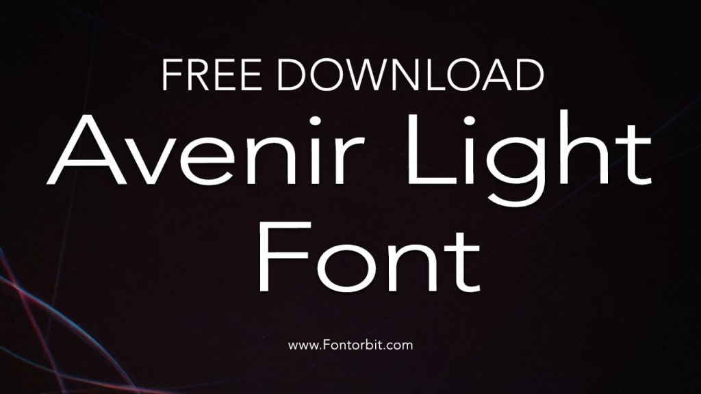
Avenir Light Font: A Blend of Elegance and Simplicity
Avenir Light

Typography plays a crucial role in design, influencing how a message is perceived and understood. Among the myriad of fonts available, Avenir Light has carved a niche for itself as a timeless and versatile typeface.
Its clean and modern aesthetic makes it a favorite among designers for both print and digital media. In this article, we explore the features, history, applications, and benefits of the Avenir Light font.
History of Avenir Light
Avenir, which means "future" in French, was designed by the renowned Swiss typographer Adrian Frutiger in 1988. Frutiger created this font as a modern take on geometric sans-serif typefaces, drawing inspiration from the Erbar and Futura type families.
The "Light" weight of Avenir exudes a refined and airy quality, perfect for designs that demand subtlety and sophistication. Over the years, Avenir has been expanded into a family of fonts, with Avenir Light standing out for its delicate charm.
Key Features of Avenir Light
Geometric Precision: Avenir Light maintains a perfect balance between geometric shapes and humanistic elements, making it both precise and approachable.
Readability: Despite its thin strokes, Avenir Light is highly legible, even at smaller sizes, thanks to its well-proportioned letterforms.
Versatility: This font works seamlessly across various design projects, from branding and advertising to web design and editorial layouts.
Minimalism: Avenir Light embodies minimalism, making it ideal for designs that prioritize clarity and simplicity.
Applications of Avenir Light
Branding: Many brands use Avenir Light for logos, taglines, and other identity elements due to its modern and professional appearance.
Web Design: Its clean lines and excellent legibility on screens make it a popular choice for website headings and body text.
Print Media: Avenir Light adds a touch of elegance to brochures, magazines, and books.
UI/UX Design: The font’s simplicity ensures a seamless user experience, especially in app interfaces and digital platforms.
Benefits of Using Avenir Light
Enhances Aesthetic Appeal: The font’s sleek design elevates the overall look of any project.
Improves Communication: Its clarity ensures that the message is effectively conveyed to the audience.
Timelessness: Avenir Light’s classic design ensures it never goes out of style, making it a reliable choice for long-term projects.
Conclusion
Avenir Light is more than just a typeface; it is a statement of modernity, simplicity, and elegance. Whether you are working on a corporate branding project, a website, or a publication, Avenir Light offers the perfect balance of form and function. Its versatility and timeless appeal make it a go-to choice for designers seeking to create visually compelling and readable designs.
Frequently Asked Questions (FAQs)
1. What is the origin of Avenir Light?
Avenir Light is part of the Avenir font family, designed by Adrian Frutiger in 1988. The name "Avenir" means "future" in French, reflecting its modern and forward-thinking design.
2. Is Avenir Light free to use?
Avenir Light is a commercial font, meaning you need to purchase a license to use it legally. Some platforms, like Adobe Fonts, include it as part of their subscription plans.
3. What are the best uses for Avenir Light?
Avenir Light is ideal for branding, web design, print materials, and UI/UX design due to its clean and minimalist appearance.
4. How does Avenir Light differ from other weights of Avenir?
Avenir Light is thinner and more delicate compared to other weights, making it suitable for subtle and refined design elements.
5. Can Avenir Light be paired with other fonts?
Yes, Avenir Light pairs well with serif fonts like Times New Roman and bold sans-serifs like Helvetica for a balanced and dynamic typography scheme.
6. Is Avenir Light suitable for body text?
While Avenir Light is legible, it is best used for headings or short paragraphs. For extended body text, a slightly heavier weight like Avenir Book may be more appropriate.
7. What makes Avenir Light a timeless font?
Its geometric precision, modern aesthetic, and minimalism ensure that Avenir Light remains relevant and stylish across different eras and design trends.
About the Creator
Jillur Rahaman
Jillur Rahman is the creative mind behind FontOrbit. This website is a vibrant hub for typography enthusiasts. With a CSE degree and over a decade of experience in web design & development, Jillur got passion for sharing knowledge.
Keep reading
More stories from Jillur Rahaman and writers in Art and other communities.
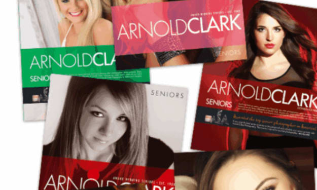
Arnold Clark Photography… The Pinnacle in High School Senior Portraits
Arnold Clark Photography sits on 24th Street in Omaha Nebraska, its front windows glowing softly long after most shops have gone dark. From the outside, it looks timeless with clean lines and framed portraits that hint at decades of stories. Inside, it is anything but stuck in the past.
By ArnoldClark Photography6 days ago in Art
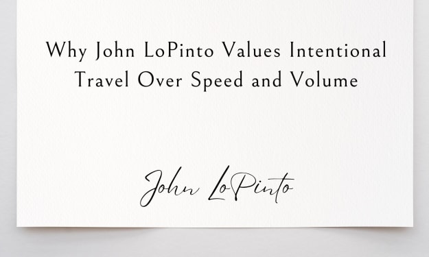
Why John LoPinto Values Intentional Travel Over Speed and Volume
In a world that celebrates movement and accumulation, travel has increasingly become about speed and volume. More destinations, tighter itineraries, and constant motion are often seen as markers of experience. John LoPinto takes a different approach. He values intentional travel over rapid consumption, believing that depth of experience matters far more than distance covered. For him, travel is most meaningful when it creates understanding, not just memories.
By John LoPinto5 days ago in Art
Affection and Healing for Yourself
During the night of the last quarter moon, I gathered my ritual supplies. I carefully handled the chunk of black tourmaline that would protect me from your overall negative and narcissistic energy. I carefully walked the house with my stick of selenite in hand, asking the universe to cleanse our working space.
By Alisha Wilkins ✒️🦋🖋️7 days ago in Fiction


Comments
There are no comments for this story
Be the first to respond and start the conversation.