
Analyzing Popular Rebrands: Why Did They Work?
Exploring Strategies and Elements That Made Effective Rebrands


Hello, fellow designers! Have you ever wondered why some rebrands stand out and become instantly iconic while others fade into the background? Rebranding is more than just changing a logo; it’s about redefining a company’s identity and connecting with its audience on a deeper level.
Today, we’re diving into five recent rebranding cases from 2020 to 2024 that have made a significant impact. Let’s explore why these rebrands worked and how they reflect their respective brands’ stories.
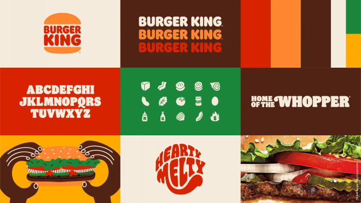
Burger King’s Retro Revival
In 2021, Burger King unveiled a new logo that harkens back to its 1969 design. This move away from the 1999 logo was part of a broader strategy to emphasize the brand’s commitment to quality and taste.
Why It Worked
Burger King’s rebrand worked because it tapped into nostalgia while modernizing the overall look. The simplified, flat design is more versatile and works better in digital formats, which is crucial in today’s online-driven world. The rebrand also coincided with Burger King’s push for cleaner ingredients and sustainability, aligning the visual identity with the company’s values.
Reflecting the Brand
The retro-inspired logo evokes memories of classic, delicious fast food, appealing to long-time fans while attracting new customers who appreciate a vintage aesthetic. The bold, confident design conveys trust and quality, reinforcing Burger King’s position as a leader in the fast-food industry.
Positive Effects
The rebrand received positive feedback on social media, with many praising the nostalgic yet fresh look. It also boosted sales as the company’s commitment to better ingredients resonated with health-conscious consumers.
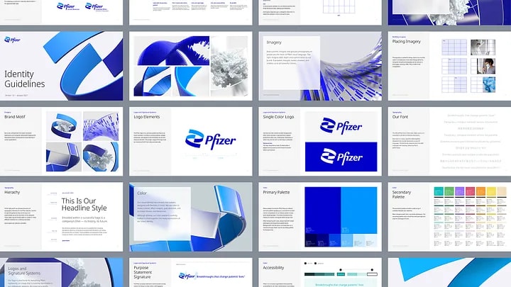
Pfizer’s Scientific Shift
In 2021, Pfizer introduced a new logo as part of a rebrand that emphasizes its focus on scientific innovation. The new logo features a double helix design, replacing the old oval shape that had been in use for over 70 years.
Why It Worked
Pfizer’s rebrand worked because it communicated the company’s commitment to advancing science and developing innovative healthcare solutions. The double helix design is instantly recognizable as a symbol of DNA, underscoring Pfizer’s role in cutting-edge medical research.
Reflecting the Brand
The new logo reflects Pfizer’s mission to improve health through scientific discovery. The sleek, modern design conveys innovation and progress, aligning with the company’s forward-thinking approach. The blue color scheme remains, maintaining continuity with the brand’s history while signaling a new era of growth.
Positive Effects
The rebrand coincided with Pfizer’s pivotal role in developing COVID-19 vaccines, enhancing its reputation as a leader in the pharmaceutical industry. The new logo and brand identity helped reinforce public trust and confidence in Pfizer’s products.
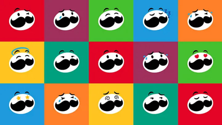
Pringles’ Clean and Simple Update
In 2020, Pringles introduced a new logo as part of its first rebrand in 20 years. The updated design features a simplified version of the iconic Mr. P character, with cleaner lines and a bolder look.
Why It Worked
Pringles’ rebrand worked because it modernized the brand without losing its recognizable elements. The simplified design is more adaptable to digital formats and maintains the playful, fun spirit that Pringles is known for. The cleaner look also makes the packaging more appealing and easier to recognize on store shelves.
Reflecting the Brand
The new logo reflects Pringles’ playful and fun nature. The updated Mr. P character retains his familiar mustache and bow tie, ensuring continuity while presenting a fresher image. The bolder design emphasizes the brand’s vibrant personality and its commitment to providing enjoyable snacking experiences.
Positive Effects
The rebrand was well-received on social media, with fans appreciating the modern yet familiar look. The updated packaging helped boost sales, as the cleaner design made the product more attractive to consumers.
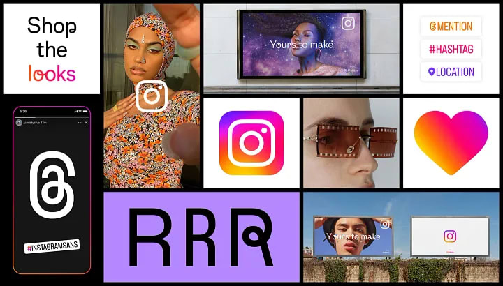
Instagram’s Fresh Gradient
In 2022, Instagram updated its logo and overall visual identity. The new logo retains the iconic camera shape but introduces a more vibrant gradient and a cleaner, more streamlined design.
Why It Worked
Instagram’s rebrand worked because it refreshed the brand without alienating its massive user base. The vibrant gradient reflects the platform’s dynamic and diverse community, while the simplified design ensures versatility across various applications.
Reflecting the Brand
The new logo reflects Instagram’s commitment to creativity and self-expression. The vibrant colors represent the diverse content and experiences shared on the platform. The cleaner design aligns with the platform’s user-friendly interface, enhancing the overall user experience.
Positive Effects
The rebrand received positive feedback from users, who appreciated the fresh and modern look. The updated visual identity helped reinforce Instagram’s position as a leading social media platform, attracting new users and retaining existing ones.
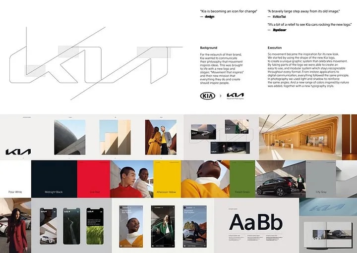
Kia’s Futuristic Transformation
In 2021, Kia unveiled a new logo as part of a comprehensive rebrand. The new design features a sleek, interconnected letterform that represents the brand’s commitment to innovation and future mobility.
Why It Worked
Kia’s rebrand worked because it signaled a clear shift towards a more innovative and forward-thinking brand. The futuristic design aligns with Kia’s focus on electric vehicles and advanced technology, setting the stage for the brand’s future growth.
Reflecting the Brand
The new logo reflects Kia’s mission to become a leader in the future of mobility. The interconnected letterform symbolizes connection and movement, key aspects of the brand’s vision. The sleek design conveys sophistication and progress, appealing to modern consumers.
Positive Effects
The rebrand received positive feedback from industry experts and consumers alike. It helped boost Kia’s brand perception and align it with its new product offerings, such as electric and autonomous vehicles. The new logo and brand identity have contributed to increased sales and a stronger market presence.
Wrapping Things Up!
Rebranding is a powerful tool for companies looking to redefine their identity and connect with their audience. The five rebranding cases we’ve explored — Burger King, Pfizer, Pringles, Instagram, and Kia — demonstrate how a well-executed rebrand can enhance brand perception, boost sales, and strengthen market presence. Each rebrand reflects the company’s mission and values, telling a compelling story that resonates with consumers.
Utilizing different tools and techniques during the rebranding process is crucial. It’s important to consider how the new visual identity reflects the brand’s story and connects with its target audience. Don’t be afraid to innovate and take bold steps, but always stay true to the brand’s core values.
If you found this analysis helpful, be sure to follow me for more insights and tips on design and branding. Let’s continue to learn and grow together in this ever-evolving field. Feel free to reach out with any questions or share your own experiences.
Happy designing!
About the Creator
Gading Widyatamaka
Jakarta-based graphic designer with over 5 years of freelance work on Upwork and Fiverr. Managing 100s logo design, branding, and web-dev projects.
Keep reading
More stories from Gading Widyatamaka and writers in Art and other communities.
'Till Death We Do Art
There would be nothing divine in this world without art. Nature may surpass the divine to all intents and purposes, but like everything it absorbs and is absorbed by, it remains here, stuck on the surface of this world, ever-present, physically bound to the universe.
By Avocado Nunzella BSc (Psych) -- M.A.P 19 days ago in Art
Wander the World
In a not-so-distant future, the world had changed in many ways. Cities floated in the sky, and robots helped people with their daily tasks. Among these wonders lived a curious girl named Elara. She was sixteen years old and always dreamed of exploring the world beyond her floating city called Skyhaven. Elara had long, wavy hair, bright green eyes, and a heart full of adventure. She spent her days in her small room, gazing at the stars through her window, imagining the places she would go.
By Hamad Afridi 2 days ago in Art


Comments (1)
Rebrands are coo!