
On choosing a cover page
Designing is easier than choosing

It starts getting hot in November. The Australian summer technically goes from December - February but really, everyone knows November is a summer month down here.
Empty beaches start filling up, air-conditioning units start clocking in for their yearly overtime shifts, jeans start disappearing in favour of shorts, Christmas beetles start crawling along verandas in the evening, Christmas songs start caterwauling through the shopping centre aisles.
And I try to decide what cover to use for my next book.
This will be the fourth collection of writing I have published in the past four years. Each time summer rolls around in November, I will have typed up all the various poems and / or short stories from my little notepads, scribbled full throughout the year. I will have collated and edited them, along with any that were already shared elsewhere (such as Vocal or even just posted on Facebook for friends and family) and I will have chosen the ones to make the final cut. Before I can publish the collection on Amazon, however, there is always the final step: the cover.
I tend to use my own photos for cover images, and I enjoy the design process. Trying to answer which photo goes best with that year's writing - working out if there is perhaps any overarching theme that I should match with an image, or whether I should simply choose a striking photo that will grab attention.
What I don't particularly enjoy, however, is choosing which design to ultimately use. I am terrible at it. (I'm also terrible at choosing titles, but that is another matter).
This year, I thought perhaps the Vocal community might help.
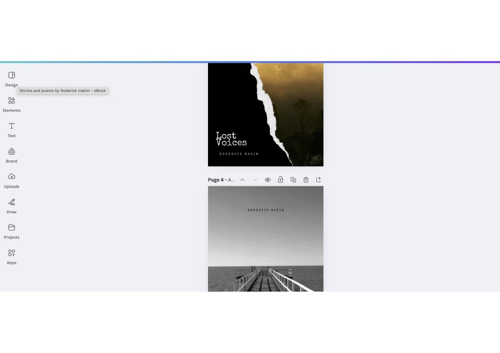
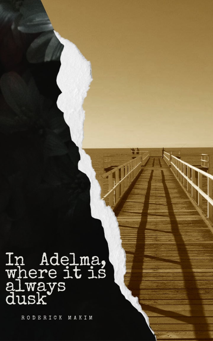
I have narrowed it down to the final two designs, and if anyone has any opinion on which I should use, feel more than free to let me know in the comments. They will be attached below for your perusal. In the interests of full disclosure, I can't promise to abide by majority rules - at the last minute my gut might tell me one or the other, or I might even wake up one morning, rush to the laptop and create an all new design that simply insisted upon itself. Still though, any help anyone wants to give will certainly be considered carefully.
Cheers,
Roderick.

About the Creator
Roderick Makim
Read one too many adventure stories as a child and decided I'd make that my life.
I grew up on a cattle station in the Australian Outback and decided to spend the rest of my life seeing the rest of the world.
For more: www.roderickmakim.com
Keep reading
More stories from Roderick Makim and writers in Writers and other communities.
NEW BOOK NEW BOOK NEW BOOK
Honestly I'm not really sure if this is the appropriate space for this or not, but anyway...for those of you who have enjoyed some of my poems this year, I just published a new book. It is a collection of about 75 or 80 of my favourite poems I wrote during my travels this year around Australia and Asia, including a few that showed up here on Vocal. (I lost count because I kept going back and forth about which ones made the cut or not).
By Roderick Makim2 years ago in Writers
My Favorite Essay
I return to this essay each spring, scattering my ink under Eliot’s. I remember Dr. Evans’s shock at my love for Eliot. It seemed incongruent with my love of Mark Twain and Steinbeck and all of those early loves who stole my heart with strong voices. Eliot employs voice differently than fiction writers, and for me, the voice of “Tradition and the Individual Talent” feels like the canon itself is speaking, directly to me, as if I am the recipient of a love letter from literature itself. When Wally (Dr. Evans) referred to Eliot (and Emerson and Hume) as stuffy old bastards, it was my turn to react with shock. I’m sure I looked at him like he had three heads or a tuba growing out of one ear. I feel an intimacy when I read Eliot. “Journey of the Magi” brought me to tears the first time I read it.
By Harper Lewisabout 4 hours ago in Writers


Comments (1)
Hi Roderick! I like both covers, but I subjectively find the second one to be more eye-catching. I think mostly because of the larger white-on-black print.