
How to Do Deep Dive Stock Analysis
The 2008 crash, volatility, and correlation analysis

The 2008 Crash, Volatility, and Correlation Analysis
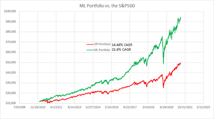
In a previous article, I made stock selections using fundamental analysis (“Warren Buffett style”) and combined it with some machine learning. I back-tested the model through the previous 10 years and it performed well (21.6% growth). After reading the article, a good friend asked some great questions. This article will take a look at some of those questions in detail.
Company Ticker List (ANSS, CME, IEX, ISRG, MA, MCD, MCO, MNST, PSA, SBUX).
What would happen to this portfolio during the 2008 financial crisis?
To have enough data to build a good ML model, I couldn’t go back any further than 2011. Most of the companies that I picked don’t have fundamental data going back past 2009. Despite that, I want to back test how these companies would have done through the 2008 financial crisis. The idea is that we can assume these companies had similar financial results in the years leading up to the financial crisis. I worry that since the ML model used information from 2009–2010 forward, those years are “cheating” a little bit. I am thinking this will be offset by the fact that I have no data from 2007 to 2009, which will be critical years in the simulation (stock market crash).
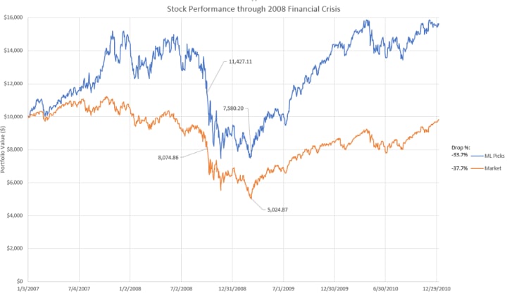
Both the ML portfolio and S&P 500 see a sizeable drop during the crisis. From the start of the drop (beginning of October 2008) to the low point (March of 2009) both do quite poor. The ML picks do slightly better, only dropping 33.7% compared to 37.7% of the S&P 500. The ML model also recovers more rapidly coming out of the low point. Overall, not good, but no worse than the rest of the market.
How much volatility does the approach see relative to the market?
This is another great question. In order to get the extra gains, do we need to take on more volatility (risk)? I include the below comparison showing the performance results of the portfolio vs. the S&P 500 as a reminder of the “carrot” for using this methodology.
In order to look at the volatility, I computed the % change in the closing stock price each day. I plotted the S&P 500 over top of the ML Portfolio so that we could visualize the comparison of volatility.

In general, you can see that the ML portfolio has slightly higher bands for the highs and lows. To quantify this, I calculated the standard deviation. This calculation matches the intuitive analysis of the plot, with the ML portfolio having a slightly higher standard deviation (1.51%) compared to the S&P 500 (1.28%). Given I only picked 10 stocks, I was expecting this volatility differential to be much greater. All in all, the improved returns seem like a good trade-off, for the small bump in volatility.
You picked companies from different sectors, but how diversified is this approach?
This is a slightly different, but similar question to the previous one. In general, a well diversified portfolio will have lower volatility because of lower correlations between the stocks within the portfolio. So, it’s a slightly different way to look at volatility. To recap, I picked stocks from the following sectors: Consumer Discretionary, Consumer Staples, Financials, Industrials, Technology, and Real Estate. I didn’t dip my toe into the Communications Services, Energy, or Health Care sectors because I could find a company within these sectors that I liked. Personally, I am happy with this approach as it feels like a good middle ground between being over diversified (minimizing long term returns) and putting everything down on one stock.
Diversification is protection against ignorance. It makes little sense if you know what you are doing. — Warren Buffett
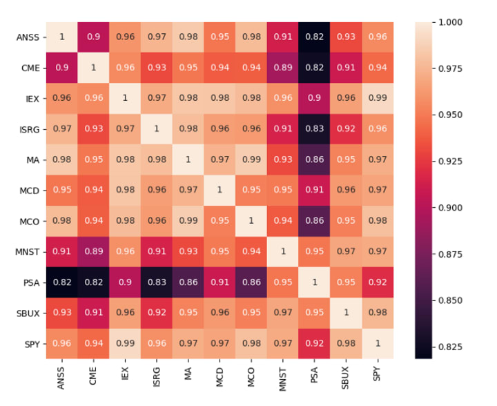
The first thing that jumped out at me was that PSA obviously has the lowest correlation of all the stocks within the portfolio. Its “low” score relative to ANSS is setting the bottom of the color scale. It also has the lowest correlation value relative to the S&P 500 itself. Looking at the values in isolation they all seem quite high.
To get come more context, I wanted to do this same comparison with the other 490 stocks in the S&P. Because of the number of companies involved, I opted for a histogram plot rather than a heat map. Instead of looking at the correlation between the individual companies, I compared only to the S&P 500 overall. The distribution is skewed so far to the right (>300 of the 500 companies have a correlation above 0.9), so it is not surprising that the 10 companies I selected fell into this range.

Conclusion
In this article, I walked through several important questions for my investing methodology. First, the approach did slightly better than the market during the 2008 financial crisis. It also had ever so slightly higher volatility, which is totally worth it given the increase in returns. While stocks were chosen from different sectors, not all sectors were used. The correlation values seem high between the individual stocks, but actually fall with the expected range of other stocks in the S&P 500. If this approach is interesting to you, you may be interested in another article that creates a dashboard for screening stocks using fundamental analysis:
Note that this article does not provide personal investment advice and I am not a qualified licensed investment advisor. All information found here is for entertainment or educational purposes only and should not be construed as personal investment advice.
About the Creator
Keep reading
More stories from Carl Westerby and writers in Trader and other communities.
Beat the S&P 500 with Machine Learning
The S&P 500 acts as a great benchmark for investment gains. Lots of investors try to beat it and fail miserably. The idea that I want to walk through in this article is: could you beat the S&P 500 by only picking the best stocks within it? No offense to companies like GE and GM, but if you dropped them from the S&P 500, the index’s overall performance would improve.
By Carl Westerby4 years ago in Trader
Australia Switchgear Market: Power Reliability, Grid Expansion & Industrial Demand
Australia Switchgear Market The Australia switchgear market is experiencing robust growth as the nation expands its power infrastructure, modernises electricity networks and integrates renewable energy sources. Switchgear — electrical equipment used to control, protect and isolate electrical circuits — plays a critical role in ensuring reliable power distribution across residential, commercial, industrial and utility sectors. According to IMARC Group, The Australia switchgear market size reached USD 1.5 Billion in 2025. Looking forward, the market is expected to reach USD 2.4 Billion by 2034, exhibiting a growth rate (CAGR) of 5.29% during 2026-2034.
By Amyra Singh3 days ago in Trader


Comments
There are no comments for this story
Be the first to respond and start the conversation.