
The Best MLB City Connect Jerseys
Did your favorite make the list?


In 2021, Major League Baseball released their City Connect series. A jersey's design of a team represents their respective cities cultures. Some people like them, while others loathe it. Whether it's the colors, designs, or whatever it may be, a jersey's aesthetics are meant to stand out. The Texas Rangers have since discontinued their City Connect jerseys last season, but a new design is expected to be released for the 2026 MLB regular season. The following entries are my favorite City Connect jerseys in no particular order. If you didn't see your favorite on this list, comment down below. I'll only be focusing on the jerseys themselves, not the ball caps. A list for that will be featured in a future story. For the City Connect jerseys, I'll be critiquing them based on color scheme, font, and overall appearance.
Cincinnati Reds

Red and black compliments the jersey exceptionally well. The text that reads CINCY is attention-grabbing. The red and white outline for each letter is spot on. As for overall appearance, definitely a 10/10! If you're a Reds fan, the jersey would go well with a pair of black Chucks and red shoelaces, or any brand of sneakers in those colors.
Toronto Blue Jays

The reigning American League Champions had a spectacular 2025, reaching the World Series. Despite being unable to clinch a championship, they're determined to return to the 2026 Postseason. Getting back to the jersey: red and blue really stands out. The design behind the font displays the Toronto skyline. Speaking of the font, it represents nightlife in Toronto. As for the jersey's overall appearance, I also gave it a 10/10. I hope that the organization keeps this forever, because no other City Connect jersey design would ever top this.
Miami Marlins

The next entry on this list has one of my favorite color combinations: pink and turquoise. We can make jokes about the Marins all day, but that's not the whole point of why I chose them for this story. Let's start with the color scheme. The jersey and the detail of it gives me Miami Vice vibes. As someone who loves the 80s and was born in that decade, I love this a lot. The font that reads MIAMI with the turquoise lettering and pink outline suits the jersey well. Might as well give the same rating as the first two entries.
Texas Rangers

The Rangers introduced their City Connect uniforms in 2023, which happened to be the same year they won their first World Series title. Fast forward to now, they've since discontinued it. However, a new design will be released for the 2026 season. The concept behind the jersey wasn't afraid to stay true to themselves. Here we have a cream-colored jersey with two interesting emblems. I'll get to the font in a bit. On the right sleeve of Adolis García's arm is the Peagle. It's the combination of a Panther (Fort Worth Panthers/Cats) and an Eagle (Dallas Eagles). The "TX" logo on the right side of his jersey is very creative. It's a gothic-like font from the Dallas Eagles, while the spur adds a great touch to it, which is derived from the Dallas-Fort Worth Spurs. I'm not too crazy about the font for the numbers, which is the only negative. The color for the numbers is fine, but a better font for them would've made the jersey stand out a little bit better. Overall appearance for this jersey: 9.5/10.
St. Louis Cardinals

The color red is expected to stand out for a Cardinals jersey. The text reads The Lou, paying homage to the city. Rapper Nelly is from St. Louis, but the text is sophisticated. The two cardinals perched on each side of the baseball bat stays true to themselves. While the font for the jersey number isn't bad, I wish it were the same font as the text. Overall appearance: 9/10.
Arizona Diamondbacks

The Diamondbacks. D-Backs. The Answerbacks. Whatever you want to call them. We're going to go over their City Connect jersey. The sand-colored jersey is perfect. It's a fantastic fit and represents the state of Arizona well. The black, creative text that reads Serpientes is eye-opening. Serpientes, in case you didn't know, means snakes in Spanish. Meanwhile, a diamondback is a pit viper. The color and font for the jersey number fits well. Overall appearance for this jersey: 9.5/10. The text reading Serpientes is what led me to award the jersey an extra half point.
Tampa Bay Rays

Paying tribute to skateboarding culture, the Rays are featured last on this list because neon colors are the best in my opinion. The jersey is dark grey, which I love. The text that reads Tampa Bay is outstanding. The colors also coordinate well with it. I used Randy Arozarena as an example for this entry, because on the back of his jersey, the text and color for his last name is amazing. It's light green and the font for his jersey number is stunning. Oh, and the ray on Arozarena's left sleeve is neon green. The jersey itself looks like it can glow in the dark. Overall appearance for this jersey: 10/10.
About the Creator
Mark Wesley Pritchard
You can call me Wesley. Former cosplayer, retro gaming fanatic, die-hard Texas Rangers fan, and nostalgic freak. Need I say more?
Threads: @misterwesleysworld
Instagram: @misterwesleysworld
Keep reading
More stories from Mark Wesley Pritchard and writers in Styled and other communities.
Spooky Sixteen: My Halloween Costume Ideas
Greetings, Vocal readers! One of the holidays that I always look forward to is Halloween. This will be my 16th consecutive year celebrating the spookiest day of the year. I officially celebrated Halloween back in 2010 as an adult, where I dressed up as Superman (which was a last-minute option) and won first place in a costume contest at a Halloween party on campus. I was 22 at the time and was attending college. Why is that? My now estranged parents didn't "believe" in it, whatever that meant. I now realized that they didn't let me, or my siblings celebrate Halloween due to their religious beliefs, despite me being eager to dress up and go trick-or-treating with the other kids. Since then, I've won three more costume contests, including last year at work, where I dressed up as legendary baseball player Reggie Jackson, with a World Series trophy made by my now former cosplay craftsman, which I had with me. Halloween has no age limit and it's the one night of the year where you can be anyone you want. Just because you're an adult, it doesn't mean that you have to give up the things you like in order to appease anyone. I retired from cosplay in October 2024 after 10 awesome years and yes, I'll still dress up for Halloween every year.
By Mark Wesley Pritchard 6 months ago in Styled
How to Style a Pakistani Kurta Set for Casual Family Gatherings
There’s something comforting about getting ready for a family gathering—the kind of day where you know you’ll be sitting on the floor with cousins, helping in the kitchen, moving around the house, and still wanting to feel presentable. A Pakistani Kurta Set fits beautifully into these moments. It doesn’t try too hard, yet it holds a quiet grace that feels right for home, comfort, and togetherness.
By Pakistani fashion2 days ago in Styled
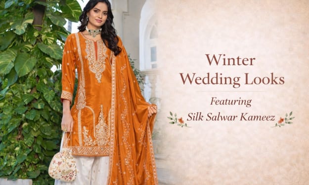
Winter Wedding Looks Featuring Silk Salwar Kameez
Winter weddings have a charm of their own. The crisp air, evening celebrations, glowing lights, and rich décor create the perfect setting for luxurious fabrics. And when it comes to choosing the right outfit for the season, nothing feels more appropriate than a silk salwar kameez.
By Amit Mandal2 days ago in Styled


Comments
There are no comments for this story
Be the first to respond and start the conversation.