
Architecture, Real Estate, and Landscape Photo Editing Tips and Tricks
Techniques from one of the Pacific Northwest's most renowned real estate photographers

When I was about halfway through high school, I found myself in need of a job above and beyond the carwashing and lawn mowing I'd been offering for years. As it so happened, I found a gig that paid ok, could be done from home, and worked to some of my strengths - I became a photo editor for a photographer specializing in real estate and architecture. Back when I was spending hours a week straightening horizons, editing lens dust out of the sky, and trying to hide personal belongings that had snuck into the carefully staged shots, I wish I'd had an article like this one to help me out. Whether you're just handling the editing, are trying to kickstart your own photography business, or even just want to take pictures of funky buildings for fun, I've teamed up with that very same photographer, the talented Sheila Say, to bring you the insights and hacks she uses every day to satisfy realtors and magazines alike.
Getting Started - Setting Up the Camera
Any photographer will tell you that no amount of editing can save a truly botched pic, so a good portion of the "photo magic" we're seeking behind the computer screen can actually be more easily accomplished through the lens of your camera (DSLR or smartphone - true die-hards may cringe, but we welcome all here! Although, those not using a DSLR may wish to skip this first section). In this first part of the article, I'm going to share some of the settings Sheila uses on her Nikon D850, as well as the steps she takes when setting up a room so the picture, as they say, is perfect.
The first thing Sheila stresses, both in general and for her specific technique, is that outside of the very rare experimental shot, a tripod is always a must. Why will be clear shortly. The very first thing she does after positioning the camera where she wants (usually in a corner, more on this to come!) is to utilize the in-camera virtual horizon to level out the shot, both horizontally and vertically. Trust me, this is a massive time-saver, I speak from experience in saying that when the horizon's off, your entire editing job gets a whole lot harder.
Sheila always shoots with an aperture of around 11, as she finds this lends the sharpest focus. Here's the first major trick of Sheila's technique - three bracketed shots. That means that those three shots are taken from the same angle and position, about two f stops apart apiece. What this does is give you a sampling of the shot in which one has a properly exposed exterior/window, and two offer balanced exposures of the interior. These three images are later combined to beautifully show off everything the scene has to offer in ways you simply couldn't with a single exposure.
A Clean Workspace - Taking the Shot
Once your camera is set up, it's time to get the space you're shooting in a condition that not only best shows it off, but is apt to make your editing experience a little bit easier. The first thing to take into account is lighting, starting with what time of day you're taking your pictures.
The vast majority of us already know about the golden and blue hours, but what you might not know is that they're critical to aim for during interior photoshoots as well. Twilight offers a more balanced light coming in through the windows compared to what's going on inside. Furthermore, the deep blue sky found in the blue hour is much more friendly for colour balancing than more complex or muddled skies.
You'll want to turn on every light in the room, and if any lights are on dimmer switches, utilize them! Clever adjustment of dimmer switches, with the goal of balancing the interior and exterior light as much as possible, can up to double the efficiency of your editing in the Lightroom phase, according to Sheila. This can also be accomplished with careful adjustment of blinds and curtains to put that sunlight exactly where you need it.
Turning on every light isn't a universal rule though. If the lights are blindingly bright, particularly in comparison to what's coming in through the windows, she'll turn them off and shoot only using ambient light. Sheila says she never uses a fill flash, as she finds it too contrasty, and the resulting photo will look amateurish.
Equally important to finding the right lighting is to make sure the room is free of clutter and presentable. If shooting for real estate, it's important to organize the space in a way that the viewer could see themselves moving in, decorating, etc... without the room appearing empty! Things like TV remotes, rolls of paper towel, tissue boxes, small appliances, and other non-decorative pieces can be hidden from view. Sheila normally stores these sorts of items in either the laundry room or a walk-in pantry, if there is one. Better yet, get your client to tidy up before you get there!
This step is particularly important for bathrooms. Toothbrushes, pill bottles, hairbrushes etc. all make the room feel more intimate... too intimate! Speaking of too intimate, close that toilet lid! If it's left open, says Sheila, you might as well delete the shot. Further on the decluttering side of things, Sheila recommends removing small carpets, rugs, and mats. It's important, particularly in real estate, to show off the flooring of the room people are thinking about moving into! Likewise, beds should be well made without messy bedclothes, or sheets hanging out from under the duvet.
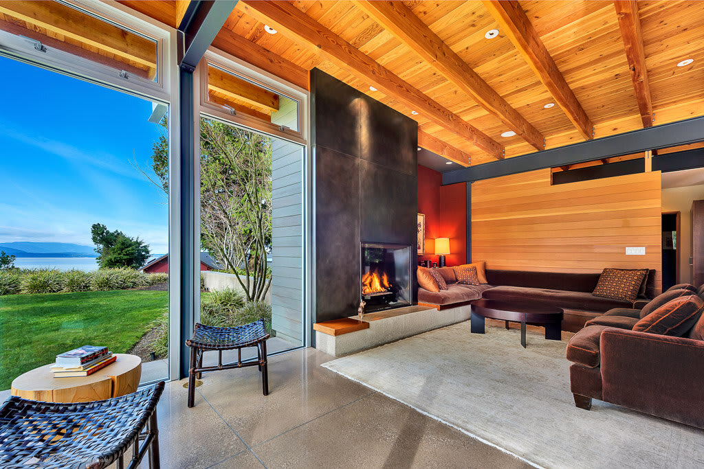
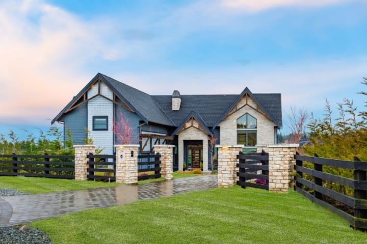
As far as where to place your camera physically, Sheila always recommends shooting corner to corner, that is, placing your camera in one corner of the room facing the opposite corner. If it's a smaller room, such as a bathroom or walk-in closet, she generally recommends shooting from the doorway looking in. As for where to place your camera vertically, her rule of thumb is to shoot from chest height - about four feet. If you shoot from too high you’ll get slanted floors, countertops, and cabinets. Too low causes similar issues. The bottom line, though, is that you don’t want to be shooting from eye level - particularly if you’re tall!
One last comment before we move on to the actual editing, why we're all here! Although it's by no means necessary, Sheila finds it best to present the photos in the order one might view the house if taking a physical tour, starting with the front yard, then front entryway, then living room, so on and so forth. Why we're mentioning this here is that she finds it creates a much more dynamic artistic flow if the photos are also shot, and edited, with this order in mind.
Let's Get Editing! - Adobe Lightroom
For your average shoot Sheila ends up with about 60 good exposures which, during the course of editing, are combined and synthesized down to about 30 - 40 photos. She says around 85% of the editing process happens within Adobe Lightroom, a must-have for any serious photographer (sorry Photoshop fans, although PSD does come in later!), importing the best RAW files after culling them down to only one or two exposures per room. In an ideal situation, you're looking for a room that is neither too light nor too dark in any given part of the space, that way these levels can be adjusted without losing much detail.
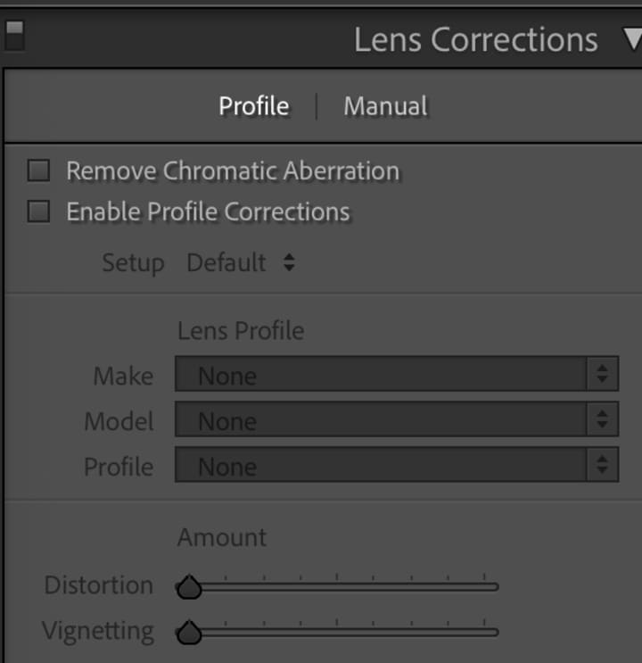
The first step is always to enable Profile Corrections, and to remove Chromatic Aberration, both of which are found under Lens Corrections within the develop module in Lr.
Next, she moves on to the "Basics" tab, generally using the first exterior shot as a template, and quickly adjusts by dragging down the highlights, bringing up the shadows, amping up the vibrance and saturation, then maybe adding a bit of contrast, clarity, or a touch of the dehaze function.
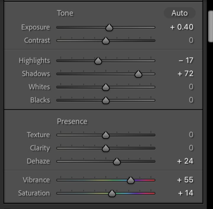
The next thing you want to do after those general settings have been updated is to utilize the adjustment brush to make changes such as adding a little more blue to the sky, or dodging a shadow area. Another thing to watch out for that can be fixed with this tool is yellowing of grass, a common side effect of bumping up the saturation.
Once this first photo is looking eye-catching, vibrant, and beautiful, you can copy what changes you made on that image and paste them into all the other exterior shots. Sometimes they'll require a little extra tweaking of the exposure, but more often than not they're good to go just like that.
Sheila invested a few hours one day to editing the "perfect" interior shot in Lightroom, and saving those changes as a preset, and highly recommends you do the same! Once you've done this you can simply apply that preset, and then make a handful of finer adjustments such as extracting the yellows and deepening the blues. Not only does this save you loads of time, but it is also an easy way to maintain a consistent, professional look across your entire portfolio!
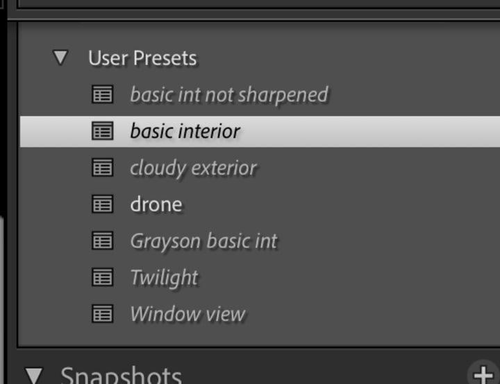
If you see in that screenshot that there is also the "Window View" preset, that's one that Sheila uses on the exposure that best captures the view out the windows of a room, which is later merged with the interior shot in Photoshop. After all these edits are complete, the pictures are exported as PSD files.
Photo, Finished - Touch Ups in Photoshop
The first order of business in Photoshop is to go through with the bandaid tool and remove anything that isn't supposed to be there, be it little dust marks from the lens (especially prominent if shooting at very small apertures!), ugly wires, or your phone left on the kitchen counter. The next job is to use the dodge and burn tools to even out shadowy and bright areas.
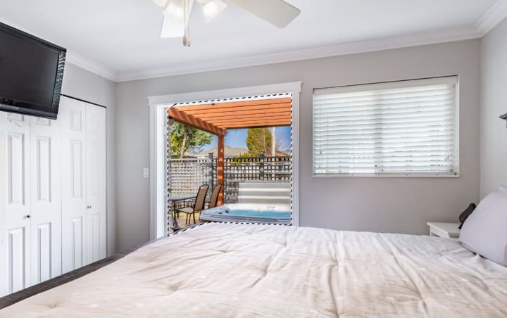
Now comes time to edit together the interior-focused and exterior-focused exposures, to make the view through the window or doorway as stunning as the inside of the room. You'll want to place the layer containing the exterior exposure above the layer containing the interior, then use the lasso tool to outline the window(s) you want to "punch out" of the interior exposure. Next Sheila uses the inverse selection option and begins erasing the space around the window to reveal the interior exposure underneath. She then flattens the two layers into one.
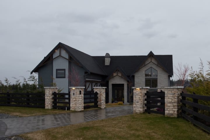
In a similar move, Sheila will sometimes replace an overcast or grey sky with something that better shows off the property, in her case a selection from a folder of more than 30 potential skies. This is done using the background eraser tool. She places the ideal sky as the bottom layer, selects the colour of the existing sky, then uses the tool to reveal the bottom layer, and hence the new sky. The backgrounder eraser tool is ideal for the job because it works in and around things like trees, hedges, and lamp posts.
One final secret tip for editing architecture and real estate photos Sheila let me in on was that she always, without fail, removes the vast majority of ceiling light fixtures from homes, and uses the clone stamp tool to blend in the area around it. She says that no one ever notices that the fixtures are missing when they receive the photos, and it's an edit that invariably makes not only the rooms look better, but the pictures more professional.
Sheila and I both hope you enjoyed reading this article and will get some use out of these ideas to elevate your next shoot.
This post was written in collaboration with Sheila Say. For more information on her and her business, please visit her website at www.sheilasay.com
About the Creator
Rio Breakell
I've been writing since before I could read, and the passion only grows!
I self-published two novels in my teens, and am currently working on a massive two volume story I'm hoping to print soon.
I live in Vancouver with my partner and 2 cats
Keep reading
More stories from Rio Breakell and writers in Photography and other communities.
The Mad Dash
The scratching of the dry ballpoint in the little black notebook was starting to get to Jason. After hours in the small cement cube, forcing down acidic coffee and blinking up into the one harsh bulb, inquisition after inquisition only deepening his faith in his own stupidity - it was the scratching of that damn pen that sent him over the line.
By Rio Breakell5 years ago in Criminal
Why Printed Photographs Still Matter: The Art and Value of Preserving Memories in Print
In a world where most photographs live on phones, laptops, and cloud storage, it is easy to assume that printing pictures is a thing of the past. Yet something meaningful gets lost when memories stay locked inside a device. A photograph printed on high quality paper carries a weight and warmth that no screen can fully replicate. It can be held, shared, framed, and passed down through generations.
By The Iconabout 9 hours ago in Photography
The Forsyth House Fire
Since 1851, Forsyth House has stood on the corner of Union Street and Gordon Street in the heart of Glasgow. Its iconic, or was... because on Sunday 8th of March, 2026, a fire broke out in a small, seemingly un-named shop in the building and tore all that history down. As I write, the rubble is still unsettled and the street is still blocked off. Central Station is quiet on the upper level, and around 30 small businesses have quite literally gone up in smoke.
By S. A. Crawford3 days ago in The Swamp


Comments
There are no comments for this story
Be the first to respond and start the conversation.