
How to Use the Font EB Garamond
Plus, tips about ransom notes & colors from Guilin

If you like this series, you can subscribe here. You can also read it on our blog.
Hi There 👋
How’s your week going so far? Last week was productive for me. I wrote a new post on the blog about visualizing ideas for branding. I also finally bought this video game on my wishlist. I ended up spending many hours last weekend playing it! I normally use the weekend to think up content ideas and work on writing, but it was a nice change. I’ll probably spend more time on it this weekend. I hope you have a wonderful week. Don’t forget to come up to the surface for some air!
In This Issue
- Fonts: EB Garamond, a classic font perfect for any layout
- Design Idea: Ransom note!
- Color Inspiration: Silver Cave in Guilin, China
Font of the Week
Defining a Style
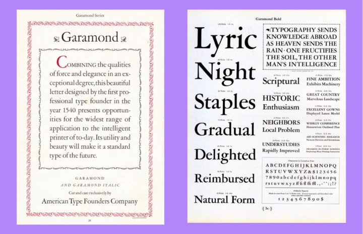
While we don’t know when Claude Garamond was born1, we do know that he created one of the most timeless, classic fonts that have ever existed: Garamond. Well-known for its grace and elegance, Garamond is one of the most popular fonts of all time. In fact, it was so popular that it became its own category: many similar-looking fonts created during that time were collectively Garamonds. A staple for book covers, posters, it’s timeless and classic.
Can You Read the Problem
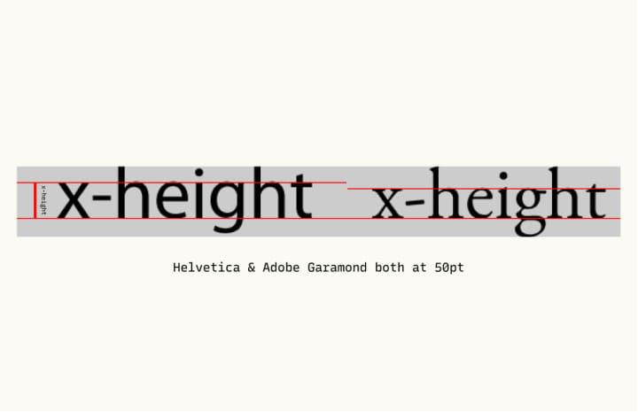
Garamond is considered an old-style serif. Typical characteristics of old-style serifs: Organic strokes, upright designs, and structures resembling handwriting with a pen.
Initially designed for print media, Garamond has excellent readability on books but is not well-adapted to screens. Garamond has a relatively small x-height ( height of the lowercase x). As a result, some white space of the letter becomes muddled and blurred out on screens.
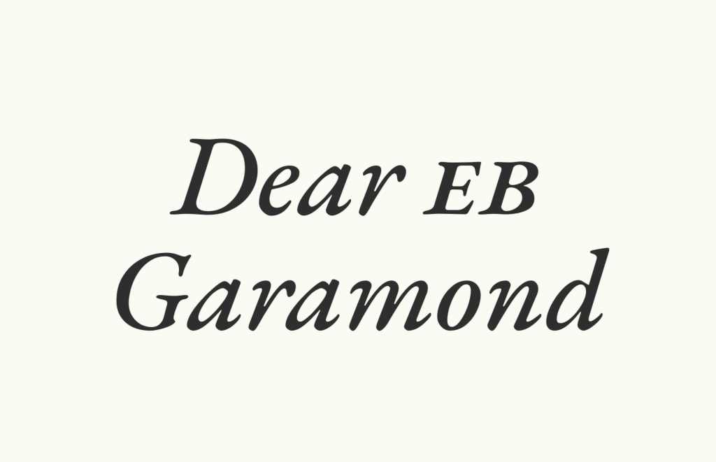
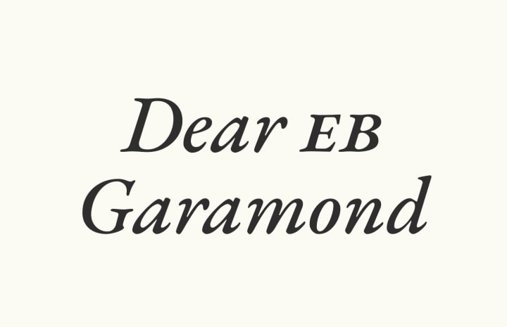
Enter EB Garamond
Just as people were desperately looking for a screen replacement, EB Garamond came to the rescue. A faithfully executed revival of the original Garamond, EB Garamond greatly improves the readability for screens at 12-point reading size while retaining elegance. Like Garamond, EB Garamond is an old-style serif with organic strokes and handwriting-like influence.
Font Details
- Five weights, two styles (regular & italic)
- Variable font format
- It has small caps (Small caps are uppercase letterforms molded into lowercase sizing, making these special uppercase letters optimal for readability at small sizes. Small caps are used for captions or labels on websites.)
General Usage Tips
- Many weights make it is easy to create more complex, dynamic layout for websites and books
- Use small caps in designs with small size capital letters, like labels and captions
Specific Usage Tips
How to use it for logo?
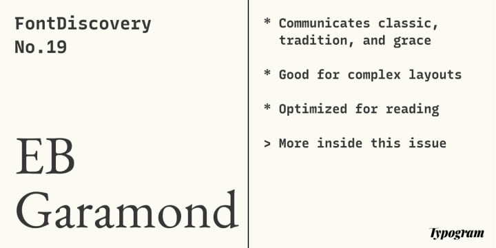
- Communicates classic, tradition, and grace
- Perfect for publishing companies or brands with a focus on editorial or tradition
How to use for marketing and branding?
- Great for landing pages, editorial storytelling, books, or publishing projects.
- Distinctive italic style is perfect for emphasizing the message

Design/Marketing Idea of the Week
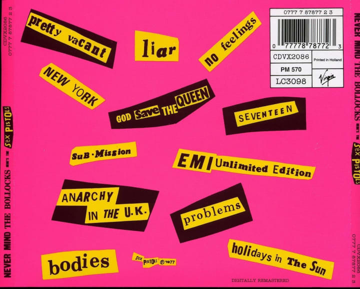
Ransom Notes
You are probably no stranger to this. A design tactic we see commonly used is the ransom note: a jumbled bunch of letters collaged together to produce a harsh mixture of voices meant to conceal the identity of the sender. With its roots back in the late 19th century, when printers mixed up different font styles on the same page2, the ransom note has remained relevant in pop culture, even today, especially in the underground culture.
Is the ransom note tactic something you can use for your projects?
Color Inspirations of the Week
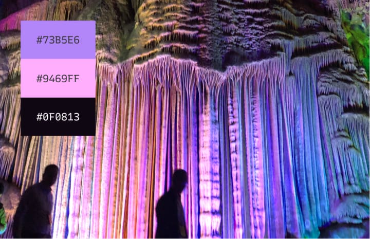
Every week we feature beautiful photos from our subscribers and community! This week we have a funky palette from the Silver Cave, a Karst Cave in Guilin, China. Wenting is a UX designer based in New York City. Thanks for the photo, Wenting!
Interested in contributing an image? email me your image for a chance to be featured!
Creative Prompt
Can you create a Twitter visual with EB Garamond, ransom note, and the color palette from this week?
Thank you
…for reading and hanging out here this week! EB Garamond is available here.
Have more questions about design and fonts? Please email me! [email protected] or find me on Twitter at @HuaTweets.
If you liked today’s post, please consider subscribing or sharing with a friend…That would make my day!
----
sources:
1- https://en.wikipedia.org/wiki/Claude_Garamond
2- Heller, Steven. 100 Ideas that Changed Graphic Design.
About the Creator
hua shu
I am a designer and bootstrapping founder building Typogram, a brand design tool. I am writing FontDiscovery, a weekly series highlighting marketing and design ideas to help founders step up their branding game 👉 fonts.substack.com


Comments
There are no comments for this story
Be the first to respond and start the conversation.