
FontDiscovery no.18: Tips about the Flirty Font League Script & Storytelling with Comic Books
Plus, colors from Finland

I am a designer and bootstrapping founder building Typogram, a brand design tool. As part of running Typogram, I create this weekly digestible visual guide with marketing and design ideas to help founders step up their game in branding and marketing.
If you like this series, you can subscribe here or read the past issues here
Hi There 👋
This weekend I went for a walk and was so happy to see greens all around me. Have you taken a nice walking break recently? If not, I hope you will get a chance to do so this week. Have a wonderful Mother’s Day weekend ahead!
-Hua
------
In this Issue
- Fonts: League Script
- Design/Marketing Idea: Storytelling with Strips and Panels
- Color Inspiration: a Scene from Helsinki, Finland
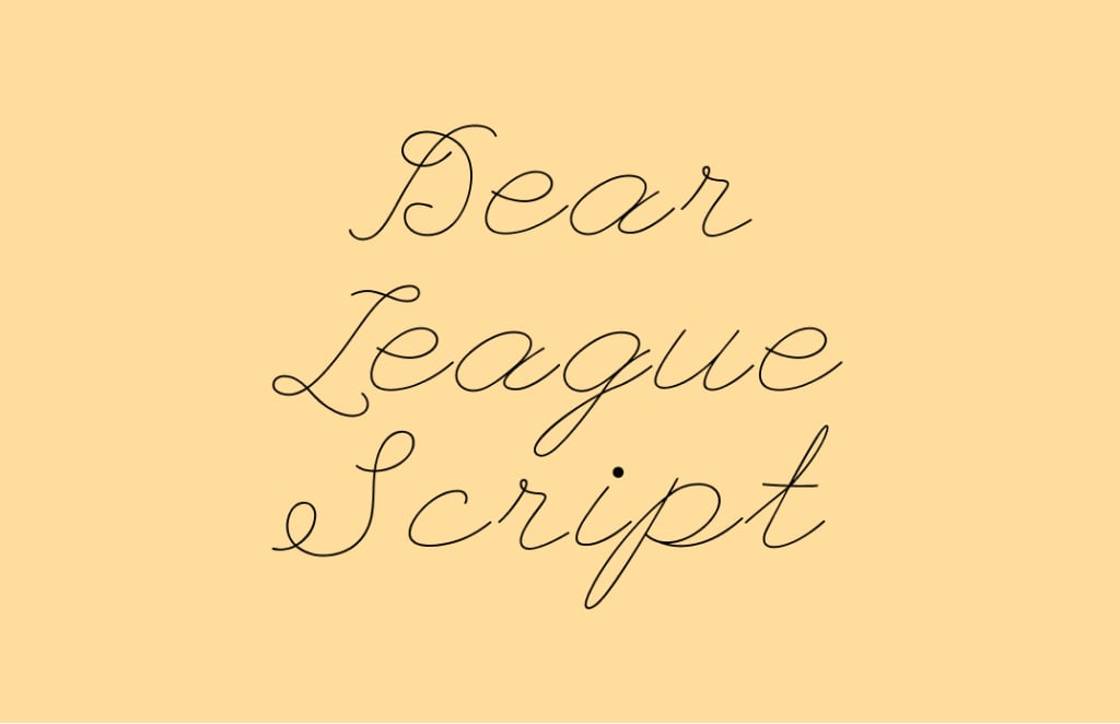
img: sample of League Script
Font of the Week
Out of My League
When I was growing up, my friend Lindsay had the most beautiful handwriting. Whenever we got yearbooks, she would bring a pack of color gel pens. People lined up to get her to sign yearbooks. She was creative and wrote the heartfelt message with cutesy, heart-filled cursive letters. Hearts replaced dots on i’s and apostrophes. She would write pages and pages of these glittery, thoughtful messages.
The name League Script is a little misleading. It might have made you think that this font has a connection to sports. The designer of League script has said it is somewhere between a handwritten letter from the 1920s and a high school girlfriend’s love note. Upon a close examination, we’ll find flirty flares and thin, ball-point pen-like strokes with round caps.
Font Details
- Enlarged dots
- Uneven baseline in capital letters
- Thin strokes with round caps
img: font details of enlarged dots and round stroke caps
img: capital letters of this font have an uneven baseline, giving it a bouncy and whimsical look.
General Usage Tips
- Suitable for text at large font size
- One weight
- Avoid using at small sizes, like paragraphs
- Pairing: Helvetica
Specific Usage Tips
How to use it for logo?
- Communicates softness, whim, casualness, intimate
- Not very suitable for logo. The thin strokes break when displayed small. Logos need to be legible in small sizes.
How to use it for marketing and branding?
- Looks fantastic in large sizes because of the casualness and ease
- Consider this font for showy marketing pieces
img: a shop banner made using League Script and Helvetica
img: a slightly similar thin script is used here on a theater in Berlin; source: FontsinUse
Design/Marketing Idea of the Week
Storytelling with Strips and Panels
The first modern comic book, Famous Funnies, was released in the US in 1933. The series was a hit. At one point, it sold 180,000 of its 200,000 print run. That’s 90%! Folks loved this new and refreshing format. Comic book panels take us around the scene, showing us every possible angle. Even when we don’t see everything in the panels, it’s magical. We have room to imagine and muse about what happens between the scenes.
Examples of good stripe and panel ideas: Roy Lichtenstein, Scott McCloud, r/comics, @StartupIllustr
Can you incorporate strips and panels into your marketing projects?
img: a philosophical comic for your enjoyment. source: Reddit r/comic
Color Inspirations of the Week
This week we have a beautiful photo from Helsinki, Finland. Thank you Alexis for contributing!
img: a nice sunset in Helsinki, Finland; source: Alexis
Interested in contributing an image? email me your image for a chance to be featured!
Creative Prompt
Can you create a mother’s day graphic with League Script, strips and panels, and the color palette from this week?
Thank you
…for reading and hanging out here this week! League Script is available here.
img: simple infographic about League Script
I share tips like these every week. If you like this series, you can subscribe here. You can also read previous issues on Typogram's blog.
more questions? drop me a tweet @HuaTweets or email: [email protected]
About the Creator
hua shu
I am a designer and bootstrapping founder building Typogram, a brand design tool. I am writing FontDiscovery, a weekly series highlighting marketing and design ideas to help founders step up their branding game 👉 fonts.substack.com
A Dart at Dusk
Seconds ago, the sullen sun set on the two of us… my exuberant furry companion and me. A fresh breeze embraces us, delivering welcome relief from the day’s oppressive heat. His typical stumbling and staggering along — apace with a sloth — has turned into trip-trapping, high-stepping, almost skipping along.
By Angie the Archivist 📚🪶4 days ago in Petlife


Comments
There are no comments for this story
Be the first to respond and start the conversation.