
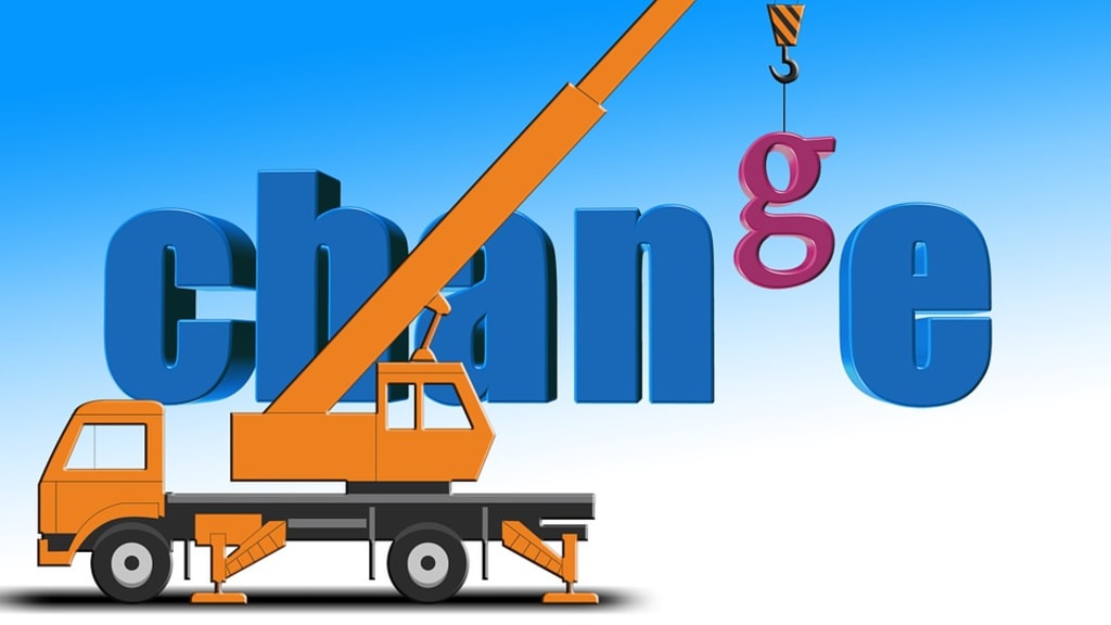
Why Modernize Your Current Logo in 2020?
Is it Important to Redesign Your Business Logo?

Some customers always look to us to change the company logo in order to keep up with new graphic and logo trends.
These companies know the value of your image and know that changing your logo can bring several benefits.
It is important to note that if the company already has a strong brand with its customers, a radical change of logo may not be a good strategy.
The ideal is to evolve until you arrive at an image that follows market trends and remains aligned with the essence and purpose of the company.
1. Logo History of Google
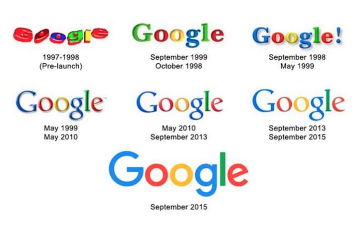
Notice how Google was making its logo lighter (clean) and with flat colors (flat design), without volume. However, without changing the essence of the logo, which is the company's name.
One of the trends in the creative process of the logos is to make the brand light and with flat colors, thus making it easier for users to visually remember the brand.
Google has also created a minimalist symbol. Minimalist branding is generally used for avatars (which has little space but needs to be read), and Google solved this issue very well.
2. Logo History of Apple

Apple has adopted the apple symbol since 1977, and it has become an international brand. A strong brand! The changes were only in the color and texture, which was now colored, due to the innovation of the colors of its products, and other versions were with the appearance of glass, metal, reflection, which adds volume to the logo.
But in 2015, he opted for a flat and light tone. A trend.
Apple has created a unique, minimalist brand, both for use in its products and in avatars.
Do you want to change your brand logo or redesign your business logo? LogoDesigner360's affordable custom logo Design Services in UK can help you to create a professional custom logo for your brand. Contact us.
3. Logo History of Microsoft

Microsoft radicalized. The logo changes a lot, in typology and symbol.
However, following the same trends as the previous brands, it became lighter and with flat colors.
They say that the brand typology is a modified Myriad Pro font (from Apple).
About the minimalist brand, basically the 4 squares, very simple and easy to remember.
4. Logo History of BMW

As a vehicle brand, the BMW brand has evolved subtly, so as not to lose its "personality". In this case, the tendency was to add some volume to the symbol, to represent its image as the emblem on cars, a composition with gradients of light and shadow to have a raised look.
Avatars can also be used, as it is a visually simple brand. It was excellent! A strong brand!
5. Logo History of COCA-COLA
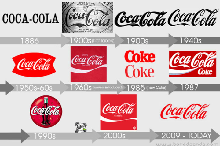
An old and worldwide brand!
The brand changed a lot, as can be seen in the image above, however, from 1905, the changes were more subtle, with the exception of 1985. Only then, it returned to the 1969 typology and remained so, with only slight changes , usually just added graphic elements around the names, without changing the essence of the brand.
In 2007 he adopted a flat and light style, very minimalist and simple, that is, a trend. Taking the best from every worlds, the “Taste the Feeling” campaign brought Coca-Colas One Brand strategy to life combining the old with the new.
Check Out Our New Blog Start Your Online Store In Minutes
6. Logo History of SHELL
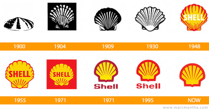
A brand that the concept and essence have not changed, only the visual image of the symbol has changed a lot. Notice that from 1971 until today, the symbol has remained the same, changing only the typology of the brand. As of 1999, the typology was banned, since the brand is strong and is already known only by the symbol.
A symbol that is also the minimalist brand. Flat colors and lightness were maintained.
7. Logo History of NIKE

The brand had a major change in the beginning, perhaps because it is little known, even changed the name. It only happened to be called Nike in 1972. And it has evolved little, but significantly since then. It kept its essence and symbol, but the typology changed. Today, like the brands we have seen so far, it has removed the name of the symbol for being a strong brand for many years.
8. Logo History of Mc Donalds

I couldn't help writing about this brand. Worldwide known for its quick and universal snacks, the MC DONALDS brand has evolved considerably since its creation. It became more famous from the 70's and never stopped.
When arriving at the brand M concept, it changed very little, and today, it also removed the name/typology, leaving only the symbol.
Minimalist and flat, easy to remember, obviously.
We talk here about some of the world's biggest brands. There are others that I could mention, but the vast majority evolved in the same way, major changes in the beginning and then more subtle changes. The vast majority also simplified, rather than complicate, following design trends.
What do you think about our analysis? Is it necessary to modernize your logo in 202? Share your ideas in comment's section. Thank you so much.
About the Creator
LogoDesigner360
LogoDesigner360 offers creative logo design services in US, UK, UAE and all over the world. From individuals to startups, mid-sized companies to large corporations, we have served them all.
Keep reading
More stories from LogoDesigner360 and writers in Journal and other communities.
5 Amazing Prototype and UI Design Tools in 2020
Every day there are more design tools and different SaaS that offer us solutions to our work process. But which one to choose is a complicated decision, it all depends on the phase of your project you are in and the needs you have.
By LogoDesigner3606 years ago in Journal
Strengthening Billing Accuracy in Care Settings
Full Introduction In the residential and long-term care landscape of 2026, billing accuracy has shifted from a back-office administrative task to a high-stakes clinical and financial priority. As payers—including Medicare and Medicaid—tighten documentation requirements and deploy AI-driven audit tools, even minor discrepancies in daily charting or insurance verification can lead to immediate claim denials and revenue loss. Strengthening accuracy now requires a systemic approach that integrates real-time eligibility checks, disciplined clinical documentation, and a culture of cross-departmental accountability. By focusing on front-end precision and back-end auditing, care settings can ensure that the services provided are the services fully reimbursed.
By Abdul Mueed3 days ago in Journal


Comments
There are no comments for this story
Be the first to respond and start the conversation.