
We Helped a NYC Therapist Build a Mental Health App—Here’s What It Taught Us About Designing for Boundaries
We Helped a NYC Therapist Build a Mental Health App—Here’s What It Taught Us About Designing for Boundaries
The first time we spoke with the therapist, she was clear about one thing:
“I want an app that supports my clients—but I don’t want it to pull them in.”
That single line reshaped how we thought about the project.
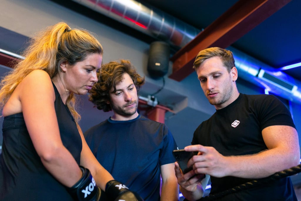
As New York’s mobile app developers, we’ve helped build products that do everything from drive e-commerce sales to gamify learning. But this one was different. It wasn’t about optimizing engagement, boosting daily active users, or crafting the stickiest UX possible. It was about creating something quiet—an app that offered value only when users needed it, and gracefully stepped back when they didn’t.
The client—a licensed therapist based in Manhattan—wanted to give her patients a digital tool for reflection, emotional check-ins, and access to trusted mental health resources. But she also wanted to protect their boundaries. That meant rethinking everything: from notification logic to visual rhythm, and even the way we approached data storage.
What started as a mental health app quickly became a masterclass in designing for restraint.
Here’s what we learned.
The Problem—Most UX Is Designed to Keep You Hooked
Modern apps are masters of manipulation.
They nudge, they notify, they reward. Whether it’s a social platform prompting you to “check what you missed” or a wellness app congratulating you for a meditation streak, most user experiences are built on one core principle: keep people coming back.
From a business standpoint, it makes sense. More engagement means more retention. More retention often means more revenue. But when it comes to mental health and especially the vulnerable moments users bring to therapy-related apps—that logic can backfire.
Our client summed it up perfectly:
“If a user doesn’t open the app for a few days, I don’t want them to feel like they failed. I want them to feel like it’s still here for them—on their terms.”
That’s when it clicked for us: conventional UX strategies were harmful.
Because in mental health, more time in the app doesn’t always equal better outcomes. Sometimes, the healthiest thing a person can do is close the app, go outside, or just sit quietly. The last thing we wanted to do was design guilt into the interface.
So, before we wrote a single line of code, we had to ask ourselves: What does helpful, non-coercive design even look like?
That question would shape everything that came next.
The App’s Mission—Support, Don’t Stimulate
Most apps are built to grab attention. This one was built to give it back.
From the start, the goal wasn’t to create another daily tracker or self-improvement system. It was to design a space that felt like an extension of the therapist’s actual practice: calm, private, and pressure-free.
Together with the client, we mapped out a core set of features designed to quietly support her patients between sessions:
● Offline journaling, so users could reflect privately—no accounts, no syncing, no cloud.
● A curated resource library with meditations, breathing techniques, and trauma-sensitive articles—nothing overstimulating or commercialized.
● Mood logging that lets users track patterns over time without gamification, streaks, or rewards.
● Gentle audio content that didn’t require sign-ins or behavioral tracking—just open, press play, breathe.
Just as important as what we included was what we intentionally left out:
● ❌ No streak counters
● ❌ No progress dashboards
● ❌ No badges for usage
● ❌ No push notifications by default
This was a tool for people who might be emotionally overwhelmed, grieving, anxious, or simply looking for stillness.
Everything we built had to feel like an invitation, not an obligation.
And while the feature list looked simple on paper, executing it meant constantly asking ourselves: Is this feature here to serve the user or just to pull them back in?
That level of restraint became the heartbeat of the design.
UX Lessons—Designing for Boundaries Instead of Engagement
Building this app challenged every instinct we’d developed from traditional product work.
Most of the time, UX is about reducing friction and increasing interaction. You want users to scroll more, tap more, return more often. But in this project, every decision had to be filtered through a different lens: Does this help the user feel safe, respected, and in control?
That meant rewriting the playbook.
Here’s how our usual UX habits compared to the design decisions we made for this project:
Typical App UX Therapeutic UX (Used in This Project)
Optimize for time-in-app Optimize for minimal, meaningful interaction
Encourage daily check-ins Allow for irregular, user-led usage
Use push notifications by default Offer opt-in only, with extremely limited use
Reward with streaks or badges No gamification—just quiet journaling and mood awareness
Store data in the cloud Prioritize local storage, giving users full control over data
Prompt users to upgrade/share Avoid any commercial upsell or pressure
We also made conscious design choices that signaled calm and neutrality. Soft color palettes. No red warning banners. Clean screens with no crowded modules or pop-ups. In user testing, people described the app as “unobtrusive,” “gentle,” and “a space I can return to when I’m ready.”
That was the real win. Not the number of logins. Not session duration. But the feeling the app left behind.
And if there’s one thing we took away from the UX side of this build, it’s this:
Sometimes, the best interface is one that knows when to step back.
Ethics in App Development—What We’ll Bring to Future Builds
This project reframed how we think about all user-facing tools. Especially ones tied to health, reflection, or personal growth.
As New York’s mobile app developers, we’re often asked to build products that look great and scale fast. But what this experience reminded us is: great UX is about respect—for people’s time, attention, and emotional state.
Here are a few principles we’ve since carried into other projects:
● Design for opt-out, not addiction.
Assume users don’t want to be nudged constantly. Let them lead their own rhythm.
● Make features emotionally safe.
Ask: will this feel helpful after the 10th use? Or will it start to feel invasive or performative?
● Build for longevity, not urgency.
Don’t create artificial pressure. Let the product grow with the user, not ahead of them.
● Default to privacy.
Unless the experience truly requires cloud sync or tracking, local-first is often the more respectful route.
The result? Apps that people come back to not because they’re “hooked” but because they trust them.
We still build fast-moving platforms, complex enterprise tools, and growth-minded products. But this particular project taught us something far more enduring: your app can show up for users without demanding anything in return.
And if more companies built with that mindset, the internet might start to feel a little more human again.
Not Every App Should Fight for Your Attention
Some apps are meant to entertain. Others are built to convert, retain, and monetize. But not every app should compete for screen time and not every user benefit can be measured in clicks.
The mental health app we helped design was there for moments of clarity, overwhelm, or quiet reflection—when the user chose to open it. And in that choice, there was trust.
That trust was earned through restraint: fewer notifications, no streaks, no pressure to “keep up.” Just a clean, respectful space that users could turn to on their terms.
As New York’s mobile app developers, we’ll keep building products that solve real problems and scale with purpose. But this experience reminded us that the best apps don’t always push harder. Sometimes, the most meaningful ones are the quietest in the room.
And in a world full of noise, that’s what stands out.
About the Creator
Keep reading
More stories from Aurang Zeb and writers in Journal and other communities.
The Revival of Victorian Dresses: Embracing Vintage Fashion in the 21st Century
In an age dominated by fast fashion and modern trends, one style that continues to captivate hearts and wardrobes is the timeless elegance of Victorian dresses. From high-neck lace gowns to voluminous skirts with intricate detailing, Victorian fashion is experiencing a notable revival in the 21st century. More than just costumes for themed events, these dresses have become a statement of individuality, sustainability, and vintage appreciation.
By Aurang Zeb5 months ago in Journal
The Town That Banned Wi Fi. A 10 Year Case Study on Electrosensitivity.
A small European town took a radical step. Local leaders banned public Wi Fi. They removed routers from schools, libraries, and offices. Private hotspots faced strict limits. The decision followed complaints from residents who reported headaches, fatigue, and sleep problems. They linked these symptoms to wireless signals. Officials labeled the condition electrosensitivity.
By Wilson Igbasi5 days ago in Journal
Rachel Reviews: The Spiral Archive by Pieter Hendrik
It's difficult for me to know where to start with a review of this book as it was, for me, an entirely unique experience and one that I'll probably never have again. I don't want that to be interpreted as unenjoyable but it has left me scratching my head a little and ruminating on its content, its themes and its characters.
By Rachel Deeminga day ago in BookClub


Comments
There are no comments for this story
Be the first to respond and start the conversation.