
Introduction to Human Chasing Colors
Introduction to Human Chasing Colors

There is a subspecies of "visual animals" who are obsessed with colour. They drink colourful drinks and try new and exciting sensory experiences; they take photos, share, express, think, and feel the new vitality of colours in creativity, ideas, products, and environments; and they take photos, share, express, think, and feel the new vitality of colours in creativity, ideas, products, and environments.
Color has influenced the social lives and consumption habits of the new generation of young people in waves from the past to the present.
Let us travel back in time to 7 million years ago, to the second of human origins -
No one imagined that when a beam of light entered the eye, different wavelengths of light travelled through the optic nerve, allowing us to see colour, one of the most beautiful things in the world.
But no one has been able to articulate or say everything that is indescribable in this language for millions of years.
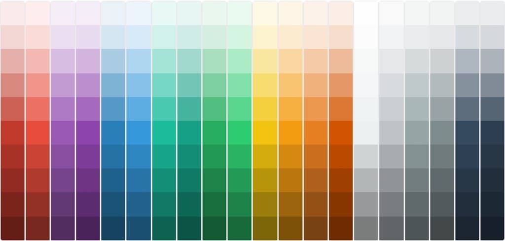
Today's colours include more than just red, orange, yellow, green, blue, blue, and purple, with 16,777,216 different names.
Color is no longer just about the colour. It has changed over the course of human art history, influencing the course of social evolution and cultural change as well as expressing everyone's psychological emotions, life consumption, and social expression.
These shifts are not arbitrary.
Color has become so ubiquitous that no one realises how it subtly alters everything.
Black is not black, and white is not white
We couldn't even utilise knowledge to explain colour earlier in human history. To harvest coloured minerals from nature, process them into powder, and then add water to add colour, we could only rely on pure visual curiosity.
The earliest known pigments date back to the pre-Paleolithic period, when humans were able to extract deep black compounds from ashes 350,000 years ago.
The oldest surviving human art paintings are from 250,000 years ago. Ochre has been used by humans to extract yellow, red, and brown pigments.
People began to understand how to make colours that did not exist in nature from more and more simple elements in early civilizations.
For instance, the lamp black formed of animal fat and resin, as well as the bone white and black made by burning bones over an open fire. The ancient Egyptians invented Egyptian blue 5,000 years ago, and it has been learnt to heat with lime, copper, silica, and caustic soda, and the specific amounts may be modified, similar to a chemical experiment.
Blue was not blue to the ancient Greeks; it was "melas," which meant "darkness." Blue is merely a brighter form of black to them. Blue was also not the cold hue it is now; it was considered a bright colour in the Middle Ages, denoting "the most lively colour."
Johann Jacob Diesbacht, a colour manufacturer, accidently produced Prussian blue, the first modern artificial pigment, when he mixed cochineal worms with oxalic acid polluted with animal blood in his laboratory about 1704.
The hue rapidly went global, making a splash in art history.
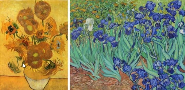
In fact, the pigment is worthless in and of itself. People can sense the potential when they are translated into colours and created into works of art by artists.
Then vivid gold, scarlet, and blue began to appear in mediaeval lacquer manuscripts; during the Renaissance, waves of spectacular artistic triumphs appeared; and following generations found the modernist works of the twentieth century even more stunning.
This was further fueled by the nineteenth-century Industrial Revolution, when more chemicals were produced as industrial by-products, resulting in great pigments and dyes.
It wasn't until the late 1800s that inexpensive synthetic pigments like cerulean, chrome orange, and cadmium yellow, as well as new hues, became available, thanks to a rise in finished pigments and the advent of metallic paint hoses. Humans now have access to new hues that were previously unimaginable, such as fluorescent and phosphorescent colours, thanks to modern science.
Color delighted artists and drove them insane in the creation of colour, leaving a trail of endless glimpses.
Humans have been exploring and discovering colours for thousands of years, employing pigments, pigments, dyes, and chemical processes.
However, the hues remain "chaotic" even then.
Color is objective in and of itself, but not in its name, description, or symbolism.
In the 1980s, a large-scale survey revealed that the colour gamut division in different places was extremely ambiguous. In Korean, for example, there is a colour called yellow-green that is only used to differentiate between conventional green and yellow-green. The people of the Solomon Islands' atolls split the colour spectrum into white, dark (blue and green), and red (yellow and orange), and have their own classifications of what they see.
Oranges were introduced to Europe, and oranges could only be found in Europe, according to another surprising fact. Goldfish were once known as yellow or gold fish, which is why they aren't referred to as orange fish.
This is due to the fact that the colour is no longer just that.
Its importance is intertwined with human beings' social, cultural, and economic importance.
Purple has long been seen as the noblest hue, representing a society's utmost strength and splendour. Scarlet was once the exclusive domain of a few elites in China, while auburn was the domain of low-status peasants, with distinct colour grades assigned to different groups of people.
The planet has been transformed into a new "huge dye vat" as a result of the colour.
It is the rise of a massive economic industry, as well as the ups and downs of a small artist's life; it is the raw material that touches the eyes and shakes the soul, or it is the old glory in the social hierarchy; it is the rise of a massive economic industry, as well as the ups and downs of a small artist's life.
Color Genesis: Awakening from Chaos
We prefer things to have a beginning and a finish; we dislike split flaws; we prefer to be in command; and we despise chaos.
As a result, since Newton's spectral theory's inception, scientists, artists, and designers all over the world have spent a great deal of work, like creating the "Genesis" of the colour world, to allow humans to grip the chaotic colour gamut's hand.
The spherical 3D colour model was proposed in 1810 by German Romantic painter Philip Otto Jung. In the same year, in his book Color Theory—the renowned colour circle dominated by red, yellow, and blue—the German poet Wolfgang von Goethe added a more human-centered examination of colour perception.
Maxwell established the three main colours as the cornerstone of contemporary colorimetry in 1861.
The "Munsell Color System," which was the first to describe colour in three dimensions of luminance, hue, and chroma, and the first widely acknowledged colour management system, was born in 1905.
The colour matching technology, however, had not yet made its way into genuine objects from all aspects of life at the time.
Many dye and textile firms began issuing samples in a variety of hues around this period. The colour business was likewise on the verge of collapsing after World War I. The Textile Color Card Association was founded by American textile mills and manufacturers to create the first industry-wide colour chart and colour trend projection, based on American dyes.
Lawrence Herbert, a typographer by trade, was having some colour issues one day.
He's always been good at modifying colours for designers and clients, but when a client maintained that the colours he printed were not what he wanted, Herbert decided it was time to create a set that everyone could use. language of colour
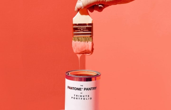
The subsequently famous PANTONE colour card was inspired by this.
In 1963, Herbert suggested a collaboration with 21 ink producers called the Pantone Color Matching System, stating how the system would provide new advances to designers, manufacturers, merchants, and customers all around the world.
This is the starting point for Pantone's global app.
Each faint colour began to have its own number and colour card in 1965, and each unique colour could also be clearly combined according to the guidelines.
Pantone's initial colour system, ruby red, rose red, reflecting blue... radiated seductive brilliance in all aspects of life in the lively 1960s, just like its namesake.
It has travelled to every continent and appears to have returned to the vibrant centre.
Pantone introduced colour matching systems for pigments, polymers, powder coatings, screen technologies, and textiles in the years that followed, developing a collection of the most prevalent colour languages and establishing colour as a true public industry.
Steve Jobs excitedly debuted Apple's first iMac G3 desktop computer on the stage of Apple's conference in 1998, and everyone watching was wide-eyed - it was distinguished from all the other all-white beige computers on the market, where the light of technology and the future shines on the blue translucent shell.
Soon after, the iMac G3's bright colours, such as grape purple, tangerine orange, strawberry pink, and lime green, flooded the market, radically redefining people's perceptions of computers and demonstrating the limitless potential of colour in business.
The colour industry has progressively gained traction, and it is now being conducted in a systematic manner.
Pantone's "Color of the Year," released at the conclusion of each year, is the most well-known.
Pantone's colour specialists have been searching for the colour of the year since 2000, based on changes in numerous areas around the world. It employs colour to represent worldwide cultural emotions and attitudes, and it can often strike people's unspeakable hearts, causing a fresh wave of colours to be released.
The latest business trends in technology, fashion, home furnishings, and other industries are hidden under the annual fashion hues.
Even if people do not use social media or pay no attention to the colour of the year, they may be inconspicuous and wear a clothing that is influenced by it.
The editor-in-chief of the prestigious fashion magazine "RUNWAY" gazed at a sky blue sweater on her assistant and commented, "Just like in "The Queen Wears Prada," which was launched in 2006:
Contemporary Consumer Babel in Colors of Liberation
Human beings banded together in the Book of Genesis to build a tower that could go to heaven, but God intervened, causing people to speak different languages and be unable to communicate with one another, and the final plan failed.
In real-life consumption, colour is become a tower of Babel.
It has evolved into a new media, invading, linking, and engaging people's lives without the need for conversation or comprehension.
The spread of colour accelerates, and digital colour begins to surge, particularly when the digital wave arrives. It has a quick colour match and noticeable effect, as well as a much bigger imagination space than paint.
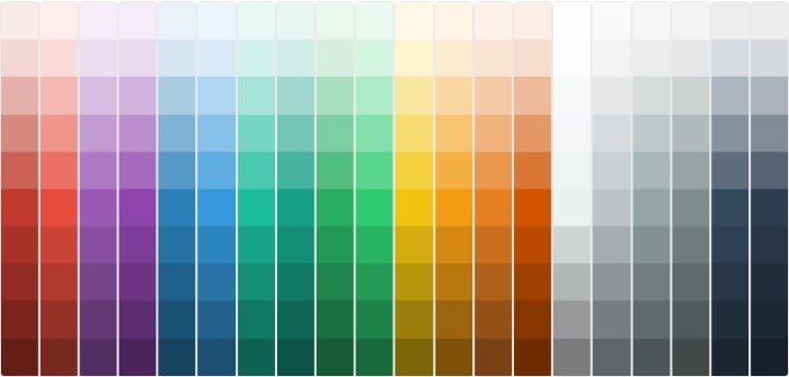
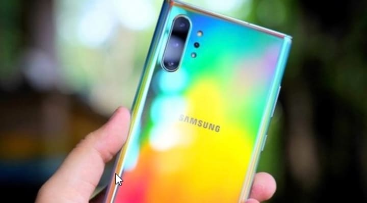
Colors in current computers are made up of three fundamental colours: red, green, and blue, which you might not have noticed. A colour component is represented by a single BYTE (byte, 0 to 255). After that, there are 256256256=16777216 different colours to choose from.
Even if you don't care about these 16777216 hues, folks have been hurriedly putting orders for the new iPhone colours every year since the colourful iMac debuted in 1988. Android phones come in a variety of vibrant colours and visual effects. The basic desire to place a good-things order erupts.
People aspire to communicate their grasp of the world perspective through more colours as time goes on.In recent years, the public's consciousness of environmental protection has become stronger, so the use of green has dramatically expanded.
According to him, the 80/90 and younger generations, who grew up with the Internet, have unique perspectives on colour and a larger desire for it. In recent years, he anticipates another new colour trend.
Young people's excitement for colour is growing, and digital media is the perfect platform for them to express and promote their ideas.
As a result, a variety of new outlets have emerged as an effective strategy for attracting young people to take photographs and punch cards.
Color has evolved into a vehicle for creative and cultural ideas, as well as social media.
Pantone is currently being referred to as a "new consumer brand."
It is not only a colour agency, but it also carries out "colour cross-border" creative ideas on a regular basis, such as developing apps, publishing magazines, opening hotels, and so on. Instagram appears to have been taken down.
All of these things allow colour to enter the aspects of people's life and have an increasing impact on them.
Of course, no matter what age a hue is in, it must still contend with fresh demands.
These structural materials with exceptional performance, such as the super-ceramic crystal screen of the iPhone and the Jun-ceramic material used in Midea refrigerators, have higher criteria for colour use as a result of research and development in numerous industries. Color trends fluctuate on a daily basis, and Lin Ruicheng says they're always creating and updating colour management technologies to keep up with shifting market demands.
Color is still changing swiftly after millions of years.
It can also have a wider range of imaginations and generate new stories.
We don't generally inquire about color's origins, but we have the idea that it comes from light, natural flora, and natural minerals, as if it has been around since the dawn of time.
The story of colour is actually the story of people, of existence, and of civilization once we get past the most basic meaning of colour.
This never-ending narrative, like yellow-green, conjures up images of the first spring buds.
About the Creator
Keep reading
More stories from writers in FYI and other communities.
The Devil's Cut
“Comrade, finally you’re awake.” The voice was smooth, sensual. A flickering incandescent bar was all that lit the white, sterile room. All Vladimir remembered was everything going black. He tried to move his arms and found them strapped to the gurney.
By Matthew J. Fromm6 days ago in Fiction


Comments
There are no comments for this story
Be the first to respond and start the conversation.