

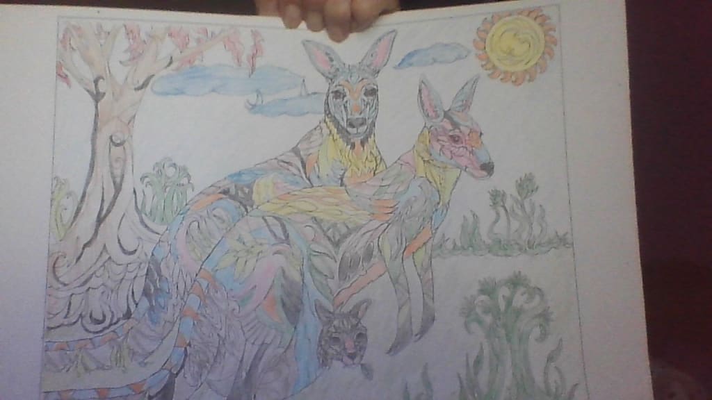
Here is a color art of some adult kangaroos with their joey. I tried for the whimsical touch with this family. The joey's head I used my gray and black colored pencils. For a more realistic look to the tree, I used light brown and black to show depth, I think I did that. The colors I chose for the kangaroos were mainly pastels from light blue, pink, orange, greens and yellow. I chose to do the sun yellow for the body of the sun and orange for the rays. The plants I just colored shades of green. Please share your thoughts.
About the Creator
Mark Graham
I am a person who really likes to read and write and to share what I learned with all my education. My page will mainly be book reviews and critiques of old and new books that I have read and will read. There will also be other bits, too.
Keep reading
More stories from Mark Graham and writers in Critique and other communities.
Rabbits
Here is a picture I colored with my colored pencils. I tried to get a festive feel kind of like Easter with the blues, pink, oranges and greens. If you notice I gave the sky area a shading of light blue with a bright orange sun. The flowers I decided to color pink, red, orange, and blues and purple.
By Mark Grahamabout a year ago in Critique
Standing While Falling
Quotation from Friedrich Nietzsche "He who wrestles long with monsters should beware lest he himself become a monster. And if you gaze long into an abyss, the abyss also gazes into you. Man is not destroyed by suffering, but by the meaning he makes of it."
By LUCCIAN LAYTH9 days ago in Critique
Fear of a Black Hat
Fear of a Black Hat, a Rusty Cundieff film, is one of my all-time favorite movies when I need to laugh. We’re talking Kentucky-Fried Movie territory. You want the uncut version, otherwise you don’t get the Ice Froggy Frog video (below) at the beginning or the discussion about artistic integrity in Cleveland. I own the cut version (😥)—couldn’t find the uncut version at that time, no extra money for it right now, but you aren’t me, so buy the uncut version.
By Harper Lewis3 days ago in Critique


Comments (2)
Kangaroos are interesting animals and mothers, don't you think? I love the way they carry and protect their offspring.
By application of different colours you can give an image a very different meaning. I have spent hours looking at Picasso, Weeping Woman, wondering at the use of red and green in a part of the detail. From a distance the colour is neither red nor green but seems to merge into another colour and a different image. I am convinced Picasso was aware of this transformation. Colour is a very powerful tool in the hands of a craftsperson who knows how to use it. Well done for pursuing this interest in colour and colouration. I enjoyed reading your explanations.