
Logo and Emblems of Modernity
Rethinking Corporate Identity Through Jens Müller and R. Roger Remington’s Logo Modernism

Hello, fellow design enthusiasts! Today, I’m diving into one of my all-time favorite books: “Logo Modernism” by Jens Müller and R. Roger Remington. If you’re passionate about logo design or just love a good dose of design history, this book is a goldmine.
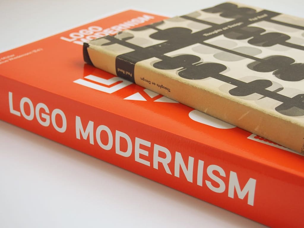
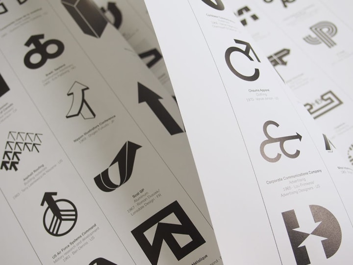
“Logo Modernism” was written by Jens Müller and R. Roger Remington and was published by Taschen at the tail-end of 2015. The book focuses on the period between 1940 and 1980, examining modernist ideas in graphic design through the documentation of close to 6,000 logos!
An instant classic, the book quickly became a staple in the collections of most major creative studios.
A Visual Feast
First things first, let’s talk about the sheer beauty of this book. “Logo Modernism” is a visual feast, boasting over 6,000 logos from 1940 to 1980. The book is hefty and packed with eye candy that will have you flipping through its pages for hours. The clean, minimalist layout ensures that the logos take center stage, allowing you to appreciate the intricate details and clever designs.
From the bold and simple to the intricate and detailed, the logos showcased in this book span a wide range of styles. It’s fascinating to see how designers of the past approached logo design with limited technology and resources. The creativity and ingenuity on display are truly inspiring.
A Journey Through Time
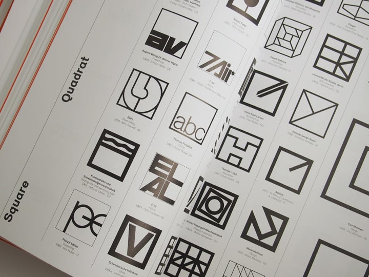
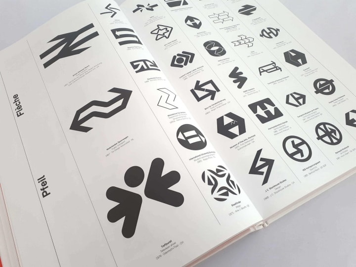
“Logo Modernism” isn’t just a collection of pretty pictures; it’s also a journey through time. Jens Müller and R. Roger Remington have meticulously curated logos that represent the evolution of modernist design principles. The book is divided into three sections: geometric, effect, and typographic. Each section highlights a different approach to logo design, showcasing how designers used shapes, effects, and typography to create memorable marks.
The geometric section is particularly captivating. It’s amazing to see how designers used simple shapes like circles, squares, and triangles to create logos that are still relevant today. The Effect section delves into the use of lines, patterns, and textures to add depth and dimension to logos. And the typographic section? It’s a typophile’s dream, filled with clever uses of type to convey brand identity.
The Power of Modernism
One of the things I love most about “Logo Modernism” is how it highlights the power of modernism in design. Modernism is all about simplicity, functionality, and clarity. It’s a design philosophy that strips away the unnecessary and focuses on what truly matters. This book shows how modernist principles have significantly influenced logo design.
Modernist logos embody timelessness, ensuring longevity and relevance in an ever-changing design landscape. They have a clean, uncluttered look that feels fresh even decades after they were created. This book is a testament to the enduring appeal of modernist design. It’s a reminder that good design doesn’t need to be complicated; sometimes, the simplest solutions are the most effective.
Behind the Logos
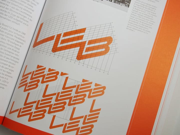
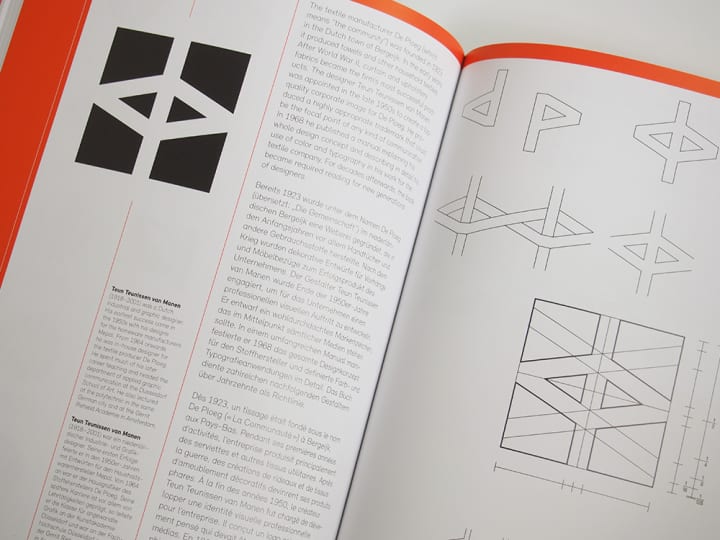
While the logos themselves are the stars of the show, “Logo Modernism” also provides valuable context. The book contains informative essays exploring the history and importance of modernist logo design. These essays examine how cultural and social factors impacted design trends in the mid-20th century. They also highlight the contributions of key designers and design movements.
I found these essays to be incredibly enlightening. They add depth to the visual content and help you appreciate the logos on a deeper level. For instance, the use of negative space in the FedEx logo showcases innovative thinking for its time, emphasizing the importance of understanding historical context in design evolution.
Learning from the Masters
“Logo Modernism” is a masterclass in logo design. By studying the logos in this book, you can learn valuable lessons from some of the greatest designers in history.
Here are a few key takeaways that stood out to me:
- Simplicity is Key : Many of the most effective logos in this book are incredibly simple. They use basic shapes and minimal elements to create a strong visual impact. This simplicity makes them versatile and easy to recognize.
- Consistency and Cohesion : The best logos have a cohesive look and feel. They align with the brand’s identity and communicate its values effectively. Consistency in design elements like color, typography, and shape is crucial.
- Timelessness : Modernist logos have a timeless quality. They avoid trends and fads, focusing instead on fundamental design principles. This timelessness ensures that they remain relevant and effective for years to come.
- Innovation and Creativity : Despite their simplicity, modernist logos demonstrate remarkable creativity. Designers found innovative ways to use shapes, lines, and types to convey complex ideas. This creativity is what makes these logos so memorable.
A Book for Everyone
Whether you’re an experienced designer seeking inspiration or a newcomer eager to learn, “Logo Modernism” offers valuable insights for everyone. For experienced designers, it’s a source of inspiration and a reminder of the power of simplicity. For beginners, it serves as an indispensable educational resource, illuminating the fundamental principles of good design.
Even if you’re not a designer, this book is a joy to explore. The logos are visually stunning, and the historical context adds an extra layer of intrigue. It’s the perfect coffee table book that will spark conversations and impress your guests.
Final Thoughts
As someone who’s been in the design world for a while, “Logo Modernism” holds a special place in my heart. It’s a book I return to time and time again for inspiration and guidance. The logos in this book remind me why I fell in love with design in the first place. They’re a testament to the power of creativity and the impact of good design. It’s more than just a book; it’s a journey through the history of logo design. It’s a celebration of the designers who dared to think differently and create logos that stood the test of time. Whether you’re a seasoned professional or a novice in the field, this book is an essential addition to your design library.
When you’re seeking inspiration, seize the moment and delve into Logo Modernism to immerse yourself in the captivating world of mid-century logo design. Who knows? You might just find the spark you need for your next big project.
Happy designing!
About the Creator
Gading Widyatamaka
Jakarta-based graphic designer with over 5 years of freelance work on Upwork and Fiverr. Managing 100s logo design, branding, and web-dev projects.
Keep reading
More stories from Gading Widyatamaka and writers in BookClub and other communities.
BookReview: Designing Brand Identity by Alina Wheeler
Hello there, fellow designers! If you’re familiar with branding, Designing Brand Identity by Alina Wheeler is familiar. This book is frequently praised as an essential resource for anyone serious about branding. I was eager to go through Wheeler’s observations and add my own as someone who has worked in the trenches of brand design.
By Gading Widyatamakaabout a year ago in BookClub
Rachel Reviews: Lakefront Wolves by Joseph Deegan
Meet Finn. He's an 18 year old kid who has potential. He's bright with great school scores and he's also an athlete, a footballer of some prowess. He has it all going for him, it would seem, and yet, he's determined to send what could be a well-planned, stable existence firmly off the rails. He drinks, he smokes, he takes drugs, he has violent tendencies and he's in danger of losing not only his mind but all that he holds dear.
By Rachel Deeming12 days ago in BookClub


Comments
There are no comments for this story
Be the first to respond and start the conversation.