
Unconventional Fonts That Made Brands Iconic
Redefining Brand Identity with Unconventional Typefaces


This article was first seen on medium.com
A brand’s font does more than display text. It shapes identity, conveys emotion, and strengthens recognition. Some companies have chosen unconventional fonts, setting them apart from competitors and making their logos unforgettable.
1. Futura and Supreme

Supreme uses Futura Heavy Oblique, a bold, slanted typeface. It reflects the brand’s streetwear roots, exuding confidence and energy. The font’s sharp angles match Supreme’s rebellious aesthetic, helping it stand out in the crowded fashion space.
2. Helvetica and American Apparel
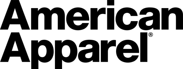
American Apparel embraced Helvetica when other fashion brands leaned on ornate or script fonts. The clean, no-frills typography reinforced the brand’s image of honesty and simplicity. This stark minimalism differentiated American Apparel and became an essential part of its identity.
3. Cooper Black and EasyJet

EasyJet’s use of Cooper Black breaks aviation industry norms. The rounded, thick letters make the airline feel friendly and accessible. Paired with the company’s signature orange, this font reinforces EasyJet’s reputation for affordability and ease.
4. Gotham and Obama’s 2008 Campaign
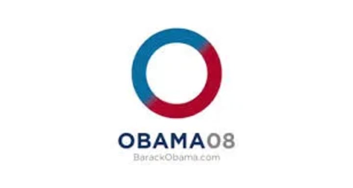
The Obama campaign’s use of Gotham was a game-changer in political branding. The sans-serif font communicated modernity, strength, and reliability. It departed from traditional serif typefaces used in political campaigns, aligning with Obama’s message of change and progress.
5. Brush Script and Instagram
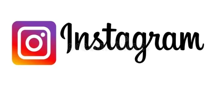
Instagram’s original logo featured a custom version of Brush Script. The casual, handwritten style emphasized creativity and personal expression. This friendly aesthetic helped establish Instagram as a platform for artistic content and community engagement.
6. Spencerian Script and Coca-Cola
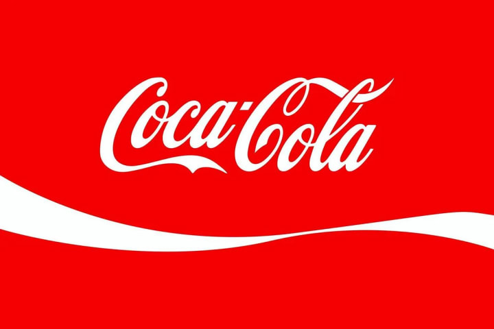
Coca-Cola’s flowing Spencerian script has been its signature since the 19th century. The elegant, cursive design evokes nostalgia and tradition. This timeless font reinforces Coca-Cola’s heritage while maintaining strong brand recognition worldwide.
7. Catull and Google
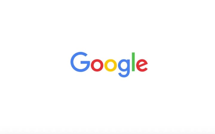
Google’s original logo featured Catull, a serif font with a distinct, quirky elegance. It reflected the brand’s mix of playfulness and innovation. In 2015, Google switched to a custom sans-serif font for better digital readability while keeping its fun, approachable identity intact.
8. City and IBM
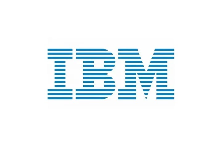
IBM uses City, a bold slab-serif typeface. The heavy, geometric structure conveys strength and reliability. This consistency in typography has helped IBM establish its reputation as a leader in technology and innovation.
9. Waltograph and Disney
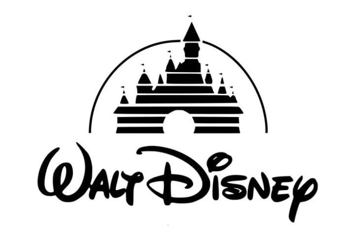
Disney’s font, inspired by Walt Disney’s signature, is instantly recognizable. The whimsical, fluid lettering encapsulates magic and imagination. This font has become synonymous with Disney’s storytelling legacy, resonating with audiences of all ages.
10. Hidden Arrow and FedEx
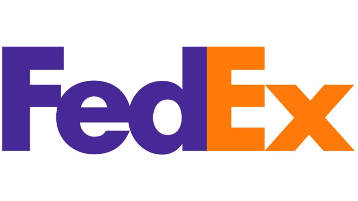
FedEx uses a clean sans-serif font with a hidden arrow between the ‘E’ and ‘x.’ This subtle design element symbolizes speed, direction, and precision. The hidden arrow is a defining feature of FedEx’s branding, reinforcing its logistical expertise.
11. Netflix Sans and Netflix
Netflix developed its custom font, Netflix Sans, to enhance its brand identity across platforms. The modern, minimalist design ensures readability on screens while reinforcing the brand’s digital-first approach to entertainment.
12. Bold and Squared Jeep
Jeep’s rugged, blocky typeface embodies durability and adventure. The bold, squared-off letters match the brand’s off-road, tough image. This font choice speaks directly to Jeep’s audience—outdoor enthusiasts and adventure seekers.
13. Elegant Script and Absolut Vodka
Absolut Vodka’s elegant script conveys sophistication and exclusivity. The refined typography aligns with the brand’s premium status in the spirits market, appealing to consumers who value craftsmanship and style.
14. Bold and Condensed Ray-Ban

Ray-Ban uses a bold, condensed typeface that reflects its timeless and stylish appeal. The confident, compact lettering aligns with the brand’s reputation for classic, high-quality eyewear.
15. Bubbly and Bold Lego
Lego’s logo features a bubbly, bold typeface that reflects playfulness and creativity. The rounded letters create an inviting, fun aesthetic, reinforcing Lego’s position as a leading toy brand for imaginative minds.
The power of an unconventional font choice in branding cannot be overstated. These examples show that when a font aligns perfectly with a brand’s identity and mission, it can enhance recognition, foster brand loyalty, and set a company apart from its competitors. For businesses looking to establish a memorable brand, considering an unconventional font might be the key to success.
When Font Rebrands Go Wrong
Some companies have changed their fonts with disastrous results, proving that typography choices can make or break a brand.
1. Topicana (2009)

Tropicana replaced its familiar script logo with a generic sans-serif font. The redesign confused customers and led to a 20% drop in sales in two months. Tropicana quickly reverted to its original branding.
2. Gap (2010)

Gap replaced its iconic blue-box serif logo with a modern sans-serif design. Public backlash was immediate. Critics argued the new logo lacked personality. Within a week, Gap restored the original logo.
3. London 2012 Olympics

The London 2012 Olympic logo featured an aggressive, jagged typeface. The chaotic design received widespread criticism for being difficult to read and unappealing.
4. Kraft Foods (2009)
Kraft introduced a softer, more colorful logo with a rounded font. Customers felt it looked generic, weakening Kraft’s strong, established identity.
5. Xerox (2008)
Xerox replaced its authoritative serif logo with a lowercase sans-serif type. While intended to modernize the brand, it lost the powerful, established feel of the original design.
6. Animal Planet (2008)

Animal Planet’s rebrand introduced a light, modern font that felt disconnected from the brand’s nature-focused identity. Viewers felt the new look was too corporate and lacked authenticity.
7. Mastercard (2016)

Mastercard’s new sans-serif typeface modernized the brand, but some felt it lost the uniqueness of the previous design. The rebrand received mixed reviews.
8. Seattle’s Best Coffee (2010)

Seattle’s Best Coffee introduced a stark, bold red font. While meant to stand out, it lost the warmth and inviting feel of the original design, alienating loyal customers.
9. Burberry (2018)

Burberry replaced its classic serif logo with a plain sans-serif font. Fans criticized the redesign, arguing it stripped away the luxury and heritage of the brand.
10. Pepsi (2008)

Pepsi’s 2008 rebrand included a new logo and font, but consumers found the redesign unnecessary. The extensive design explanation behind the changes was mocked, making the rebrand more of a marketing misstep than a success.
The Power of Typography in Branding
A well-chosen font can define a brand, while a poor font choice can damage recognition and trust. Successful brands use typography to strengthen their identity, communicate values, and connect with their audience. Before changing a font, businesses must ensure the new design aligns with their image and resonates with customers.
About the Creator
PrintPop
Hey! 👋 Obsessed with turning big ideas into even bigger designs. 🎨🖨️ Off-duty? You’ll catch me with family, outdoors, soaking up nature. 🌲 Come with me for fresh takes on how design meets business. Let’s make things pop!
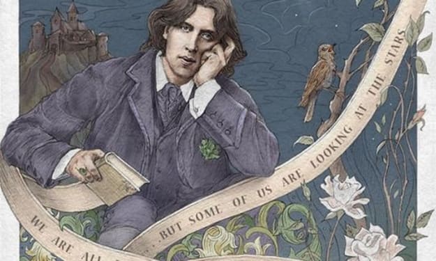
When the Artist Becomes the Art
We like to think we can separate the art from the artist, but can we, really? Art is born from the same place as sin. It mainly emerges from conflict: between what is felt and what is permitted, between the self that is lived and the self that must be hidden. No figure embodies this tension more vividly than Oscar Wilde: a man who transformed his own contradictions into style, wit, and devastating clarity. His novel The Picture of Dorian Gray is not merely a tale of aesthetic decadence but the battleground on which this question is fought.
By Yasmine Lagras4 days ago in Art


Comments
There are no comments for this story
Be the first to respond and start the conversation.