
The Evolution of the Nickelodeon Logo Through the Years
A Journey of Creativity and Innovation in Children's Entertainment Branding

Tracing the Visual Journey Through the Years
As a reputable logo design agency, we recognize the profound impact of brand symbols in shaping entertainment history. Nickelodeon, the beloved children’s television network, stands as a testament to this fact. At the core of its evolution lies its vibrant logo, a visual narrative that has transformed alongside the channel’s journey.
Nickelodeon’s logo history is akin to a compelling narrative, with every transformation serving as a pivotal chapter in the realm of branding excellence. Beginning humbly as Pinwheel in 1977, the journey to its current iconic status illustrates the mastery of a logo design company. The evolution of the Nickelodeon logo mirrors not only the channel’s expansion but also its profound cultural impact.
The Nickelodeon logo holds a cherished spot in the memories of individuals who came of age during the vibrant decades of the 80s and 90s. Its vivid and captivating design not only captured the essence of childhood bliss but also became emblematic of the illustrious era of children’s television, exemplifying the expertise of logo design services.
Since its inception in 1979 as the pioneering cable channel tailored for children, Nickelodeon has reshaped the entertainment panorama. Boasting iconic characters such as SpongeBob SquarePants and a programming lineup that served as inspiration for counterparts like Cartoon Network, Nickelodeon has etched itself into the fabric of popular culture, akin to the lasting impact of superhero logos.
Today, as we delve into Nickelodeon’s rich history and examine its current logo and brand identity, we celebrate its legacy as the ultimate young people’s satellite network. Much like the Amazon logo and Pepsi logo, Nickelodeon’s symbol stands as a beacon of creativity and innovation in the realm of branding and entertainment.
Nickelodeon’s Logo Over Time
The Nickelodeon logo has seen several significant changes since the channel's early days. Each iteration reflects the network's evolving identity and its approach to engaging young audiences.
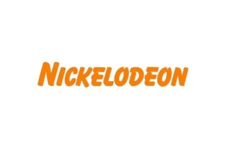
The Original Logo (1979)
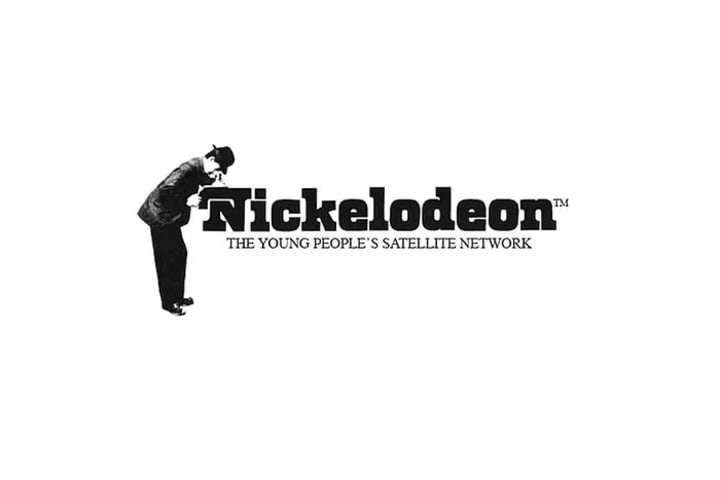
Nickelodeon's first logo, introduced in 1979, featured a black font with a distinctive design element—a man looking through a projector. This classic logo, accompanied by the tagline "The Young People's Satellite Network," represented the channel’s initial educational mission.
The Second Version of Logo (1980–1981)
In 1980, Nickelodeon adopted a more straightforward wordmark design. This version simplified the logo to just the channel's name in a bold typeface. However, this design was short-lived, lasting only a year before being replaced.
The Third Version of Logo (1981–1984)
The early 1980s saw a vibrant redesign by designer Lou Dorfsman. The new logo featured a colorful pinball design, reflecting a playful and child-friendly aesthetic. This version, with its three-dimensional pinball and chunky font, became a memorable representation of Nickelodeon's brand.
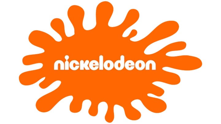
The Fourth Version of Logo (1984–2009)
The 1984 redesign marked a significant shift, introducing an orange and white color scheme symbolizing joy and excitement. Over the next 25 years, Nickelodeon experimented with various logo designs, including the popular orange splash with white lettering. This era cemented the logo's association with the channel’s identity.
The 2009-Current Nickelodeon Logo
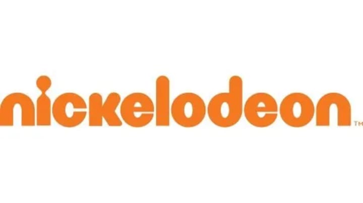
In 2009, designer Eric Zim introduced a new logo, characterized by its lowercase letters and rounded, fun font. The design features a distinctive keyhole-like 'I,' which received acclaim and was even awarded third place in the Brand New Awards 2010. This modern and playful logo continues to represent Nickelodeon today.
Key Elements of the Logo
Several elements define the Nickelodeon logo and contribute to its enduring appeal:
The Hat-Man
The original "hat-man" design was a central feature of Nickelodeon's early branding. This figure, depicted in a black hat and professional attire, symbolized the brand's commitment to quality and expertise.
The Projector
The projector element, integrated into the letter "N," represented Nickelodeon's focus on motion pictures and television. This aspect of the design highlighted the channel's dedication to visual storytelling.
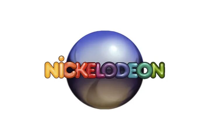
The Globe
In the 1980s, the logo featured a shiny globe resembling a pinball. This design element symbolized Nickelodeon's mission to reach children everywhere with meaningful and entertaining content.
Nickelodeon Logo Color Scheme
The signature orange and white color scheme of the Nickelodeon logo remains a hallmark of its brand identity. This vibrant combination ensures a clean and eye-catching appearance, reinforcing the channel’s energetic and playful image.
Lessons from the Nickelodeon Logo
Be Modest and Memorable
Nickelodeon's logo exemplifies how simplicity can achieve memorability. Its modern yet respectful design manages to leave a lasting impression without being overly flashy—a valuable lesson for any brand.
The Logo Is Unique and Consistent
A unique and consistent logo is crucial for brand recognition. Nickelodeon’s iconic design stands out due to its distinctive features and consistent use across platforms. The channel’s ability to maintain a cohesive brand identity through its logo has contributed significantly to its success.
Famous Nickelodeon Cartoons
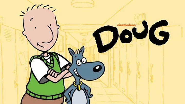
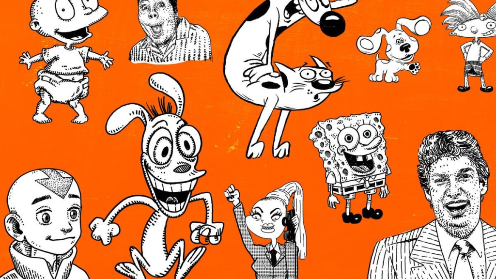
Nickelodeon is renowned for its influential cartoons, including beloved series such as Doug, Hey Arnold!, SpongeBob SquarePants, The Adventures of Jimmy Neutron: Boy Genius, and Danny Phantom. These shows have become integral to the channel's legacy, showcasing memorable characters and imaginative storytelling.
HBO’s Silence and the Dan Schneider Scandal
Despite its success, Nickelodeon has faced controversies, including accusations of mistreatment of children in Hollywood. HBO’s “Quiet On Set: The Dark Side Of Kids TV” uncovered troubling allegations involving inappropriate behavior by adults within the industry, raising concerns about the network's practices.
FAQs
What is the significance of the Nickelodeon logo?
The Nickelodeon logo represents the network’s commitment to children’s entertainment and innovation. Its vibrant orange design embodies the channel’s playful and forward-thinking approach.
How has the Nickelodeon logo evolved over time?
The Nickelodeon logo has undergone six major redesigns since 1977, evolving from a classic purple badge to the sleek orange wordmark of today. Each change reflects the network’s adaptation and growth.
Who designed the iconic Nickelodeon logos throughout history?
Notable designers, including Joseph Iozzi, Lou Dorfman, and Fred–Alan, Inc., have shaped Nickelodeon's visual identity. Their contributions have left a lasting impact on the network’s branding.
What design elements are prominent in Nickelodeon logos?
Prominent elements include the hat-man, the projector, and the globe. The logos also feature sans-serif fonts and vibrant colors, enhancing brand recognition.
How has Nickelodeon influenced the entertainment industry?
Nickelodeon has revolutionized children’s television by offering engaging, educational, and entertaining content. Its innovative approach and iconic programming have significantly impacted the industry.
Conclusion
Nickelodeon’s journey through logo design is a testament to its evolving brand identity and enduring appeal. From its early educational roots to its current status as a leading entertainment network, the Nickelodeon logo has consistently reflected the channel’s commitment to creativity and fun. For businesses seeking to create a memorable logo, platforms like Hatchwise and Flocksy offer valuable resources for design contests and virtual assistance to enhance branding and growth.
About the Creator
Hannah Trucker
I'm a skilled researcher and content writer in Media. At Logo Magicians, I weave magic into brands through engaging narratives. Join me on this enchanting journey where knowledge and creativity converge.
Keep reading
More stories from Hannah Trucker and writers in Art and other communities.
The Evolution of Pizza Hut’s Iconic Logo Through the Years
A Journey Through Time The evolution of the iconic Pizza Hut logo is akin to the transformation of other renowned logos like the Fast food logos. Much like the Amazon logo, Pizza Hut’s emblem has undergone multiple revisions, each reflecting the brand’s journey and identity. These changes were not merely cosmetic; they were strategic decisions made by expert logo design services to align with Pizza Hut’s evolving persona.
By Hannah Truckerabout a year ago in Art
The Best Philosophy in the World Is the One You Can Live
Ask ten philosophers what the best philosophy in the world is, and you will receive at least ten different answers—possibly delivered with footnotes, counterarguments, and mild contempt for the other nine. This disagreement is not a flaw of philosophy; it is its essence. Philosophy was never meant to be a universal prescription handed down like a rulebook. It exists to help human beings live better lives. By that standard, the best philosophy in the world is not the most elegant or complex—it is the one that can be lived.
By Fred Bradford5 days ago in Art
When the Artist Becomes the Art
We like to think we can separate the art from the artist, but can we, really? Art is born from the same place as sin. It mainly emerges from conflict: between what is felt and what is permitted, between the self that is lived and the self that must be hidden. No figure embodies this tension more vividly than Oscar Wilde: a man who transformed his own contradictions into style, wit, and devastating clarity. His novel The Picture of Dorian Gray is not merely a tale of aesthetic decadence but the battleground on which this question is fought.
By Yasmine Lagrasabout 9 hours ago in Art


Comments (1)
Awesome Article!