
Radiant Harmony
An Exploration of Color, Symbolism, and Light


"Radiant Harmony: An Exploration of Color, Symbolism, and Light"
In this work, I wanted to create a visual representation of the profound and enduring ideal of peace. The piece, titled Radiant Harmony, is a mixed-media exploration that uses a combination of acrylics and pastels to bring a timeless symbol to life with vibrant energy. The central element is the iconic peace sign, rendered in a deep, contemplative purple. This color choice isn't accidental; purple often represents wisdom, dignity, and spirituality, which I believe are intrinsic to the true pursuit of peace. The symbol itself is composed of three distinct lines within a circle, representing the universal message of non-violence and disarmament. The lines are purposefully not perfectly straight or uniform, giving them a hand-drawn, organic quality that feels personal and accessible. The texture is a key component, with the canvas weave visible through the layers of paint, adding a tactile dimension and grounding the abstract idea in a physical reality. This texture also gives the sense that the peace sign is not a static, clean-cut logo but a living, breathing concept, constantly in a state of becoming. The edges of the purple symbol are slightly blurred and softened, as if vibrating with an inner light, and they seem to meld into the background, suggesting that the concept of peace is not a separate entity but an integral part of the world around us.
The Palette of Hope
The background is a dynamic wash of color, a carefully orchestrated symphony of hues that radiates outward from the center. I used a warm, sunny palette of yellows, oranges, and greens, which I believe are colors of hope, renewal, and life. The central orange and yellow tones form a warm, fiery core, suggesting the passionate human spirit and the energy required to create change. This central burst of color acts as a kind of sun, emanating a light that illuminates the purple peace sign. The concentric circles of color are reminiscent of a halo or an aura, a visual metaphor for the positive energy that peace radiates. The outer ring of the background is a lighter, more ethereal yellow and green, almost like a whisper of new growth and natural tranquility. This transition from the intense, fiery core to the cooler, more serene edges symbolizes the journey toward peace—it's a process that begins with a passionate commitment and culminates in a state of calm and harmony. The use of pastels over the acrylic base adds a soft, almost glowing quality, diffusing the colors and creating a sense of gentle luminescence. The interplay of these colors creates a feeling of optimism and warmth, inviting the viewer to step into a space of hope and possibility.
Symbolism and Subtext
While the peace sign is the most overt symbol, the painting is filled with subtle layers of meaning. The concentric circles of color, for instance, are a visual echo of ripples in water, suggesting that a single act or idea of peace can expand outward, affecting a wider and wider circle of people. The vibrant and textured background represents the complexity and chaos of the world, and the peace sign, while embedded within it, stands out as a clear, guiding principle. The auras of color around the symbol can be interpreted as a protective energy field, a barrier against negativity and conflict. The choice of purple for the symbol itself, a color often associated with royalty, elevates the concept of peace from a simple idea to a noble and sovereign principle. The visible brushstrokes and the deliberate texture of the canvas are a testament to the human element in the pursuit of peace. This isn't a digitally perfect, sterile image; it's a piece of art that bears the mark of human effort and intention, reflecting the fact that peace is something we must actively and mindfully create. The organic, slightly imperfect nature of the symbol and the background together create a sense of authenticity and sincerity, as if to say that genuine peace is not about flawless perfection but about the beauty of our shared, imperfect humanity.
A Call to Contemplation
Ultimately, Radiant Harmony is more than just a painting; it's an invitation. It invites the viewer to pause and contemplate the true meaning of peace, not as a political slogan, but as a deeply personal and spiritual state of being. The luminosity of the piece is intended to be a beacon of hope, a reminder that even in a world that can feel chaotic and divided, the pursuit of peace is a powerful and radiant force. The artwork serves as a visual meditation, encouraging us to find the calm at the center of the storm and to radiate that tranquility outward. It's a tribute to the enduring power of positive symbolism and the capacity of art to inspire and uplift. My hope is that this piece resonates with viewers, reminding them that peace, like light, can penetrate even the darkest corners and that its message is as timeless and essential today as it has ever been.
About the Creator
Slgtlyscatt3red
Slightly scattered. Just a woman with autism and ADHD that loves to write poetry, create art, and sing.
Keep reading
More stories from Slgtlyscatt3red and writers in Art and other communities.
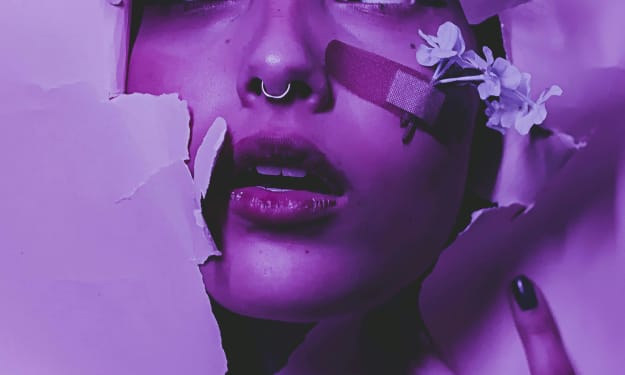
“Message”
"Message": An Exploration of Inner Radiance and Affirmation As an artist, my aim is to create works that resonate deeply with the viewer, offering both aesthetic pleasure and a moment of introspection. My piece, "Message," is a vibrant digital collage designed to encapsulate the profound beauty found within oneself and the world around us, while delivering a direct affirmation of self-worth. This work explores themes of natural splendor, personal growth, and the power of positive self-talk, all interwoven into a visually rich tapestry. Through a careful selection of imagery and strategic use of color and light, "Message" invites viewers to pause, reflect, and embrace their inherent value.
By Slgtlyscatt3red6 months ago in Art
'Till Death We Do Art
There would be nothing divine in this world without art. Nature may surpass the divine to all intents and purposes, but like everything it absorbs and is absorbed by, it remains here, stuck on the surface of this world, ever-present, physically bound to the universe.
By Avocado Nunzella BSc (Psych) -- M.A.P 12 days ago in Art


Comments
There are no comments for this story
Be the first to respond and start the conversation.