
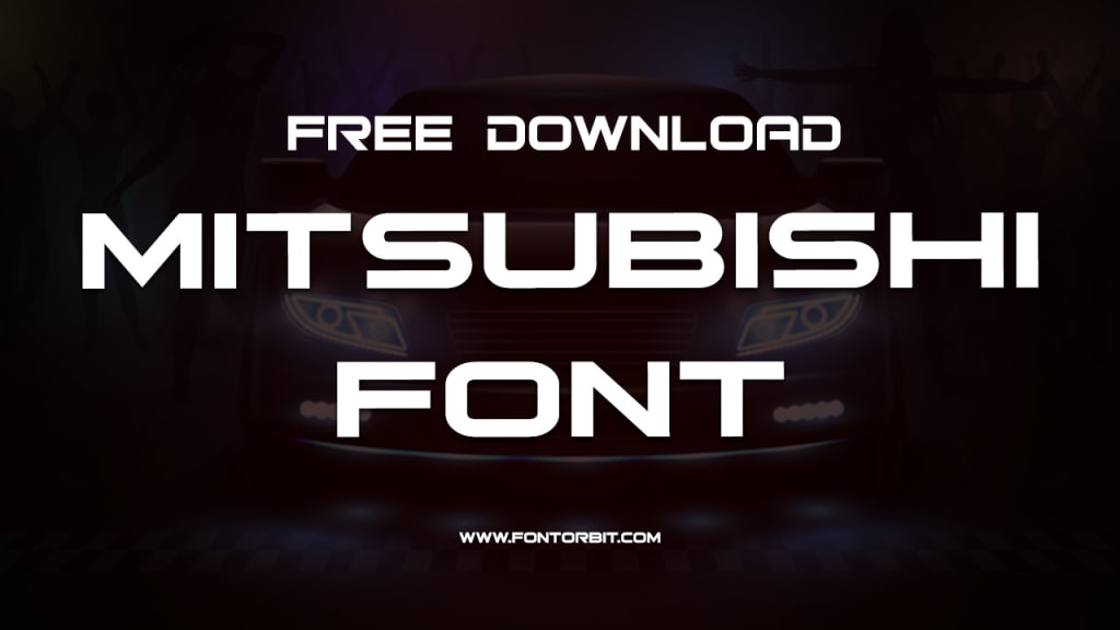
Mitsubishi Font: A Brand Identity Masterpiece
Mitsubishi Font

Mitsubishi, a globally recognized name in the automotive and electronics industries, is synonymous with innovation and reliability. While much attention is often given to its engineering marvels, the visual identity of the brand, particularly the Mitsubishi font, plays a pivotal role in shaping its perception worldwide. This article delves into the design, history, and influence of the Mitsubishi font, highlighting its significance in modern branding.
The Significance of Typography in Branding
Typography is more than just the art of arranging type; it is a powerful tool for communicating a brand's values and identity. For Mitsubishi, the choice of font reflects its ethos of precision, strength, and modernity. A well-designed typeface ensures brand recall and fosters an emotional connection with its audience. In the case of Mitsubishi, the font used in its logo and corporate materials is as iconic as the three-diamond emblem it accompanies.
Design Characteristics of the Mitsubishi Font
The Mitsubishi font is a custom-designed typeface that embodies the brand's characteristics. Here are some of its key design attributes:
Bold and Geometric Style: The font features clean lines and geometric shapes, symbolizing strength and reliability.
Sans-Serif Design: This modern choice reflects simplicity and efficiency, aligning with Mitsubishi's forward-thinking approach.
Custom Modifications: Unlike generic typefaces, the Mitsubishi font has custom tweaks to ensure a unique identity, such as slightly rounded edges that add a touch of sophistication.
Balanced Proportions: The typeface ensures readability and aesthetic harmony, making it versatile for both digital and print media.
History and Evolution of the Mitsubishi Font
Mitsubishi's typography has evolved over the years, adapting to changing trends while maintaining its core identity. Initially, the brand relied on traditional serif fonts common in corporate settings during the early 20th century. However, with the rise of modern design philosophies, Mitsubishi transitioned to a sleek, sans-serif font that resonated with global audiences. This shift marked the brand's commitment to staying contemporary while honoring its heritage.
Applications of the Mitsubishi Font
The Mitsubishi font is used extensively across the brand's touchpoints:
Corporate Logo: The typeface seamlessly integrates with the iconic three-diamond logo.
Marketing Materials: From brochures to advertisements, the font ensures consistency.
Product Branding: Vehicle emblems and electronic products often feature this font to reinforce brand identity.
Digital Platforms: The typeface adapts well to websites, apps, and other digital media.
Conclusion
The Mitsubishi font is more than just a typeface; it is a reflection of the brand’s identity. Through its thoughtful design and strategic applications, it communicates the values of strength, innovation, and reliability that Mitsubishi stands for. As the brand continues to evolve, its font remains a timeless element, bridging the gap between tradition and modernity.
FAQs About Mitsubishi Font
What font does Mitsubishi use in its logo?
Mitsubishi uses a custom-designed sans-serif font tailored to align with its brand identity. The font is not publicly available for general use.
Can I download the Mitsubishi font?
No, the Mitsubishi font is proprietary and not available for public download or commercial use.
Why is typography important for brands like Mitsubishi?
Typography conveys a brand's personality and ensures consistency across its visual communication, enhancing brand recall and trust.
Has Mitsubishi's font changed over the years?
Yes, Mitsubishi’s font has evolved to stay relevant with modern design trends while maintaining its core identity.
What makes the Mitsubishi font unique?
The font’s custom design, with its bold, geometric, and sans-serif characteristics, reflects Mitsubishi’s values of strength, innovation, and precision.
Where is the Mitsubishi font used?
The font is used in the corporate logo, marketing materials, product branding, and digital platforms.
Can the Mitsubishi font be replicated?
While similar fonts may exist, replicating the Mitsubishi font’s exact design is challenging due to its custom modifications and proprietary nature.
About the Creator
Jillur Rahaman
Jillur Rahman is the creative mind behind FontOrbit. This website is a vibrant hub for typography enthusiasts. With a CSE degree and over a decade of experience in web design & development, Jillur got passion for sharing knowledge.
Keep reading
More stories from Jillur Rahaman and writers in Art and other communities.
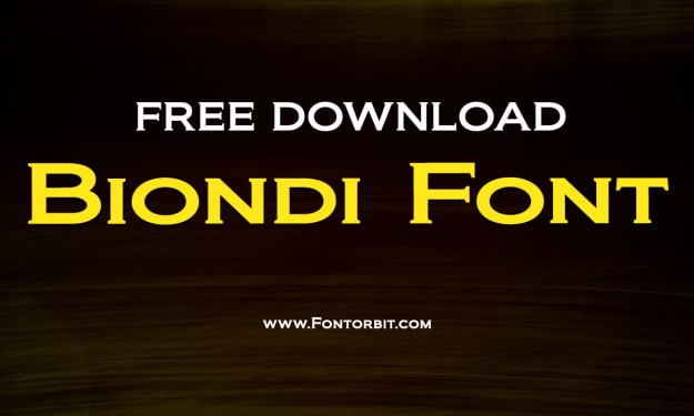
Biondi Font: A Timeless Typeface for Modern Designers
The world of typography is vast and ever-evolving, with countless fonts catering to a variety of design needs. Among these, the Biondi font has carved a niche for itself as a sophisticated and versatile typeface. This article delves into the origins, features, and applications of the Biondi font, offering insights into why it remains a favorite among designers.
By Jillur Rahamanabout a year ago in Art
In the Name of Allah
Ahmad Raza was a children’s author who specialized in mystery and detective stories. His tales were filled with suspense and wonder, captivating readers of all ages. At home, besides him, only one trustworthy servant, Akram, managed the household. Ahmad Raza’s wife had passed away years ago, and their only son, a doctor, lived in the United Kingdom.
By Sudais Zakwan2 days ago in Art


Comments
There are no comments for this story
Be the first to respond and start the conversation.