
How to Design a Neubrutalist Website (Without Scaring Users Away)
Master the art of bold design without sacrificing usability—your guide to creating impactful, user-friendly neubrutalist websites.

Neubrutalism is making waves in digital design circles, praised for its unapologetically raw aesthetic and bold presence. But with great power comes great responsibility. The sharp edges, harsh contrasts, and overwhelming visuals that define neubrutalism can easily alienate users if not executed thoughtfully. If you're looking to incorporate bold design trends without sacrificing user experience, consider exploring professional UI/UX design services to guide your creative direction. In this guide, we'll show you how to create a neubrutalist website that’s visually striking and user-friendly—balancing creativity with usability.
What is Neubrutalism in Web Design?
Neubrutalism is a modern reinterpretation of brutalism in web design, which originally drew inspiration from mid-20th-century architecture characterized by raw materials and a stripped-down aesthetic. Where traditional brutalism in web design embraced minimalism in a rigid, often jarring way, neubrutalism reimagines it with a colorful, digital twist.
Origins and Evolution of Neubrutalism
Brutalism first entered the web design scene as a counter-movement to the glossy, overly-polished interfaces of mainstream websites. Neubrutalism evolved from this ethos, adding vibrancy, playfulness, and a more structured approach while retaining the stark honesty of its predecessor.
Key Characteristics of Neubrutalist Design
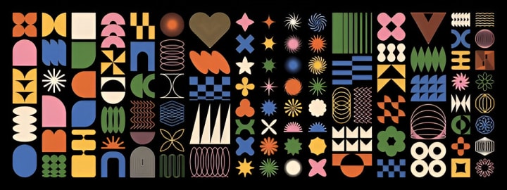
Bold Colors and Typography: Neubrutalist websites favor vibrant, almost clashing color schemes and large, attention-grabbing fonts.
High-Contrast Layouts: The contrast between UI elements isn’t just visual—it’s philosophical, creating a jarring but memorable user experience.
Intentionally Harsh UI Elements: Exposed grids, unstyled buttons, and raw edges are not design flaws—they’re the features.
Why Neubrutalism Works (When Done Right)
While neubrutalism can seem chaotic at first glance, when applied with finesse, it delivers a powerful, purposeful aesthetic. Here’s why this sustainable web design trend is gaining traction:
Breaking Through the Clutter
In an age where websites tend to look and feel the same, neubrutalism stands out. Its uniqueness grabs attention, giving brands a distinct identity.
Creating Memorable User Experiences
Neubrutalist sites are anything but boring. The bold visuals and interactive elements linger in users’ minds, increasing recall and return visits.
Standing Out Without Compromising Usability
When executed thoughtfully, neubrutalism balances its aggressive aesthetic with clean navigation and clear call-to-actions, maintaining user engagement.
Common Mistakes That Drive Users Away
Neubrutalism can be a double-edged sword. These are some common pitfalls that can quickly turn users off:
Overwhelming Color Palettes
Too many clashing colors can make your site painful to look at. Bold doesn’t mean garish—choose a few strong colors and stick to them.
Ignoring Basic UX Principles
Users still expect to find navigation menus, search bars, and clickable buttons. Ignoring these in favor of "art" will backfire.
Making Accessibility an Afterthought
High contrast can be a plus for accessibility—but only if used wisely. Avoid combinations that hinder readability or make interaction difficult.
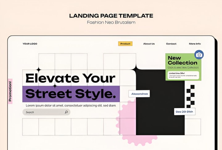
How to Design a User-Friendly Neubrutalist Website
Here’s how to create a site that leverages the boldness of neubrutalism while ensuring it’s accessible and pleasant to use.
Prioritize Readability and Navigation
Use Bold Fonts With Care
Big fonts are central to the neubrutalist aesthetic, but legibility is still key. Avoid over-decorative typefaces that hinder reading.
Structure Layouts for Intuitive Flow
Despite the chaos in visuals, the user journey should remain simple and straightforward.
Balance Harsh Aesthetics with Functional UI
Mix boldness with clarity—contrast heavy visuals with clean, easy-to-understand actions and labels.
Incorporate Microinteractions for Usability
Hover effects, subtle animations, and scroll cues can bring personality without overwhelming the user.
Mobile Responsiveness and Performance
A site can’t be sustainable or user-friendly if it doesn’t perform well on mobile. Optimize for speed and responsiveness from the start.
Tools and Frameworks to Achieve the Neubrutalism Look
You don’t have to start from scratch. Several tools can help you build a neubrutalist design efficiently:
Figma & Adobe XD Templates
These design tools offer customizable templates and UI kits with neubrutalist themes.
CSS Frameworks and Libraries (e.g., Tailwind CSS)
Frameworks like Tailwind make it easy to implement bold styling choices with utility-first classes.
Fonts, Color Palettes, and Icon Packs
Resources like Google Fonts and Coolors help you select readable yet bold typography and color schemes.
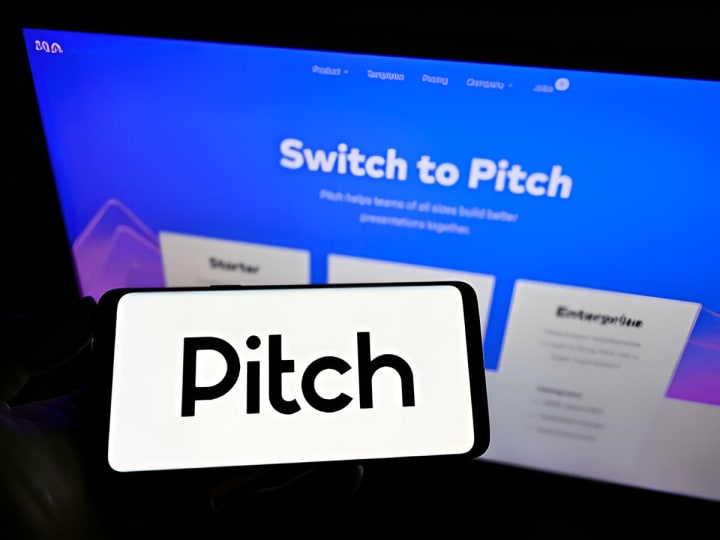
Inspiring Examples of Neubrutalist Websites
What They Got Right
Pitch.com: Their use of color, structure, and interactivity exemplifies how neubrutalism can enhance UX.
Figma’s Blog: A masterclass in combining flat, bold design with smart content hierarchy.

Lessons You Can Apply to Your Projects
Consistency in boldness breeds trust.
Navigation should never feel like a maze—even in an avant-garde layout.
Final Thoughts: Bold Doesn’t Mean Broken
Neubrutalism is not about being anti-user—it’s about being pro-expression and pro-function. This sustainable web design trend offers a creative, memorable alternative to cookie-cutter websites. The key is balance: understand the rules before you break them, and always design with the user in mind.
By embracing the core principles of neubrutalism—while respecting usability—you can craft a website that’s not only a visual statement but also a functional, compelling user experience.
So go ahead—design boldly, but wisely. Neubrutalism isn’t just a trend. It’s a digital design philosophy whose time has come.
About the Creator
Keep reading
More stories from James Paker and writers in Art and other communities.
10 Stunning Ways Stationery Design Services Can Transform Your Brand
In today’s highly competitive marketplace, businesses must go beyond a catchy logo or a sleek website to stand out. One of the most overlooked yet incredibly impactful tools is stationery design services. Whether you're a startup or a seasoned enterprise, investing in professional stationery design can enhance your brand’s visibility, trust, and professionalism.
By James Paker10 months ago in Art
'Till Death We Do Art
There would be nothing divine in this world without art. Nature may surpass the divine to all intents and purposes, but like everything it absorbs and is absorbed by, it remains here, stuck on the surface of this world, ever-present, physically bound to the universe.
By Avocado Nunzella BSc (Psych) -- M.A.P 15 days ago in Art
Ken Wolverton
By Brian D’Ambrosio Along a dusty roadside of Cerrillos, connected weathered shacks lean into the landscape like a creature molded from the earth itself. Its walls are alive with color: horses rearing across mesas, dreamlike murals, and abstract forms that seem to vibrate with movement. Inside, brushes slant in jars, canvases are stacked against walls, and unfinished murals climb wooden planks. This is the world of Ken Wolverton, an 80-year-old artist whose life has been as itinerant and unconventional as the art he creates.
By Brian D'Ambrosio 4 days ago in Art


Comments
There are no comments for this story
Be the first to respond and start the conversation.