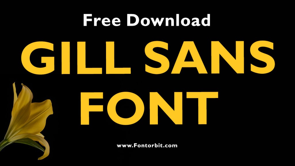
Gill Sans Font: An Iconic Typeface with Timeless Appeal
Gill Sans Font

Gill Sans is one of the most iconic typefaces in the world of typography. Designed by British artist and type designer Eric Gill in 1928, it has gained a reputation as a versatile and elegant sans-serif font. Whether used in print, digital media, or branding, Gill Sans has a distinct personality that has stood the test of time.
Origins and Design Philosophy
Gill Sans was commissioned by Monotype Corporation and first appeared in 1928. Eric Gill drew inspiration from classic Roman letterforms and the signage he created for a London bookstore. The font combines a modern sans-serif aesthetic with a humanist touch, making it both approachable and sophisticated.
The design of Gill Sans emphasizes simplicity and clarity. It features:
Balanced Proportions: The even weight distribution and open counters enhance readability.
Humanist Roots: Subtle curves and varying stroke weights give the font a warm, human quality.
Versatility: Available in a wide range of weights and styles, Gill Sans is suitable for headlines, body text, and everything in between.
Applications of Gill Sans
Gill Sans has been widely adopted across various industries due to its adaptability. Some of its prominent uses include:
Branding: Companies like the British Railways and BBC have used Gill Sans to establish a modern and professional image.
Editorial Design: The font’s readability makes it an excellent choice for magazines, books, and newspapers.
Signage: Its clarity and neutrality have made it a favorite for public signage, particularly in the UK.
Digital Media: Gill Sans translates well to screens, maintaining its elegance and legibility in digital formats.
Strengths and Criticisms
While Gill Sans has many strengths, it is not without its criticisms:
Strengths:
Timeless aesthetic suitable for diverse applications.
Extensive variety of weights and styles.
High readability and elegant proportions.
Criticisms:
Some typographers argue that its design lacks consistency, particularly in the letterforms.
Limited support for non-Latin scripts, which restricts its global usability.
Its overuse in some contexts has led to a perception of it being cliché or overexposed.
Notable Variants
Monotype has released various versions of Gill Sans to cater to different design needs:
Gill Sans Nova: An updated version with additional weights, styles, and enhanced character support.
Gill Sans Shadow: A decorative style with a shadow effect, often used in display contexts.
Conclusion
Gill Sans remains a masterpiece of 20th-century typography, admired for its clean design and timeless appeal. Despite some criticisms, it continues to be a favorite among designers for its versatility and elegance. Whether in traditional print or modern digital applications, Gill Sans offers a balance of form and function that few fonts can match.
FAQs About Gill Sans Font
1. Who designed the Gill Sans font?
Gill Sans was designed by Eric Gill, a British artist and type designer, in 1928.
2. What are the main characteristics of Gill Sans?
Gill Sans is known for its balanced proportions, humanist influences, and versatility across different weights and styles.
3. Where is Gill Sans commonly used?
It is widely used in branding, editorial design, signage, and digital media due to its readability and timeless aesthetic.
4. What are some criticisms of Gill Sans?
Critics point out inconsistencies in its letterforms and limited support for non-Latin scripts. Additionally, some consider it overused.
5. Are there modern versions of Gill Sans?
Yes, Gill Sans Nova is an updated version that includes additional weights, styles, and improved character support.
6. Is Gill Sans free to use?
Gill Sans is a licensed font available through Monotype and cannot be used freely without proper licensing.
7. What makes Gill Sans unique?
Its blend of classic Roman letterforms and modern sans-serif design gives it a warm yet professional quality, making it distinct from other typefaces.
About the Creator
Jillur Rahaman
Jillur Rahman is the creative mind behind FontOrbit. This website is a vibrant hub for typography enthusiasts. With a CSE degree and over a decade of experience in web design & development, Jillur got passion for sharing knowledge.


Comments
There are no comments for this story
Be the first to respond and start the conversation.