
Are Your Cereal Boxes Helping or Hurting Sales?
Is your cereal box design boosting or killing your sales? Discover the key elements, common mistakes, and latest trends in packaging that influence buyer decisions and drive conversions in the cereal aisle.


Introduction
Ever bought a cereal just because the box looked good? You're not alone. The truth is, cereal boxes are silent salespeople. They speak directly to our emotions, values, and cravings—sometimes more loudly than the cereal inside ever could. So, the big question is: Is your cereal box helping or hurting your sales?
Let’s dig deep into the packaging psychology, industry trends, and actionable insights to help you find out.
The Role of Packaging in Consumer Decision-Making
First Impressions Matter
Cereal aisles are like battlefields—hundreds of boxes fighting for a shopper’s attention. You’ve got mere seconds to catch someone’s eye. That’s why your cereal box design is everything. A bland or outdated box blends in and gets ignored. A vibrant, clever one pops off the shelf.
The Science Behind Eye-Level Placement
Ever noticed how certain cereals always seem to be right at eye level? That’s no coincidence. Brands pay extra for that prime real estate. But even if you’re not eye-level, your design can still pull in glances—if it's made to be visually sticky. Think bold colors, large readable text, and emotionally engaging visuals.
Elements of a High-Converting Cereal Box
Color Psychology in Packaging
Colors don’t just decorate your box—they persuade. Red and yellow trigger appetite (think: McDonald's), while green shouts "healthy." For kids, bright colors win. For adults, earth tones and clean designs build trust. Color choices should align with your brand and your buyer’s mindset.
Typography and Readability
Ever picked up a cereal box and squinted to read the name? Bad move. Fonts need to be bold, legible, and match the brand's tone. Fun and bubbly fonts work great for kids’ cereals. Sleek and modern fonts suit adult health-conscious lines. Keep it readable from a distance.
Imagery and Mascots
A smiling cartoon tiger? A magical leprechaun? These aren't just cute gimmicks—they're marketing powerhouses. Mascots create emotional bonds, especially with children. A familiar face on a box can turn a kid’s “want” into a parent’s “buy.”
Clear Branding and Messaging
Consumers are busy and distracted. Your box has seconds to deliver its message: What is this cereal? Is it tasty? Is it healthy? Make your brand name prominent. Include clear value props like “high fiber” or “no added sugar.” Transparency builds trust and drives sales.
Common Packaging Mistakes That Kill Sales
Overloading the Design
Cramming in too much text, graphics, and features? That’s a one-way ticket to visual chaos. Consumers don’t want to decipher a cereal box packaging—they want instant clarity. Use white space to balance the design. Less really is more.
Misleading or Confusing Messaging
Nothing kills trust faster than false promises. Saying “all-natural” when it’s not? Bad move. Highlighting “sugar-free” when it’s loaded with substitutes? You’ll lose loyal buyers. Keep your claims honest and verifiable.
Ignoring Target Audience
Designing a sugary kids’ cereal like it’s a health food? That’s a mismatch. Know your audience. Use imagery, language, and design that appeals to them. Otherwise, you're just wasting shelf space.
Trends in Cereal Box Design
Eco-Friendly Packaging
Sustainability isn’t a trend—it’s a demand. More shoppers care about recyclable, compostable, or reduced-plastic packaging. Brands that showcase eco-conscious materials or certifications are gaining favor, especially among Millennials and Gen Z.
Minimalism vs. Maximalism
Minimalism—simple fonts, clean design—is hot in health and luxury segments. Maximalism—color explosions, quirky fonts—is thriving in kid-friendly spaces. Choose the style that best speaks to your target buyer’s vibe.
Interactive and Augmented Packaging
Want to keep customers engaged? Add a QR code that links to games, stories, or brand videos. Even AR experiences are being used to turn boxes into fun, educational, or immersive tools. It's not just a box anymore—it's a platform.
Case Studies: Winners and Losers in Cereal Box Design
Brands That Nailed It
Cheerios, for instance, masters simplicity. The yellow box, the single-loop imagery, the health-centered messaging—everything works. On the flip side, Lucky Charms uses a nostalgic mascot and magical theme to remain top-of-mind with kids.
Packaging Fails
Remember when a major brand tried a sleeve black box to stand out? It flopped—miserably. Parents thought it looked more like a luxury electronics box than a cereal. Lesson? Stand out, but don’t alienate your audience.
How to Audit Your Own Cereal Box Design
Key Questions to Ask
- Does it stand out from 6 feet away?
- Can I read the main message in 3 seconds?
- Does it look like it belongs in this category?
If the answer is “no” to any, it’s time to revisit your design.
Gathering Customer Feedback
Use A/B testing with mock-up boxes in stores or online. Run quick surveys with your audience. You’ll be surprised how much valuable insight you can get just by asking.
Conclusion
Your cereal box isn’t just packaging—it’s your silent pitchman. Done right, it grabs attention, builds trust, and drives impulse buys. Done wrong, it repels, confuses, or simply disappears into the background. Audit your design. Listen to your customers. Keep it clear, fun, and functional. And remember: In the cereal aisle, the best-looking box often wins.
About the Creator
Larry Clark
I am a dedicated and skilled professional specializing in custom packaging solutions. With a deep understanding of packaging design, I focus on creating high-quality, tailored boxes for cakes, food, and cosmetics.
Keep reading
More stories from Larry Clark and writers in Art and other communities.
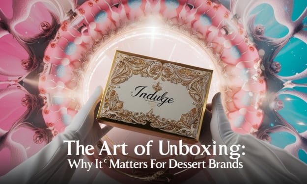
The Art of Unboxing: Why It Matters for Dessert Brands
Introduction In today’s competitive dessert market, standing out requires more than just delicious treats. Customers crave an immersive brand experience, and one of the most impactful ways to deliver this is through thoughtful unboxing moments.
By Larry Clark10 months ago in Art
'Till Death We Do Art
There would be nothing divine in this world without art. Nature may surpass the divine to all intents and purposes, but like everything it absorbs and is absorbed by, it remains here, stuck on the surface of this world, ever-present, physically bound to the universe.
By Avocado Nunzella BSc (Psych) -- M.A.P 25 days ago in Art
The Rise of Decentralized Social Media and What It Means for Content Creators
For most of the past two decades, a small number of centralized platforms have dominated the social media landscape. Companies like Facebook, Instagram, X (formerly Twitter), and TikTok built massive ecosystems that attracted billions of users, but they did so under a model where the platform holds ultimate control over content, data, and revenue distribution. Creators who poured time and energy into building audiences on these platforms often found themselves at the mercy of opaque algorithms, sudden policy changes, and revenue-sharing structures that heavily favored the platform itself.
By Chaturbateme3 days ago in Art


Comments
There are no comments for this story
Be the first to respond and start the conversation.