
Abril Fatface Font: A Stylish and Bold Typeface
Abril Fatface Font

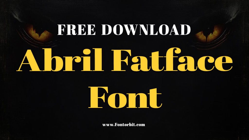
The Abril Fatface font is a popular typeface known for its bold, stylish, and elegant design. A member of the "fat face" genre of fonts, Abril Fatface combines the best qualities of both modern and traditional serif fonts, offering an impressive visual appeal that works well in a variety of design contexts.
Its heavy weight and large, round serifs give it a strong, commanding presence, making it ideal for projects that require attention-grabbing typography. Whether used for headlines, branding, or advertising, Abril Fatface adds an element of sophistication and drama to any design.
History and Characteristics of Abril Fatface
The Abril Fatface font was designed by Argentine type designer Veronika Burian and Czech designer José Scaglione. It was released in 2011 as part of the "Abril" type family. The font's design was inspired by the classic fat face styles that emerged in the 19th century, which were often used for advertising in newspapers and posters.
Abril Fatface is a display serif font characterized by its high contrast between thick and thin strokes, and its rounded, bold serifs. Its letterforms have a modern touch, while still maintaining a traditional feel due to the influence of the classic fat face typefaces. The font is ideal for large-size displays such as titles, headings, and branding, as its dramatic appearance ensures it stands out even from a distance.
Why Use Abril Fatface Font?
Attention-Grabbing: Abril Fatface’s heavy, bold weight is perfect for making statements in large typography. Whether it's for a product name, headline, or advertisement, this font is designed to grab attention.
Elegant and Modern: While the font maintains a traditional fat face design, its modern twists make it a versatile choice for contemporary projects. It's elegant, stylish, and adds a touch of sophistication to any design.
Versatile: Despite its boldness, Abril Fatface works well across various types of media, including print and digital platforms. Its readability is excellent at larger sizes, while its distinct style ensures it remains legible in more refined layouts.
Free for Use: Abril Fatface is available for free through Google Fonts, making it accessible for both personal and commercial use.
Applications of Abril Fatface Font
Headlines and Titles: The most common application for Abril Fatface is in large-scale headlines, where its boldness ensures visibility and impact.
Branding: Many brands use this font for their logos or primary text elements due to its ability to make an impression.
Posters and Advertisements: Abril Fatface’s high contrast and attention-grabbing design make it a perfect choice for advertisements and poster designs.
Web Design: With its elegant appearance and legibility, it is often used in web headers and banners.
Conclusion
Abril Fatface is a unique and striking typeface that combines the boldness of fat face fonts with a modern sensibility. Its high contrast, large serifs, and elegant curves make it ideal for projects that need a touch of drama, whether for print, digital media, or branding. It is a versatile and stylish option for any designer looking to create bold, eye-catching typography.
FAQs About Abril Fatface Font
Is Abril Fatface free to use?
Yes, Abril Fatface is free to use for both personal and commercial projects. It can be downloaded from Google Fonts.
What is Abril Fatface commonly used for?
Abril Fatface is commonly used for headlines, titles, branding, and advertisements. Its bold and eye-catching design makes it ideal for any project requiring strong typography.
Can I use Abril Fatface for body text?
Abril Fatface is a display font, meaning it is designed for large-size use. It is not recommended for body text, as it may not be legible at smaller sizes.
Is Abril Fatface suitable for print design?
Yes, Abril Fatface is an excellent choice for print design, especially for posters, magazine covers, and other materials where large headlines or titles are needed.
Can Abril Fatface be used for web design?
Absolutely! Abril Fatface works well for web design, especially for headers and banners. It’s available on Google Fonts, making it easy to implement in websites.
About the Creator
Jillur Rahaman
Jillur Rahman is the creative mind behind FontOrbit. This website is a vibrant hub for typography enthusiasts. With a CSE degree and over a decade of experience in web design & development, Jillur got passion for sharing knowledge.
Keep reading
More stories from Jillur Rahaman and writers in Art and other communities.
Project Hail Mary
The anticipation for the Project Hail Mary film adaptation in 2026 is absolutely massive! Andy Weir’s story is a masterclass in 'competence porn,' and seeing Ryland Grace brought to life on the big screen is going to be a cinematic treat. Translating that level of scientific problem-solving to film is a highly strategic process—much like the focus and timing required in a top-tier ice fishing slot game in the UK—you have to get every detail right to make the 'catch' truly satisfying for the audience
By StanleyGreen4 days ago in Art


Comments (1)
Heyo✨ Let's do a teamwork I like your stories and you gonna like mine 🫶🏻♥️