
9 Common Mistakes to Avoid When Using Business Card Mockups
Common Mistakes to Avoid When Using Business Card Mockups


Business card mockups are a fantastic way to showcase your designs in a realistic and professional manner. They help you visualize how your business card will look once printed and can elevate presentations, portfolios, and marketing materials. However, despite their simplicity, there are several common mistakes that can diminish the impact of your mockups. In this blog, we’ll explore these mistakes and how to avoid them, ensuring you create stunning visuals every time.
Neglecting High-Quality Templates
One of the most frequent mistakes is using low-resolution or poorly designed templates. High-quality mockup templates are essential for showcasing your design in the best possible way. A blurry or pixelated mockup can make even the best business card design look unprofessional. Always choose templates from reliable sources or platforms like Mockey, which provides high-resolution business card mockup options tailored to various styles and industries.
Overlooking Proper Alignment
Alignment issues can ruin the overall look of your business card mockup. If your design elements are not properly aligned within the mockup, it creates a sense of imbalance and disorder. Make sure all text, logos, and graphical elements are perfectly positioned and proportioned. Many mockup templates use Smart Objects, which allow you to place and adjust your design seamlessly within the frame.
Ignoring Realistic Lighting and Shadows
Lighting and shadows play a crucial role in making your mockup look realistic. Some users skip this step, resulting in flat and unconvincing visuals. Ensure the lighting in your mockup complements your design and adds depth. If your mockup template doesn’t include realistic shadows, you can manually add them in tools like Photoshop. This small detail can make a significant difference.
Using Inappropriate Backgrounds
The background of your mockup can either enhance or distract from your design. Using overly busy or irrelevant backgrounds can draw attention away from your business card. Choose a clean and simple background that complements your brand’s identity. For instance, a solid color, gradient, or subtle texture can work well without overpowering your design.
Not Customizing the Mockup
Another common mistake is failing to customize the mockup to align with your branding. While many mockup templates are pre-designed, it’s essential to personalize them. This includes adjusting colors, textures, and other elements to match your design. Tools like business card mockup generators make customization easy, allowing you to experiment with different looks and find the perfect fit.
Forgetting to Highlight Unique Features
If your business card design includes special features like embossing, foil stamping, or unique textures, not showcasing these elements is a missed opportunity. Many mockup templates allow you to emphasize such features through advanced settings or by using specific layers. Highlighting these details can make your mockup more engaging and memorable.
Using Too Many Effects
While it’s tempting to use various effects to enhance your mockup, overdoing it can backfire. Excessive filters, gradients, or shadows can make your mockup look cluttered and unprofessional. Aim for a clean and minimal approach that lets your business card design shine. Subtle enhancements often yield the best results.
Relying Solely on One Angle
Using only one perspective or angle for your mockup limits how your design is perceived. A single flat view doesn’t showcase the depth or versatility of your business card. Instead, use multiple angles—such as front and back views or 3D perspectives—to give a comprehensive presentation. Most business card mockup generators provide various angles to choose from.
Skipping Proofing and Final Checks
Skipping the proofing stage is a critical mistake. Always double-check your mockup for errors like typos, misaligned elements, or incorrect colors. Review your design on different devices to ensure it looks perfect across all platforms. Taking the time to proof your mockup can save you from potential embarrassment later.
Final Thoughts
Business card mockups are a powerful tool for presenting your designs, but avoiding these common mistakes is key to creating professional and impactful visuals. Focus on using high-quality templates, maintaining proper alignment, and paying attention to details like lighting, shadows, and backgrounds. Personalize your mockups with tools like a business card mockup generator to ensure they align with your brand identity. By addressing these aspects, you’ll create stunning mockups that leave a lasting impression. Start designing today and let your business cards stand out in style!
About the Creator
ladali official
I am a content creator with a love for storytelling and turning ideas into visuals that captivate and connect. I focus on creating engaging, high-quality content that speaks to audiences across platforms
Keep reading
More stories from ladali official and writers in Art and other communities.
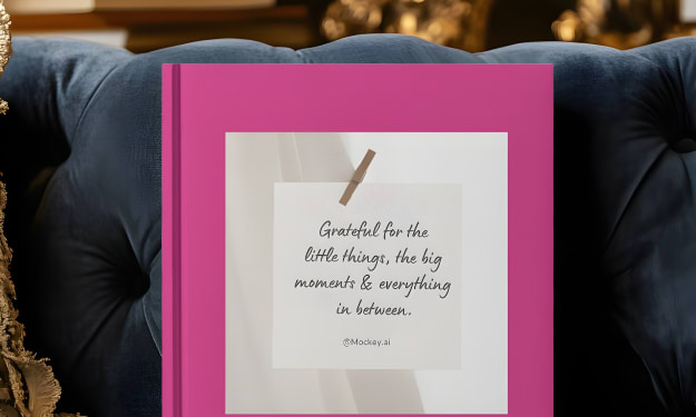
Best Book Mockups for Hardcover and Softcover Designs
Book mockups play a crucial role in presenting your book designs in a professional and visually appealing manner. Whether you’re designing for hardcover or softcover books, choosing the right mockup can make a significant difference in how your work is perceived. Mockups help authors, designers, and publishers showcase their projects in real-world settings, building excitement and trust among readers and clients. Let’s dive into the best options for hardcover and softcover book mockups and how a book mockup generator can simplify the process.
By ladali officialabout a year ago in Art
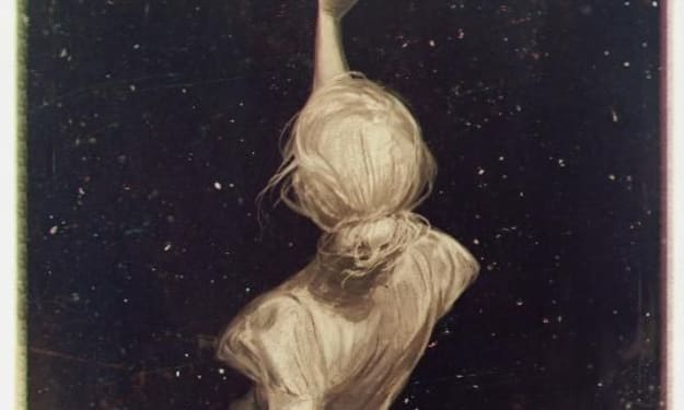
Ida shaghoian and the Inner Geography of Painting
In contemporary painting, the most compelling work often resists easy definition. It lingers, unfolds, and asks the viewer to participate emotionally rather than observe from a distance. Ida shaghoian belongs to this tradition. Her paintings explore the fluid relationship between memory, feeling, and the natural world, creating spaces that feel both deeply personal and widely resonant. Through a refined balance of abstraction and suggestion, her work challenges conventional ideas of place, time, and perception.
By Ida Shaghoian7 days ago in Art


Comments
There are no comments for this story
Be the first to respond and start the conversation.