
The Value of Kerning and How to Get Started in 2022
Some knowledge on what is kerning to design

In typography kerning is defined as the space adjustment between the two individual letters. It’s subtle and often neglected around the deadlines but the overall design will seem messy with poorly kerned typography. In kerning, two major elements are influencing the alignment of the text on the design known as leading and tracking.
The vertical spacing between the lines of typefaces is a tracking that concerns the overall distance between the two groups of letters and the leading. Technically you go first with the tracking and then lead for the desired adjustments prior to final kerning. Both these can be included as steps of kerning.
Kerning is not just an aspect of typography but it has an influence on the design outcome. Kerning is considered a skill in the field of graphic designing. Now that the market is focusing on the branding aspect, the importance of kerning has grown over the last.
Further, we are gonna talk about the real value of such a subtle practice and how you should start incorporating it in 2020.
First, The Value of Kerning
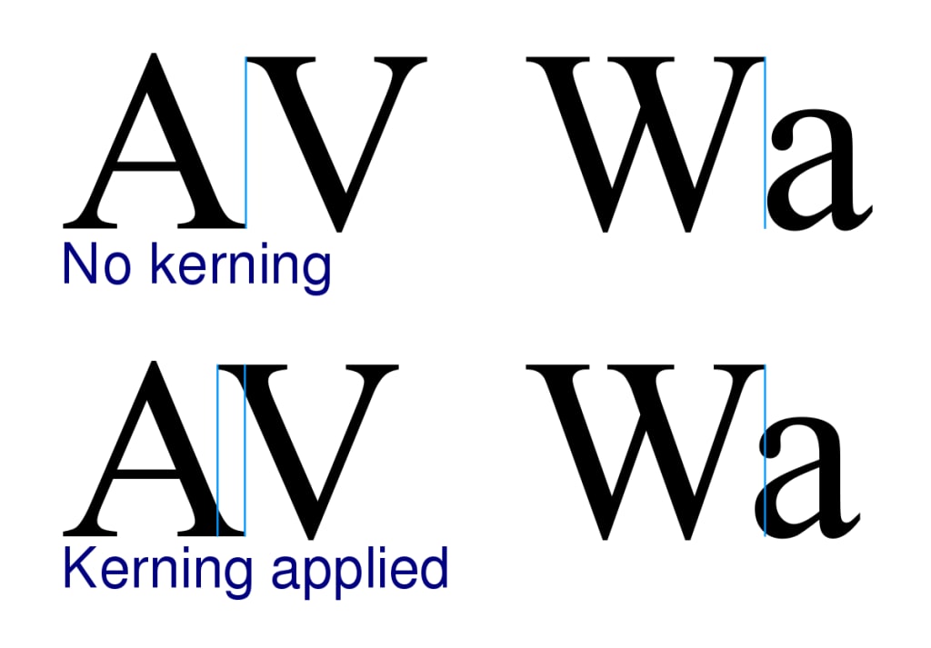
The main purpose of kerning is to make their alphabets appear visually correct and spacious.
Aids to Different Spatial Relationships:
Each typeface has a different spatial relation with the letters that require some manual adjusting. For example, I is a tall and thin alphabet whereas Q is a problematic alphabet with a tail. In comparison to the I, Q takes up a lot of space and needs adjustment manually for the typography to work its charm.
So in such cases kerning helps you in manually adjusting the space of alphabets that requires too little or too much space. Without kerning, the alignment text and the spatial relationship would be a complete mess.
Gives The Piece a Finished Look:
Letters are made up of varying shapes, curves, lines, etc. Therefore, when they are placed uniformly next to one another, there will appear to be gaps left by these different shapes.
With the practice, you first kern it yourself and then depend on the default spacing of the software. You can also use auto-kerning tools like the default Metric kerning and Optical kerning techniques for a finished look. Giving a finished look is easier than you think using the character panels which is pretty much the same in Photoshop, InDesign, or Illustrator
Clarity In the Text:
There are a plethora of bad font examples on the internet and you can get a good laugh as well as good lessons from those. In the automatic spacing of the fonts, what happens is that one word may form two words or two words that form one. This forming combination is confusing and often embarrassing too. The wrong spacing will mix up the name and well your company name ends up being a meme.
Kerning is an important tool that helps to add clarity to the text that blends perfectly with the colors theme of the logo.
How Should You Typically Start Owning The Kerning Practice in 2022
Know that Substance vs Style:
Yes, the style catches the eye but the substance always wins the race. If you observe the most liked logo fonts, you will find one thing common, all the fonts got praise over how cleverly the font was placed and used.
Style is good but if it's messing with the identity of the company then it’s not worth the risk. Since kerning helps you keep the style and substance in perfect balance.
Extra Attention Makes a Difference:
When it comes to unifying spaces small types go fine but the larger the letters the obvious would be the gap and there your designing fails. The whole point of kerning is to manually settle the font into the logo for a beautiful finishing. Through the practice of kerning, you can pay extra attention to the detail making a significant difference.
As the logo is printed and published on stationeries and digital platforms ranging from small to large in size, it is important to pay attention to the small details. Through kerning, you can do justice to the spaces between the letters, and there is no need to forget the font size anywhere.
Remember Where It Is Important:
The heading is really a catchphrase because kerning is important and is a vital part of typography in 2021 especially when you are designing a logo and a website. Kerning is important in logo designing because of the clarity of the text. However, web designers document the spacing between paragraphs, components, margins, padding, and more. This careful approach to the spacing between elements should extend to how you think about designing typography as web designers build out their UI infrastructure using their design system tools.
A UI UX Design agency in UAE that understands the importance of kerning if your perfect go for logo designing and website design and development.
No More Software Kerning:
In 2022 we shouldn't let the software do our kerning. One of the important aspects of kerning is to resist the urge to use the automatic software. A computer uniformly spaces the letters and uniform spaces are against the visually appealing outcome. As mentioned above manual kerning is done to pay attention to the details and with automatic software, you are eliminating the special element of fonts.
So, let's start kerning the headlines and logotypes yourself.
About the Creator
AllaboutStats
From concept to deployment and beyond, we are a full-service mobile app development company, providing end-to-end solutions that help our clients thrive in the digital age. We are one of the top-rated game development companies in the UK
Keep reading
More stories from AllaboutStats and writers in 01 and other communities.
6 Costly Mistakes To Avoid While Designing Your Interior
As everybody knows, redesigning your interior or designing it from scratch costs you an arm and a leg. And not every year you can save thousands of dirhams to redesign it if something goes at the first attempt.
By AllaboutStats4 years ago in Lifehack
Boosting Oracle Fusion Performance with AI-Enhanced Data Insights
In the digital era, data is one of the most valuable assets a business can possess. As companies continue to rely on cloud-based ERP systems like Oracle Fusion to streamline their operations, the integration of AI-powered data insights has become a game-changer. With AI agents for Oracle Fusion, businesses can unlock deeper, more actionable insights from their data, driving better decision-making and improving overall performance.
By Rchilli Inc4 days ago in 01
How SEO Helps Small Businesses Compete with Big Brands
Imagine you own a small business and have just launched a well-designed website. Your products are good, your services are reliable, and your pricing is competitive. Yet when you search for your industry on Google, the first page is dominated by large brands. Their names appear everywhere, making it seem almost impossible for a smaller business to gain visibility.
By Henry Davids5 days ago in 01


Comments (1)
Thanks for highlighting the significance of kerning in typography! Your insights on its role in achieving visual correctness and clarity are enlightening. Let's embrace manual kerning for polished designs. 🎨🔡 For more insights, check out this link: Kerning Practice 🌟 https://webdesignindubai.com/services/graphic-design/