
Text Alignment and Justification — Getting Your Text in Line
This article is part of a free full CSS Course: Beginner to Expert


When it comes to designing a website, the way you arrange text on a page can make a huge impact on its readability and overall aesthetic. Whether you want your text aligned neatly to the left, centered in the middle, or spread out like a neatly justified paragraph, CSS provides simple ways to control how text is positioned.
In this post, we’re diving into text alignment and justification — two key techniques that can elevate your text presentation. Let’s explore how to make sure your content looks clean, organized, and easy to read.
1. What Are Text Alignment and Justification?
Before we dive into the nitty-gritty, let’s break down what these terms mean:
- Text Alignment: This refers to the positioning of your text relative to the container or page. The most common types of text alignment are left-aligned, centered, right-aligned, and justified.
- Text Justification: This specifically refers to the way text is spaced out in a block of text, making it align neatly on both the left and right margins.
In short, text alignment and justification control where your text appears and how it fills the space around it.
2. Text Alignment: The Basics of Where Your Text Goes
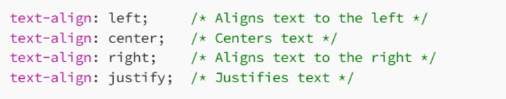
The text-align property in CSS controls the horizontal alignment of text within its container. It’s one of the most common properties you’ll use in everyday web design, and it allows you to set text alignment to the following options:
- Left Align: Aligns text to the left, which is the default in most languages that read from left to right.
- Center Align: Centers the text within the container.
- Right Align: Aligns text to the right.
- Justify Align: Spreads out the text so it aligns with both the left and right edges.
2.1 Syntax of Text Alignment
Here’s the basic syntax for text-align:
2.2 Examples of Text Alignment
Left-Aligned Text (Default)
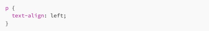
This is the default alignment for most browsers. The text starts at the left edge of its container and wraps naturally to the next line.
Center-Aligned Text
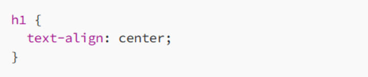
Centering text is great for titles, headings, or anything you want to stand out in the middle of the page. It’s often used in headers or banners.
Right-Aligned Text
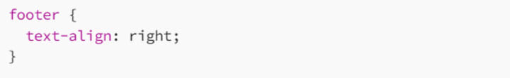
Right alignment is often used for specific design elements, such as footers or contact information. It’s also common in languages that read from right to left, like Arabic or Hebrew.
2.3 When to Use Text Alignment
Left-aligned text is generally the most readable and should be the default for paragraphs or body text in most designs.
Center-aligned text works great for headings, titles, and short lines of text, where you want to make a statement.
Right-aligned text can be used for design accents or specific layout needs (like a sidebar or quote).
Justified text can give a neat, uniform appearance for paragraphs, making the text look more formal or magazine-style. However, it can cause uneven spacing if not carefully managed.
3. Justifying Text: Making It Neat and Even
While text alignment deals with where text is placed horizontally, text justification controls how the text stretches across the container, creating an even look on both sides. This is typically used in longer blocks of text, like paragraphs or articles.
3.1 How Text Justification Works
When you use text-align: justify;, the browser adds spacing between words and sometimes even between letters to ensure that the text stretches to fill the entire width of the container.
3.2 Syntax for Justifying Text
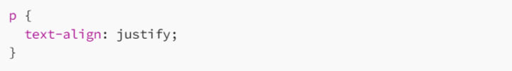
This makes the text span across the width of the container, leaving no uneven spaces on the right.
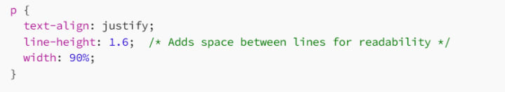
3.3 Example of Justified Text
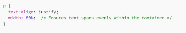
In this example, the text in the paragraph will be justified, stretching across the full width of the container. It helps create a clean, formal, newspaper-like appearance.
3.4 Issues with Text Justification
Although text justification looks tidy, it can sometimes create unwanted gaps between words or characters, especially if the text is long or if the container is very wide. This can lead to a less-than-ideal visual experience, with the text appearing spaced out unnaturally.
How to Fix Word Gaps in Justified Text
One way to control the spacing in justified text is by using the text-justify property, which specifies how the justification should be handled. You can also use the hyphens property to allow automatic word hyphenation, which can reduce awkward gaps between words.
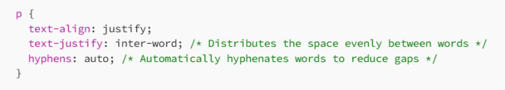
This combination makes the justified text look more natural and readable by allowing some flexibility in the word spacing.
4. Combining Text Alignment and Justification with Other Properties
4.1 Text Alignment for Headings and Subheadings
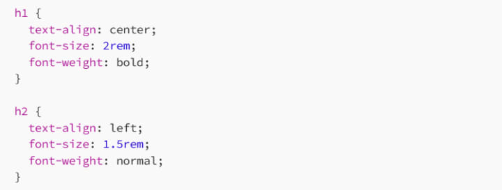
Here, we’re centering the main heading and left-aligning the subheading. This creates a strong visual hierarchy, with the most important text (the heading) being the focal point.
4.2 Justifying Body Text for a Clean Look
Justified text is great for long paragraphs, but remember to adjust line height and width to maintain readability and avoid awkward spacing.
5. Responsive Design: Text Alignment and Justification for Mobile Devices
When designing for mobile devices, text alignment and justification need some special consideration. Small screens may require more flexible text styles to maintain readability.
5.1 Text Alignment for Mobile
For mobile screens, it’s often a good idea to center-align headings and left-align body text for better readability.
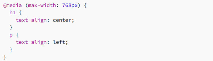
By using media queries, you can ensure that your text looks great on mobile by adjusting the alignment based on the device size.
5.2 Avoid Justified Text on Small Screens
Justified text can cause issues on smaller screens where the text might appear cramped or spaced too far apart. It’s often better to switch to left-aligned text on mobile for a cleaner look.
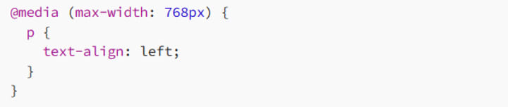
This ensures that the text is more readable and visually pleasing on smaller devices.
6. Best Practices for Text Alignment and Justification
To make sure your text alignment and justification serve their purpose, here are some best practices:
6.1 Prioritize Readability
While centering text or justifying paragraphs might look neat, don’t compromise readability. Left-aligned text is easier to read, especially for long paragraphs.
6.2 Avoid Overusing Justification
Justified text can be great for certain types of content, like articles or magazines, but it can create awkward spaces between words, especially if the text is narrow. Use it thoughtfully, and consider the readability of your content.
6.3 Consistency is Key
Ensure consistency in text alignment across your site. If you align your headings to the center, keep that consistent throughout the design. The same goes for body text — left-aligned or justified, but don’t mix too many types of alignment.
6.4 Use Mobile-First Design
Design with mobile users in mind. On smaller screens, text alignment and justification should be adjusted to ensure the best possible reading experience.
7. Conclusion: Align Your Content Like a Pro
Text alignment and justification are powerful tools in web design. Whether you’re aligning text to the left, centering it, or justifying it across the page, these simple properties can significantly affect the overall look and feel of your website.
So, next time you’re styling your page, remember: a well-aligned layout leads to better user experience. Align your text thoughtfully, adjust your justification when necessary, and make sure it looks great on every device.
Happy coding! And remember, the devil is in the details — proper text alignment can take your design from good to great!
About the Creator
MariosDev
Hi, I’m Marios! I’ve been a developer for over 9 years, crafting cool stuff and solving tricky tech puzzles. I’m a total tech enthusiast and love sharing my thoughts and tips through blogging. Also, in love with my bike!
Author’s Advice
If you would’ve asked me 20 years ago did I know I’d become a writer and an author, I would’ve said “nope, ain’t happening”. As fate would have it I did become an author and I can honestly say I’m loving it so far. It really does feel good to be a writer. I’ve learned a lot on this journey and I feel like with even me being as new to this world as I am, there’s some wisdom I need to share with every other aspiring author.
By Joe Patterson3 days ago in Journal


Comments
There are no comments for this story
Be the first to respond and start the conversation.