
Font Size, Weight, and Style — Mastering Typography for a Polished Look
This article is part of a free full CSS Course: Beginner to Expert


When it comes to web design, typography is more than just picking a nice font. The way you manipulate font size, font weight, and font style can significantly impact your site’s readability, aesthetics, and overall user experience. These properties give you control over how text appears on your website, ensuring that your content is not only readable but visually appealing.
Here you will find a full free course of CSS
In today’s post, we’ll walk through how to use font size, weight, and style in CSS to create beautiful, functional text. Whether you’re designing a blog, portfolio, or business site, these properties are essential tools in your web development toolbox.
1. What Are Font Size, Weight, and Style?
Before diving into the specifics, let’s get a quick refresher on what each of these CSS properties does:
- Font Size: Controls the size of the text.
- Font Weight: Determines the thickness or boldness of the text.
- Font Style: Defines the style of the font, such as italics or normal.
These three properties may seem simple, but when combined effectively, they can completely transform the look and feel of your typography. Let’s explore each of them in detail.
2. Font Size: The Power of Proper Sizing
2.1 Setting Font Size
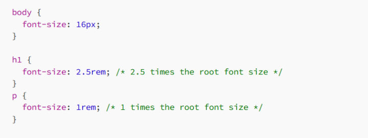
In CSS, the font-size property allows you to control the size of your text. You can use several different units to specify the size, including px, em, %, rem, and vw.
Here’s the basic syntax for font-size:
font-size: 16px;
This would set the text size to 16 pixels.
2.2 Units of Font Size
Pixels (px): A fixed-size unit that specifies the font size in terms of pixels. It’s great for precise control, but may not be as flexible for responsive design.
Example: font-size: 18px;
Ems (em): A relative unit based on the font size of the parent element. This makes em great for scalable and responsive typography. 1em is equivalent to the current font size.
Example: font-size: 2em; (twice the size of the parent element's font)
Rems (rem): Similar to em, but relative to the root element (<html>), making it more predictable across the entire page.
Example: font-size: 1.5rem; (1.5 times the root element's font size)
Percentage (%): Specifies the font size as a percentage of the parent element’s font size.
Example: font-size: 120%; (120% of the parent font size)
Viewport Width (vw): A relative unit that is based on the width of the viewport. Great for responsive typography, especially on large screens.
Example: font-size: 5vw; (5% of the viewport width)
2.3 Why Proper Font Sizing Matters
Proper font sizing is critical for readability. Too small a font size makes text hard to read, while too large can cause overcrowding and overwhelm the user.
For body text, using rem or em is ideal because they scale well with the root or parent font size.
For headings, px can be great when you need precise control over the size, but you might consider using relative units to keep your typography scalable on different devices.
Example:
By using rem for headings and rem for paragraphs, the text will scale appropriately based on the root font size, which is better for accessibility and responsive design.
3. Font Weight: Bold, Light, or Somewhere In-Between?
The font-weight property allows you to adjust the thickness of your text. Whether you want bold headlines or subtle text, controlling the font weight is key to achieving the right tone.
3.1 Setting Font Weight
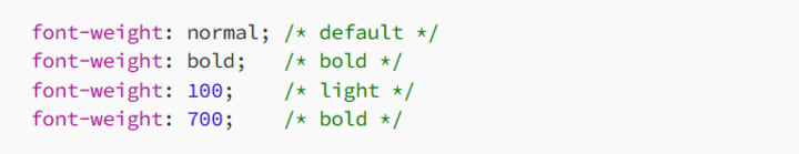
The basic syntax for font weight is as follows:
3.2 Common Values for Font Weight
normal (400): The standard weight for most fonts.
bold (700): Makes the text bold.
Numeric Values (100 to 900): Some fonts offer more than just normal and bold. You can use numbers to fine-tune the font weight, where 100 is the lightest and 900 is the boldest.
Example: font-weight: 300; (light)
Example: font-weight: 900; (extra bold)
Not all fonts support every numeric value, so it’s important to check the documentation or preview the weight before using it.
3.3 Using Font Weight for Impact
Font weight can dramatically affect the perception of your website. Bolder fonts can make headings and important calls to action stand out, while lighter fonts can be used for body text to give a clean and airy look.
Headings: Typically, headings should use a bold or extra bold weight to ensure they stand out.
Body Text: Use a normal or light weight for readability. Lighter weights can create a more elegant, minimalistic look, while normal weight is more classic and highly readable.
Example:
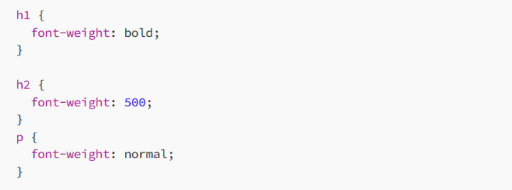
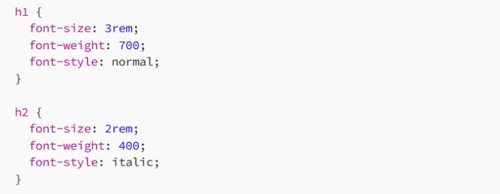
Here, the h1 is bold, the h2 is medium weight (500), and the paragraph text is set to the normal weight.
4. Font Style: Slanted, Upright, and More
The font-style property allows you to control whether your text is italicized, normal, or oblique. This can be useful for emphasis or adding some personality to your typography.
4.1 Setting Font Style
4.2 Common Values for Font Style
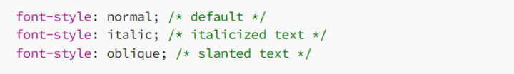
normal: The default style (upright text).
italic: Italicizes the text, making it appear slanted.
oblique: Similar to italic, but the slant is usually less pronounced. Not all fonts have a specific oblique style, so browsers simulate it.
4.3 When to Use Font Style
Italic: Use italics for emphasis, quotes, or citations. It’s also used for some stylistic effects in body text and headings.
Oblique: Use this sparingly. Since oblique styles are less common, they should be used only when necessary for a particular design effect.
Normal: Use for regular text to ensure clarity and legibility.
Example:

In this example:
- The h1 tag is italicized for emphasis.
- The paragraph text is normal (standard).
- The cite tag is slanted (oblique) for proper citation formatting.
5. Combining Font Size, Weight, and Style
Now that we’ve covered each of these properties individually, let’s see how they can work together to create dynamic typography.
5.1 Example 1: Creating a Bold, Large Heading with Italic Subheading
In this case, the h1 is bold and large, while the h2 is italicized but smaller in size and lighter in weight.
5.2 Example 2: Styling Body Text with Light Font Weight
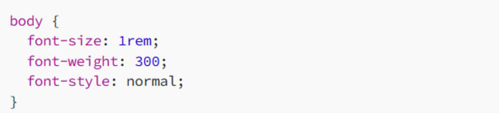
The body text here is set to a light weight, giving it an elegant and airy look. You can always adjust the weight based on the type of content you’re presenting.
5.3 Example 3: Making Links Stand Out with Bold and Larger Size
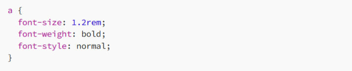
Links are given a bolder and slightly larger font to make them stand out and encourage interaction.
6. Best Practices for Font Size, Weight, and Style
To ensure your typography looks great and is highly readable, here are a few best practices:
6.1 Maintain Consistency
Make sure your headings, paragraphs, and other text elements follow a clear, consistent typographic hierarchy. This will make your content easier to scan and more aesthetically pleasing.
6.2 Don’t Overdo Bold and Italics
While bold and italics are great for emphasis, overusing them can make your design feel chaotic. Use them sparingly to highlight key points or important elements.
6.3 Be Mindful of Accessibility
Make sure your text is legible for all users. Avoid using fonts that are too small or too light, especially for body text. Good contrast between text and background is key for readability.
6.4 Test Your Typography
Different fonts, sizes, and weights may look different on various devices and screen resolutions. Always test your typography on mobile and desktop devices to ensure it looks good across the board.
7. Conclusion: Typography that Speaks Volumes
By mastering font size, font weight, and font style, you gain greater control over the visual tone and readability of your website. Typography isn’t just about making text look pretty — it’s about creating a comfortable, accessible, and engaging experience for your users.
So whether you’re designing a sleek modern site or a more traditional one, remember: small tweaks to size, weight, and style can make a big difference.
Happy coding, and don’t forget — typography is your design’s voice. Make it count!
About the Creator
MariosDev
Hi, I’m Marios! I’ve been a developer for over 9 years, crafting cool stuff and solving tricky tech puzzles. I’m a total tech enthusiast and love sharing my thoughts and tips through blogging. Also, in love with my bike!
Steps for Application Integration on AWS
It is neither new nor a secret that modern businesses have come to rely on a massive ecosystem of microservices and third-party SaaS platforms. But to do what exactly, you ask. For starters, to provide seamless digital experiences. Adopting distributed architecture decidedly improves agility and scalability. But there's also a significant challenge, i.e. ensuring independent components can communicate and share data without forming brittle dependencies. Thankfully, an effective solution is found in application integration on AWS. It addresses this issue by providing a managed framework for connecting disparate systems. Organizations can automate business processes while reducing the need for custom "glue" code by using purpose-built services for messaging, workflow orchestration, etc.
By Ryan Williamson5 days ago in 01


Comments
There are no comments for this story
Be the first to respond and start the conversation.