
Design Ideas of a Writing Software Products
A writing experience
I have never thought about making a writing software before, because I am an entrepreneur. I think about problems from a business perspective. It is a typical demand and a small group of users are very picky. Obviously there is not much room for it. There is not much commercial value, but, more than a year ago, I suddenly wanted to understand one thing, that is, this is not actually a commercial problem, that is, I need it myself. Third, um, it only costs a few hundred thousand yuan to make a software. For me, I still don’t have the money to afford it, so I made a product. This product is called Well, the purpose of doing it according to my needs is to make my thoughts very valuable. It has been a long time. I am a user and of course a happy user. Later, the product was continuously polished and made better and better. The people in my team also started to use it. A few friends around me started to use it. When I got up and they were all happy, I would think a good product. If only so few people use it It's a pity, it's better to just make a formal product and still sell the money. Will it be written, but because of this idea, you still need to invest in it.
Don’t think you’re going to do some weird operations that cost the public. There are many strange people in the public. Then I will give you an inappropriate example. You use your own software and you open a bar and you’re fine to order a glass of wine. That's great, but once you open this bar to the general public, there will be all kinds of strange people. For example, he comes to the bar and gives me two glasses of beer, right, what do you do if you give me a glass of beer? There are even people who come to give me a ton of gasoline. You have to ensure that this software is stable and safe under all circumstances, without errors, and it has higher performance that can carry more users.
Yes, we need further research and development. We have invested more than 1 million yuan in this research and development. Now, it’s almost done. Today, we can finally show it to everyone. Today, I’m in I’ll give you a demonstration on the Mac. Actually, we are a cross-platform product. The Mike version of F4 million pixels is very high. The Russian version can also be used on the Android version and is also under development, so all mainstream platforms.
While talking about products, we also talk about our understanding of creators and requirements for system software. The first requirement of the software I wrote is to look good. I very much believe that a good system environment can be to a certain extent Affects the quality of the work, this one looks good. It is definitely not cool, but a kind of restrained beauty. When designing, the most important design philosophy is to give way. What we have to respect is the content created, not to show people themselves. Do many small softwares have that kind of contrasting design in color? I will show you a few today , Like this, these are all very well-known system software, that is, the harmonious related software is a very contrasting deed, or the use of very bright colors, absolutely not doing things that are eye-catching.
nA good software does not need to have a strong sense of its own existence. The whole software should have no main color, no color, but no basic color design. In fact, it is very difficult to do because it will easily become It's so ugly, we did it. Seems ok The one on the left in Anhui uses a whole piece of gross profit. As far as the management is concerned, this kind of colorless one is basically um, if he can not be rigid, we have taken some interactive measures. Another good example is that one of my friends is working on designing, building and sell tiny house on wheels to young couples who can not afford their first house in the city. He put all his ideas scattered around into one and to publish it on to facebook to test the local market.
When it’s clicked, its color will change a bit. It’s to enhance and confirm these. In fact, it’s different from Max’s approach. The design of Mike’s system is afraid to accept it. Well, first of all, when designing the product. Well, I think we should follow the standard of degree as much as possible .
Many domestic softwares are often different, and they do very poorly in this respect, but on the other hand, in the case of graduation, the rule of caring can be broken, but this kind of break. It should not be too strong or the maintenance should not affect the user's usage habits. It is the so-called step of each other and it is all senior product managers need to consider.
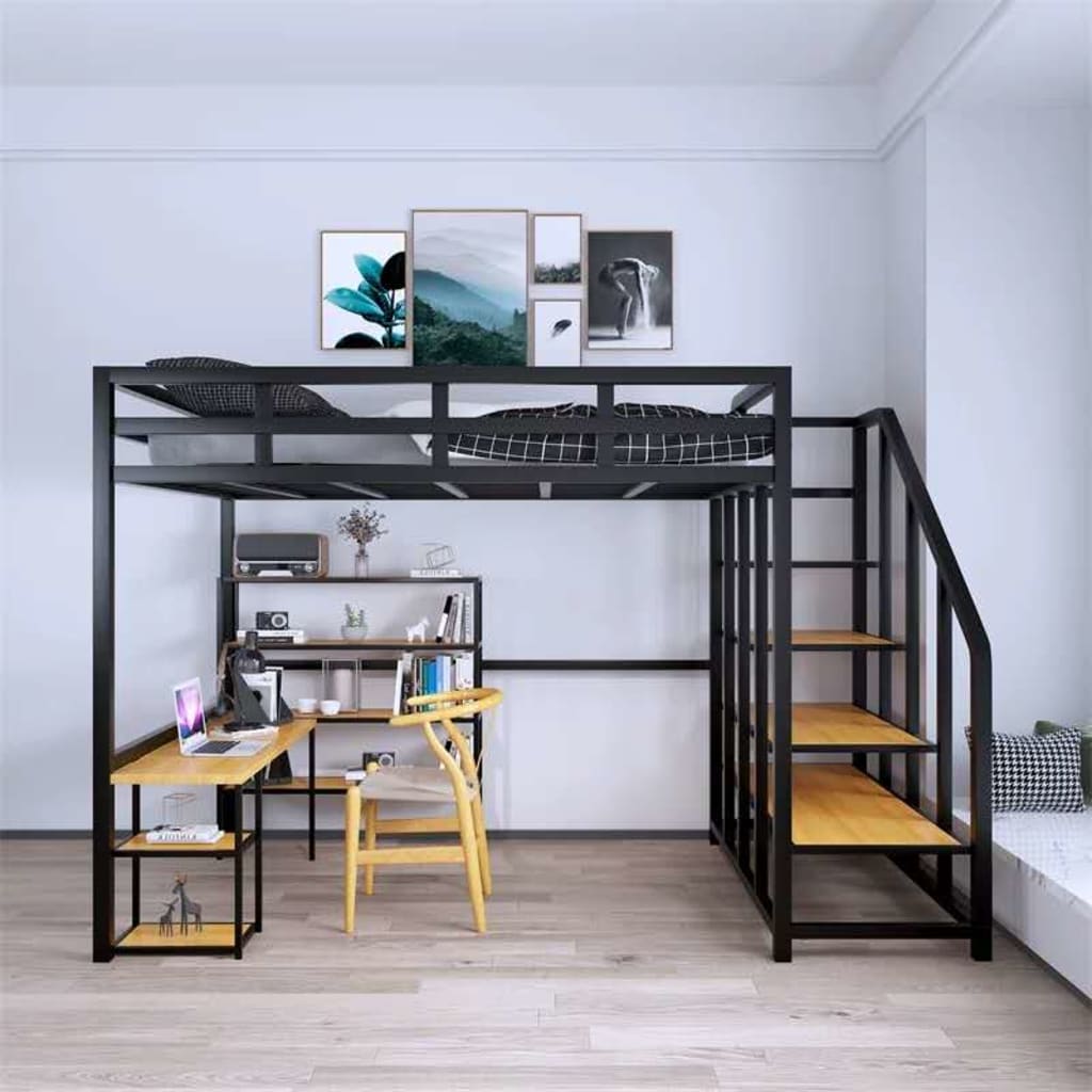
So we made the preview of the manuscript in the middle to look like a card. This, it should also be our original creation. The card in this card area will be slightly beating with this innovative mouse movement. These are all It is an article written for myself. The beating of is also a metaphor for the feeling that the creator’s own thinking is beating. These trends will make users feel exquisite, but it will definitely not be because of the majority. Moreover, it is not unintentional that every action must have reality. The meaning of these animations, for example, when you point to a specific article life.
And it adopts this tri-column structure. In fact, many people are using it. For example, software like this is also a tri-column structure. For example, like this kind of organization with 30 people, how about you? Make some changes to make it easier to use your own style without affecting the user's habit of using independent products. You know that this is actually the most difficult thing to do, right, because whether an interface without colors works.
Show me some text? Change the interface to these few pieces, right? Then I also used some to expand this content to the district in the middle, um, this is very common, if this is done in this way, it is meaningless, right? Our design is, yes, look at them all at 30. Although we are also a sauna, we actually focus on a piece of frosted glass on the left for the past two years. . It's stronger, unlike other software. Piece by piece feels very crisp. In this way, our entire software looks more concise and, in fact, our entire interface.
Color, because this action requires a very strong sense of confirmation, so there will be a color to break the calm of the interface, but this color is not actually the color of s, it is a color of the system, my system is now Red, so it’s this red. What color is the system you choose?
On the right is the writing area. This is my second requirement for writing software, that is, you must have an immersive writing environment. First of all, to exclude dissidents, it can be put away so that you can enter a very pure creation. Status, click this button, you can also use shortcut keys, of course you can In addition, basically you don’t put it away. As long as you enter the creative state, the interface on the left will gradually fade without knowing it. Ah, seeing that the color has faded without you. I was the only one to go up. He will become brighter
About the Creator
ROIX
ROIX is a marketing and investment company dedicated to boosting local businesses with tailored marketing solutions and investments.


Comments