
7 Tips For An Effective BI Dashboard
Here are the top strategies that you can follow to make your reporting dashboard stand out

For any Business Intelligence requirement, optimized dashboards are the most important aspect from the user experience point of view.
In this blog, I'll focus on how to make the reporting dashboards effective from both the aesthetics and performance perspectives. Doesn't matter if you use Power BI, Tableau, Quicksight or any other BI tools; a good dashboard can be created anywhere.
The idea of a dashboard is to present your most important data in way that stands out.
Two things that should be kept in mind:
- Data should be simplified and its complexity should be reduced.
- Effective data visualization - design should be crisp and clean.
Here, I list 7 strategies to design an effective dashboard that fulfills the above criteria. I always try to implement these while designing my dashboards and I hope you too find them useful too.
1. Choose the Right Type
It is crucial to choose the right dashboard especially when you have large user base. A wide variety of users would mean they would be dealing with different types of data. Hence, its essential to create the right category of dashboard.
For example, you would create a Sales Dashboard to showcase how different products are performing. This kind of dashboard would cater to the Sales team and decision-makers.
Similarly, a Research Dashboard that shows results of different experiment/studies etc., would cater more to technically-minded people like engineers and scientists etc.
Other examples include:
- Business Monitoring Dashboards for CEOs and business owners to track overall progress using various KPIs.
- Operational Dashboards for operations teams to analyze performance using real-time data.
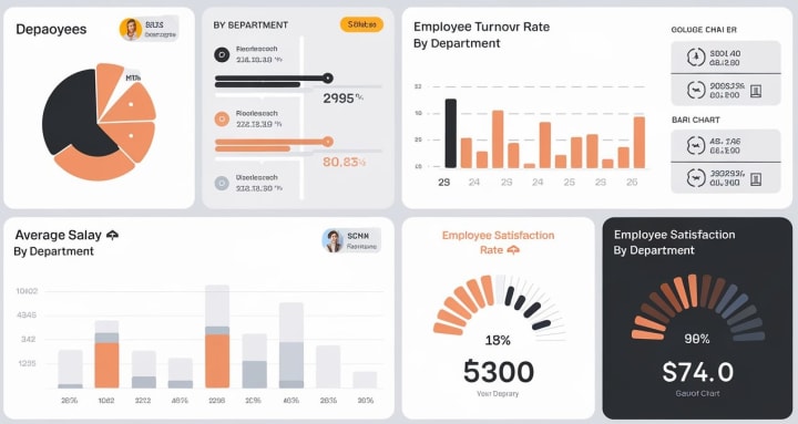
- HR Dashboards for HR teams to analyze hiring rates, employee satisfaction, etc.
Not just these, there are many other different categories and one should select the right type based upon its usability.
2. Understand Your Audience
This is related to the first strategy only. To make an impactful dashboard you need to understand your audience well.
Which means, you should be aware of :
- What your audience is looking for?
- What insights they are interested in?
- What level of technical detail they would be okay with?
- How much information would be too much for them?
You can get answers by reviewing requirement documents or directly interacting with the audience. This way you'll be able to create a dashboard that is more aligned with audience needs and adds value to them.
3. Don't Make It Messy
We often tend to provide too many details in name of adding value to the end users. In this process to we many different kind of charts/visuals on the dashboard although sometimes they are meant to show similar information.
This makes the dashboard cluttered and messy. Which in turn, would fail to grab the audience's attention. Hence its necessary that you are adding only necessary information. Also make sure you don't show repetitive and redundant data.
Additionally, you should also consider, where the dashboard will be displayed. If it's viewed on:
- Large Monitors: You can add more content/visuals.
- Tablets or Phones: Keep it simple with fewer visuals for better readability.
4. Follow Top-to-Bottom and Left-to-Right approach
This is what we always do and its quite natural also. We might not have observed but we naturally tend to analyze anything Top-to-bottom and left-to-right.
You are reading this blog in the same manner!
And this will happen with the dashboard you create as well. Hence it becomes important to display KPIs, big numbers etc. on the top left side and then the related information in different charts/graphs as you move down and towards right.
5. Use Colors and Fonts Judicially
Colors add "colors" to you dashboards (quite literally) and give them life. The right color can attract the users attention in the most easiest way than you think.
Having said that, you don't have to put too many colors on a single dashboard, instead follow a template that's consistent throughout across all the visuals. Make use of a theme that resonates with the category of dashboard you are creating.
Similarly, many developers tend to use multiple fonts and font sizes on a single dashboard. Though it may seem tempting to use variety of fonts but it can turn your dashboard unattractive and unreadable. It is generally accepted that using a single font type on a dashboard offers better readability.
When it comes to font size, don't play too much with that as well. Follow a hierarchy such that title/headers have larger font as compared to the values. Sub-headings can have a font size in between the headings and values. To sum up, you should use 3 font sizes at max.
Also, don't keep text and visuals on the dashboard of same size, readers might have difficulty focusing on what's most important. To showcase the most prominent information and make them stand out, use card visualizations.
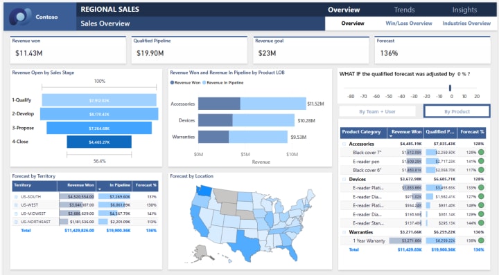
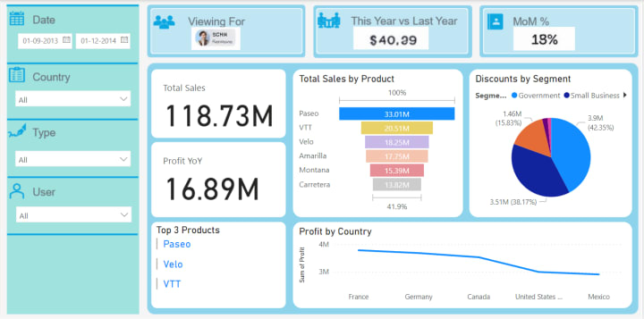
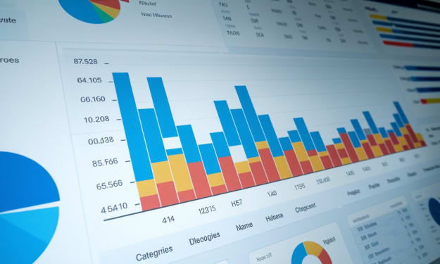
6. Use Right Visualizations
Don't use too many visualizations for the sake of variety. Visualizations are meant to be easy to read and interpret. Don't make use of complex charts and visuals when you are creating a high level dashboard.
Understand your data well and use visualization accordingly. Below are few pointers to understand, when to use what visualization:
- Bar/Column charts: To compare data side-by-side.
- Pie/Donut Charts: To show data segments.
- Line charts: To show data over a period of time.
- Tree maps: To show the hierarchical data spread.
- Funnel Charts: To show data with sequential process.
- Gauge Charts: To show data compared with the goals.
- Scatter Charts: To show relationship between the data.
7. Optimized Render Time
Charts/Visuals load time is also an important aspect. Lesser are the number of Visuals on a dashboard, higher is its performance.
If at all, there is a requirement to show large number of visuals, show only the important visuals on the Dashboard page and use Drilldown for detailed view.
Talking specifically about Power BI, visuals pinned on the dashboard uses Query cache, providing better and more consistent performance. Avoid using poorly optimized Custom Visuals in Power BI.
Wherever possible, turn off the interactions between the visuals. This reduces query load when users cross-highlight. And also ensure that queries that is sent back from each chart should also be optimized.
Conclusion
An optimized and user-friendly dashboard is an essential requirement for a smooth BI experience. In this blog, I covered the top seven basic and essential strategies that I think should be considered while creating any type of Dashboards.
I often create dashboards from the lens of these strategies and I hope they will be helpful for you as well.
Do let me know what all steps do you follow for creating the BI dashboard?
***
If you find my blogs valuable and want to support then you can Buy Me A Coffee.
- Subscribe me to read more from me Power BI, Data Analysis, Dashboarding and more.
***
Originally published at https://medium.com/microsoft-power-bi/what-it-takes-to-make-a-great-bi-dashboard-a4e3c8cd4d6b
About the Creator
Akshay Mishra
Professionally, I'm a BI & Data Analytics Architect with 10 years of exp & I love sharing my expertise in Microsoft Power BI, Data Visualization, SQL & more.
Beyond the work, I like to read & write on World Politics, History & Geography.
Reader insights
Outstanding
Excellent work. Looking forward to reading more!
Top insights
Expert insights and opinions
Arguments were carefully researched and presented
Easy to read and follow
Well-structured & engaging content
On-point and relevant
Writing reflected the title & theme
Keep reading
More stories from Akshay Mishra and writers in 01 and other communities.
Why is Power BI the Best Business Intelligence Tool in 2025?
When I first started working in the BI spaces back in 2015, I was primarily working on SSIS, SSAS and SSRS. Gradually, I began transitioning to Power BI, which was emerging as a new BI tool and I was eager to explore new technologies. Since then, it has been an unforgettable journey of learning and growth.
By Akshay Mishra12 months ago in Journal
The Top 10 Reasons Why Hackers Target Facebook Accounts: A Complete Guide to Methods, Malware, and Protection
The Billion-Dollar Black Market of Stolen Identities A Facebook account is more than a social profile—it’s a digital identity, a repository of personal connections, memories, and often, a gateway to other online services. This immense value has made Facebook accounts a prime target for cybercriminals worldwide. But what truly drives hackers to invest time and resources in compromising these accounts? This in-depth article explores the top motivations, reveals the real methods and tools used, and provides a robust defense blueprint to protect your digital life.
By Alexander Hoffmann5 days ago in 01
Can AI Predict a Successful Brand Name? Let’s Find Out
Did you know that a staggering 9 out of 10 startups fail? While many factors contribute to this grim statistic, the strength and memorability of a brand name often play a surprisingly significant role in a business's initial traction and long-term success.
By Ecom Mediatech5 days ago in 01
The Duelist
The rays of a dying red sun flashed against the onrushing blade. The grey beards say the key to dueling lies in size, speed, reach, righteous fury, whatever the person in front of them pays them to say. Matteo knew better than any it was none of these and had an undefeated record on these sands to prove it.
By Matthew J. Fromm4 days ago in Fiction


Comments (1)
Thanks a ton Akshay for this one. I would have multiple visuals in one report many a times, not anymore!