
5.3. Applying Borders in CSS
Because sometimes your content just needs a good outline.


Let's talk borders. No, not geopolitical ones - we're diving into the CSS kind: those handy little outlines that make your content look neat, polished, or even a little dramatic (depending on how you style them). Whether you're framing a button, separating sections, or going full-on design ninja with creative outlines, borders in CSS give you control and flair.
And guess what? They're easier to use than you think.
Why Use Borders?
- Borders do more than just add lines around boxes. They:
- Define and separate visual elements
- Emphasize important sections
- Help with layout and alignment
- Bring out design personality (dashed, double, dotted anyone?)
Borders can add both form and function to your site. Want that call-to-action button to pop? Add a bold border. Need to divide your blog post from your sidebar? Border. Want to look like you know CSS? Border.
It's one of those things that seems simple but can take your layout from "meh" to "heck yeah!" in seconds.
Border Basics
Let's kick off with the basic syntax. The border property in CSS is shorthand for three things:

Yup, just three simple values:
- Width - How thick should the border be? (1px, 2em, etc.)
- Style - What type of border? Solid? Dashed? Dotted? (More on these soon.)
- Color - The border's color (black, #f06, rgb(255, 255, 255), etc.)
Here's a sample:
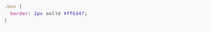
Boom - that's a 2-pixel-thick, solid, tomato-red border.
Border Styles - Pick Your Flavor
CSS comes with a variety of border styles. Some are sleek. Some are funky. All are useful.
- solid: A clean, unbroken line.
- dashed: A series of dashes - like Morse code for your layout.
- dotted: Perfect for subtle outlines or whimsical designs.
- double: Double the line, double the fun.
- groove: Gives a carved-in 3D effect.
- ridge: The opposite of groove, as if it's sticking out.
- inset: Makes the element look sunken in.
- outset: Gives a raised look.
- none: Removes the border entirely.
- hidden: Like none, but sometimes used in table layouts.
Here's a visual party you can try:
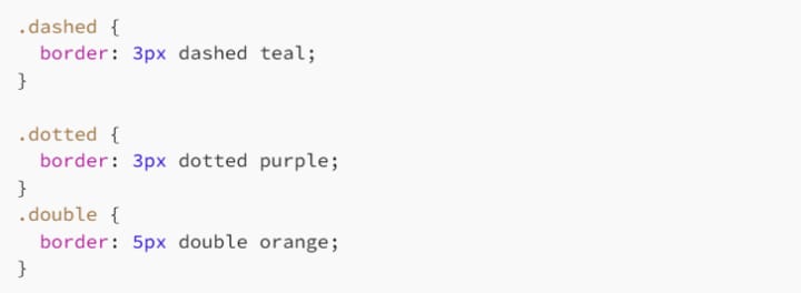
Drop those into a few divs and watch the borders work their magic.
One Side at a Time: Top, Right, Bottom, Left
Want a border only on the top? Just the left side? You've got options:
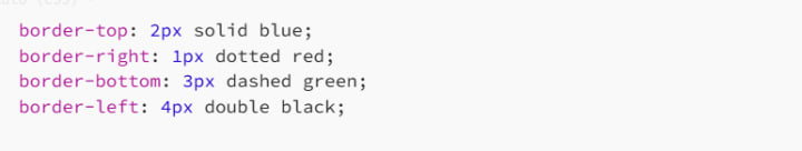
Use these when you want a partial outline or are going for asymmetrical design.
You can also set width, color, and style for each side individually:

CSS gives you precise control over every edge.
Shorthand vs. Longhand
CSS shorthand saves space and sanity:

But you can still go longhand when needed:
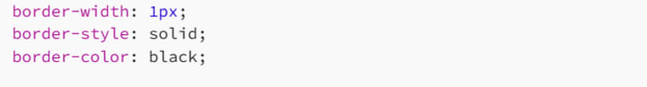
Or mix and match:

Use shorthand when it's the same all around. Use longhand when you want to get fancy.
Border Radius: Rounding the Corners
Want to smooth things out? Use border-radius to round those edges:
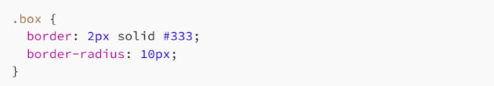
Go full circle with 50%:
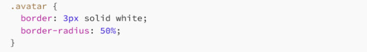
This is perfect for profile pics, buttons, badges - anything that could benefit from that sleek, modern pill or circle look.
You can even set different radii for each corner:

That's top-left, top-right, bottom-right, and bottom-left - clockwise, like most things in CSS.
Borders Inside Elements?
Want an internal border, like an underline effect that doesn't affect layout? Try pseudo-elements like ::before or ::after with absolute positioning, or even use box-shadow for trickery. Here's a fun underline trick:
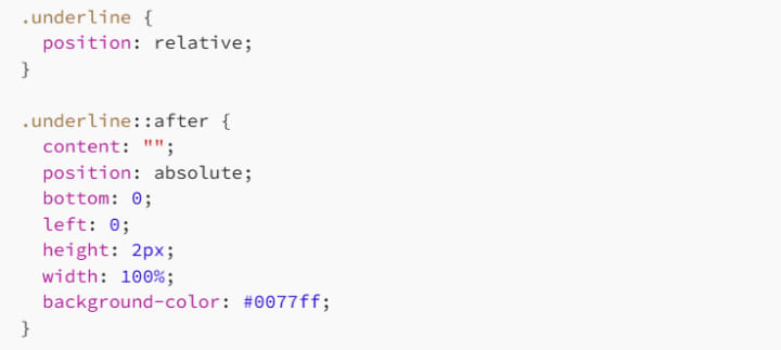
It's technically not a border - but it looks like one!
Responsive and Scalable Borders
Be careful with fixed-width borders (px) in responsive design. On small screens, that chunky 5px border can feel like a brick wall. Consider using relative units:

Or media queries:
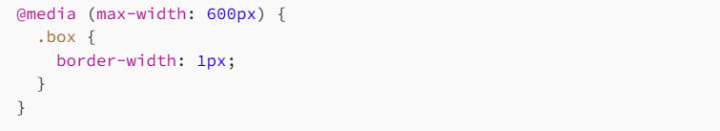
Your layout (and your users' eyeballs) will thank you.
Border Use Cases That'll Make You Look Cool
Let's look at some practical uses of borders beyond just boxes:
1. Buttons
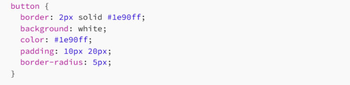
Add :hover effects and you've got a slick UI element.
2. Section Dividers
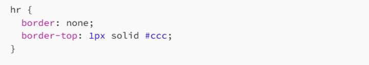
A modern alternative to the <hr> tag.
3. Card Designs
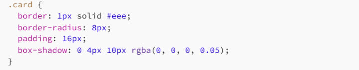
Add a subtle border to give a clean frame to content blocks.
Border Pitfalls to Avoid
Too Much Thickness
A 10px solid border might scream "notice me," but it can also scream "amateur." Be subtle unless you really mean it.
Bad Color Combos
Lime green on pink? Bold choice. Proceed with caution.
Not Accounting for Box Model
Borders add to the total size of your element - unless you're using box-sizing: border-box (and you should).
Clashing with Backgrounds
Make sure your border contrasts nicely, especially on buttons or links. Low-contrast = low usability.
Developer Wisdom
Whenever you're not sure if something needs a border, ask yourself:
- Does it help visually group related content?
- Does it improve readability or usability?
- Does it serve a real purpose?
If the answer is "yes," go ahead. If not, skip it. Not everything needs a frame - sometimes whitespace does the job better.
And if you're feeling wild, experiment with gradients inside borders using border-image (yes, that's a thing!) or get creative with SVG-style dashed lines for custom visuals.
Final Thoughts
Borders might seem simple, but in the right hands, they're powerful design tools. Whether you're framing a quote, defining a layout, or making a call-to-action button pop like bubble wrap, knowing how to wield border in CSS gives you serious control.
Start small: add a clean line here, a subtle curve there. Then go wild when the mood hits. It's all about balance - and once you get the hang of borders, you'll see them not just as lines, but as the literal edge of creativity in your design.
Happy bordering! 🧑🎨🧑💻
About the Creator
MariosDev
Hi, I’m Marios! I’ve been a developer for over 9 years, crafting cool stuff and solving tricky tech puzzles. I’m a total tech enthusiast and love sharing my thoughts and tips through blogging. Also, in love with my bike!
The Role of Custom Pennant Flags in Soccer Culture
Sports traditions often include visual symbols that represent identity, loyalty, and shared history. Among these symbols, pennant flags have become a recognizable part of sports culture. These triangular banners are commonly associated with team pride, historic matches, and fan traditions. In soccer, items such as soccer pennants, soccer club flags, and custom pennant flags continue to appear in stadiums, club exchanges, and sports memorabilia collections around the world.
By charliesamuelabout 15 hours ago in 01
Why Didn't Anyone Tell Us
Men, move along. This is not for you. This is for the women. I was forty-five when I began menopause. It is pretty young for that to be going on in a woman’s life, but I had undiagnosed PCOS, my entire life. Thank you to all the gynecologists I had seen my entire life. That in itself should encourage women to keep seeking second opinions, especially when you are not getting correct answers or any at all.
By Alexandra Grant2 days ago in Humans


Comments (1)
Borders in CSS are super useful. They can really transform a layout. I once used a dashed border to separate sections on a page, making it look more organized. The basic syntax is straightforward. Width, style, and color are key. I like experimenting with different styles like dotted or double. How do you think borders can enhance a simple website design? And which style do you find most effective for emphasizing content?