
CSS Course: Overlay Techniques — Adding Depth and Focus to Your Designs
This article is part of a free full CSS Course: Beginner to Expert


Overlays are a subtle yet powerful design technique that can add sophistication, depth, and focus to your website. Whether you’re using them to create a dimming effect for background images, highlight content, or give a polished look to your UI elements, CSS overlays can elevate your design with ease.
This article is part of a free full CSS Course: Beginner to Expert
In this article, we’ll dive deep into overlay techniques, explaining what overlays are, how to create them with CSS, and how to use them effectively in your projects. From simple color overlays to complex image effects, you’ll be able to master this stylish design tool in no time.
1. What is an Overlay?
An overlay is a visual element that sits on top of another element, often with a slight transparency, color, or blur effect. It’s a way of applying an effect to an underlying element — like dimming a background image or emphasizing text — without affecting the content beneath it.
Overlays can be used for a variety of purposes:
- Enhance legibility: Add a semi-transparent dark overlay to an image to make text easier to read.
- Create focus: Dim or blur the background to highlight a specific section or call-to-action button.
- Add visual effects: Apply a stylish gradient or color overlay to give depth to your content.
With the right technique, overlays can make a simple design feel sophisticated and polished.
2. Basic Overlay with a Color
The most common use of overlays is to add a semi-transparent color over a background image or element. This is often done to improve readability, especially when the background is busy or has contrasting colors.
Syntax
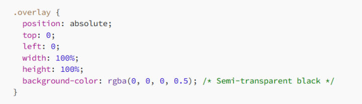
- position: absolute: Positions the overlay relative to its parent element (usually set to position: relative).
- background-color: rgba(0, 0, 0, 0.5): Adds a semi-transparent black color. You can change the RGBA values to adjust the color and transparency.
Example
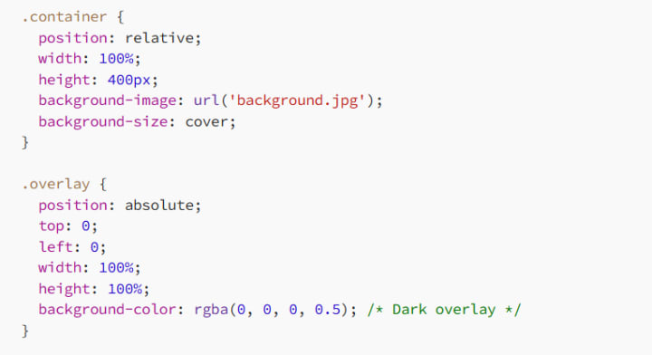
Here, the .overlay class will darken the background image, making the content (like text or buttons) more legible.
3. Gradients as Overlays
Another way to use overlays is by applying a gradient over an image or background. This can create a subtle transition of color that draws focus to specific areas of your design, such as a call-to-action button or title text.
Syntax
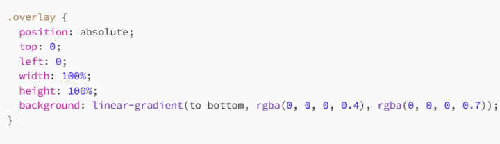
Here, we use a linear gradient to transition from a semi-transparent black (rgba(0, 0, 0, 0.4)) to a darker black (rgba(0, 0, 0, 0.7)), creating a smooth overlay effect that fades as it moves down the page.
Example
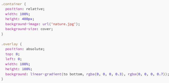
This creates an elegant gradient that smoothly fades from semi-transparent black to a darker black, perfect for adding atmosphere to your background images.
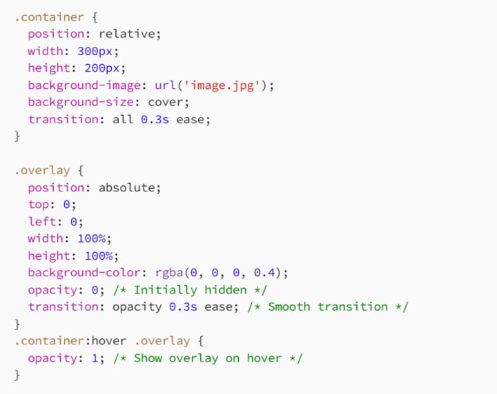
4. Using CSS for Hover Overlays
One of the coolest things about overlays is their ability to add interactive effects. Using CSS, you can create overlays that appear when a user hovers over an element. This technique is ideal for adding dynamic interactions to buttons, images, and cards.
Syntax
Example
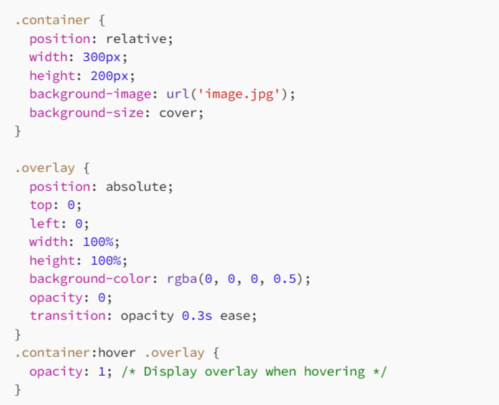
In this example, the overlay will only appear when the user hovers over the .container. It’s a simple but effective way to add a dynamic, attention-grabbing effect.
5. Blurring the Background with Overlays
Another interesting effect you can achieve with overlays is blurring the background. This can add focus to the content in the foreground while still keeping the background visible.
Syntax
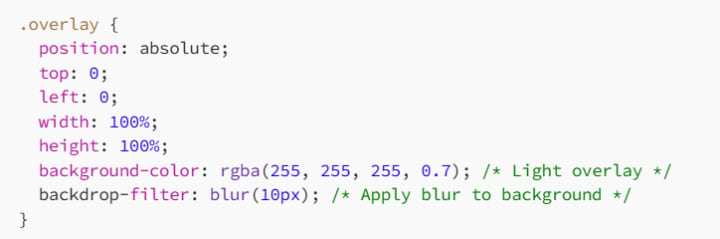
backdrop-filter: This property is used to apply graphical effects like blur or brightness to the area behind the element (i.e., the background).
Example
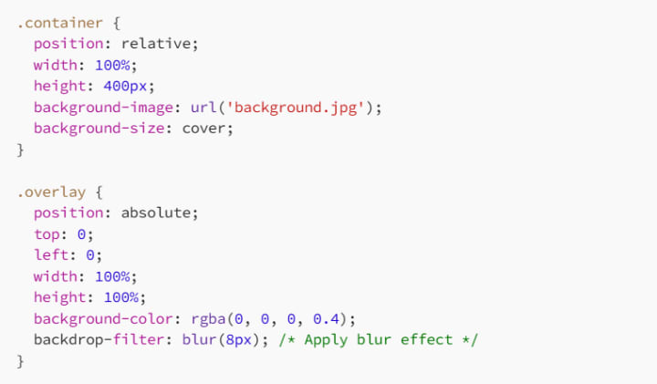
In this example, the .overlay will blur the background image while still allowing the foreground content to remain clear and sharp.
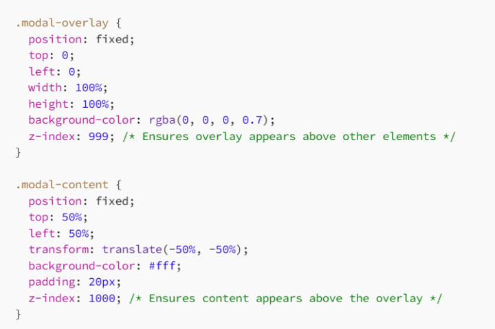
6. Overlay Techniques for Modals and Pop-ups
Overlays are also a popular choice for modals, pop-ups, and dialogs. By adding a semi-transparent overlay behind the modal, you can give the impression that the modal is floating above the content, drawing focus to it while dimming the rest of the page.
Syntax
Example
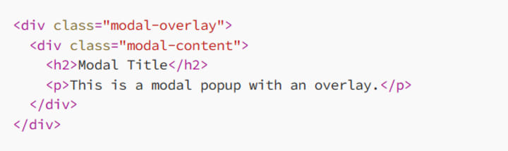
In this setup, the .modal-overlay will cover the entire screen with a semi-transparent black background, while the .modal-content is centered and stands out above the overlay.
7. Pro Tips for Using Overlays
To make your overlays truly stand out, here are some pro tips:
7.1 Experiment with Different Opacities
Adjusting the opacity of your overlay can have a big impact on the final effect. Try using different opacities for different elements. For example, a lighter opacity works well for images, while a darker opacity is great for adding focus to content.
7.2 Combine with Animations
Adding animations to your overlays can make your website feel more interactive and dynamic. For example, you can fade in or slide in the overlay when a user hovers or clicks on a specific element.
7.3 Use Overlays for Accessibility
Overlays aren’t just about making things look pretty — they can also enhance accessibility. By darkening or blurring backgrounds, you can make text and UI elements stand out more clearly, improving readability for users with vision impairments.
8. Conclusion: Overlays Are a Game-Changer
CSS overlays are a powerful technique for adding depth, focus, and style to your designs. Whether you’re using a simple color overlay, a gradient, or even a blur effect, overlays give you the flexibility to enhance the user experience without overwhelming the design.
By combining overlays with other CSS techniques like hover effects, animations, and gradients, you can create dynamic, visually appealing interfaces that capture attention and leave a lasting impression.
So go ahead — get creative with overlays, and give your designs that extra punch!
Happy styling, and may your overlays always add that perfect finishing touch!
About the Creator
MariosDev
Hi, I’m Marios! I’ve been a developer for over 9 years, crafting cool stuff and solving tricky tech puzzles. I’m a total tech enthusiast and love sharing my thoughts and tips through blogging. Also, in love with my bike!
Web3 Mobile Apps: What Actually Changes When You Build One
If you spend enough time around product teams, you’ll notice that Web3 tends to enter conversations in two very different ways. Sometimes it shows up as marketing language — the “future of the internet” narrative. Other times it appears as a practical engineering question: what actually changes when parts of your mobile stack stop living on your own servers?
By Valeriia Shulga2 days ago in 01


Comments (1)
Overlays are a neat design tool. I've used them to dim backgrounds and highlight content. The basic color overlay is super useful for readability. You mentioned using rgba values to adjust color and transparency. How do different color combinations affect the overall look and feel of the overlay? And are there any specific color palettes that work best for different types of content? Creating overlays with CSS seems straightforward. But what if you want to animate the overlay, like fading it in or out? Any tips on achieving that?