
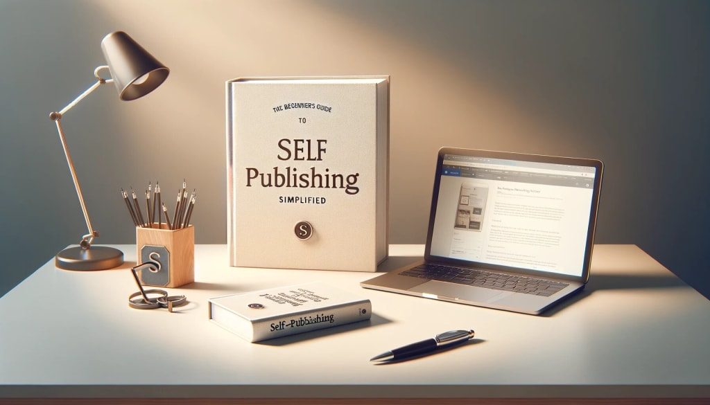
Creating a Professional Self-Published Book: Essential Design, Layout, and Formatting Tips
A Step-by-Step Guide to Designing and Formatting Your Self-Published Book for Success

In the world of self-publishing, producing a professional-looking book is crucial to your success. While content is king, a well-designed, properly formatted book can make all the difference in how readers perceive your work. A polished, professional book not only reflects the quality of your writing but also helps build credibility, attract readers, and increase sales.
Whether you’re publishing an eBook or print book, the design, layout, and formatting are just as important as the story itself. In this article, we’ll walk you through the key elements of creating a self-published book that looks and feels professional—cover design, interior layout, and formatting—for both eBooks and print.
1. The Importance of Book Design: Cover, Branding, and Appeal
Your book cover is often the first thing potential readers see, and it plays a massive role in whether they’ll decide to buy or read your book. It’s the visual representation of your story, and a great cover can draw readers in. Here’s how to ensure your cover makes a lasting impression:
A. Understand Your Genre’s Aesthetic
Each genre has its own visual conventions that readers expect. A thriller cover may use dark, bold fonts with an image that evokes mystery, while a romance novel might feature soft colors and romantic imagery. Study the covers of bestselling books in your genre to see what appeals to your target audience and works within those conventions.
B. Hire a Professional Designer
If you’re serious about self-publishing, hiring a professional cover designer is worth the investment. A good designer will not only create a visually appealing cover but also ensure it meets industry standards. They’ll consider factors like font choice, color schemes, and image resolution, which are crucial for a high-quality cover that looks professional both in digital and print formats.
C. Book Title and Author Name Placement
Your title and author name should be easy to read, even as a thumbnail image on an online bookstore. Avoid overly decorative fonts that might make text hard to read. Your title should stand out, and your name should be legible at smaller sizes.
D. Branding
If you plan on publishing multiple books, creating a consistent visual brand is key. Consistent design elements, like logo placement, color schemes, and font choices, across your book covers will help readers recognize your work quickly. Think about your cover as part of your long-term brand identity as an author.
2. Interior Layout and Design: Creating a Polished Reading Experience
Once a reader opens your book, the interior design will determine how easy and enjoyable it is to read. An unprofessional layout can distract the reader or make it hard to follow your content. Whether you're publishing a digital eBook or a printed book, both require meticulous attention to layout.
A. Choosing the Right Fonts
Fonts are one of the most important design elements in your book’s layout. You’ll want to use readable fonts that suit the tone of your book. In most cases, a classic serif font (like Times New Roman, Garamond, or Georgia) works best for body text, as it’s easier to read in print. For eBooks, fonts like Arial or Helvetica might be more appropriate, as they tend to look clearer on digital screens.
Font size: A 12-point font is generally a good size for the main text in print books. For eBooks, choose a font size that is flexible and easy for readers to adjust on their devices.
Line spacing: Set line spacing to 1.15 or 1.5 for a comfortable reading experience. Avoid making it too tight, as that can cause eye strain, or too loose, as it can disrupt the flow of the text.
B. Page Margins and Indentation
Proper margins and indentation are crucial for a clean, professional layout. Use standard margins (1 inch on all sides) for printed books to avoid text running too close to the edges. For eBooks, you can experiment with slightly smaller margins, but remember that the text should never feel cramped or hard to read.
First-line indentation: In most nonfiction and fiction books, it’s customary to indent the first line of each paragraph. However, avoid excessive indentation, as this can make the text look clunky.
Justified vs. Left-Aligned Text: For print books, left-aligned text is usually better, as it’s easier to read than fully justified text. Full justification can sometimes create awkward spacing between words and lines. For eBooks, consider left-aligned text to keep formatting consistent across devices.
C. Chapter Titles and Headings
The design of chapter titles and headings should help guide the reader through the book. Use larger font sizes, bold text, or distinctive fonts for headings to make them stand out. Keep headings consistent throughout the book to create a cohesive flow.
Chapter start pages: Leave enough space at the beginning of each chapter. This can include a large, bold chapter number or a stylized title page. Don’t overcrowd it with too much text or imagery.
D. Page Numbers and Headers/Footers
Page numbers help readers navigate your book easily, especially in physical copies. Keep the page numbers in the header or footer, depending on your preference and layout style. Ensure that the numbers are easy to read and properly aligned.
3. Formatting for eBooks: Special Considerations for Digital Readers
Formatting for eBooks requires special attention because of the flexible, dynamic nature of digital text. Unlike print books, eBooks are read on a variety of devices (from smartphones to eReaders), and the text will adjust to different screen sizes. Here’s how to format your eBook for the best reading experience:
A. Formatting for Reflowable Text
eBooks typically use reflowable text, meaning the text automatically adjusts to the screen size and reader’s preferences. Use a program like Scrivener, Adobe InDesign, or Vellum to format your eBook correctly.
B. Table of Contents (TOC)
A functional and well-organized Table of Contents is essential for eBooks. It allows readers to easily navigate between chapters. Make sure each chapter title in your TOC is linked to the corresponding section in the book, making it simple for the reader to jump to different sections.
C. Image Placement and Quality
For eBooks, images should be high resolution (300 dpi for print, at least 72 dpi for digital) and optimized for small screens. Avoid placing images in the middle of text-heavy pages as it can disrupt the reading experience. Also, keep in mind that images might not display the same on every e-reader device, so check compatibility across different platforms.
4. Formatting for Print: PDF, Trim Size, and Layout
For print books, the formatting process is more rigid due to the specific requirements of print-on-demand (POD) services or traditional printers. Here are some key considerations:
A. Choosing a Trim Size
Trim size refers to the physical dimensions of your book. Common trim sizes for print books are:
- 5” x 8” (pocketbook size)
- 6” x 9” (standard paperback size)
- 8” x 10” (larger format for illustrated or coffee-table books)
When formatting your book, make sure your content fits within the chosen trim size, leaving space around the edges for margins.
B. Bleed and Margins
If your book contains images that extend to the edge of the page, you’ll need to account for “bleed.” Bleed ensures that there is no white space between the edge of the paper and the image. Typically, you’ll need to add an extra 0.125 inches of bleed to each side of the page, but check with your printing service for exact requirements.
C. Finalizing PDF Format
For print, the most common format for submitting your book to a POD service is a PDF. Ensure that your PDF file is high resolution (300 dpi for images) and the fonts are embedded so they display correctly in print.
5. Final Proofing and Quality Checks
Before you hit "publish," always proof your book—both digitally and physically. If you’re publishing a print book, order a proof copy to inspect the physical layout, design, and printing quality. For eBooks, review the file on multiple devices (Kindle, tablet, smartphone) to ensure that the formatting looks good on all screen sizes.
It’s also a good idea to have someone else review the formatting. A fresh pair of eyes can often spot issues you might have missed.
Conclusion
Creating a professional self-published book requires attention to detail, from cover design to interior formatting. Whether you're designing a print or eBook, your goal should always be to create a seamless, enjoyable reading experience. Invest time in making sure your book is properly formatted, well-designed, and visually appealing—this will pay off in higher sales, better reviews, and a more loyal readership.
By following the design, layout, and formatting tips outlined here, you can ensure that your self-published book looks just as polished and professional as any traditionally published title. The effort you put into this aspect of your book will not only elevate your writing but also help set you apart in the crowded self-publishing marketplace.
About the Creator
Ryder Flint
Author
Keep reading
More stories from Ryder Flint and writers in Writers and other communities.
Mastering Book Marketing: A Comprehensive Guide to Promoting Your Self-Published Work
Self-publishing offers authors the freedom to write and publish on their own terms, but it also places the full responsibility of marketing and promotion on the author. Unlike traditional publishing, where a publisher’s marketing team handles much of the promotional work, self-published authors need to actively market their own books to stand out in an increasingly crowded marketplace. Effective book marketing can make the difference between your book being noticed or getting lost in the shuffle.
By Ryder Flintabout a year ago in Writers
Emerging Trends in Healthcare RAG Systems
Retrieval-Augmented Generation (RAG) is rapidly evolving in healthcare, driven by the need for accuracy, explainability, and regulatory compliance. Below are the key trends shaping how healthcare organizations are adopting and scaling RAG systems.
By Lilly Scott3 days ago in Writers
🅼🅸🅳🅽🅸🅶🅷🆃 🆂🅽🅰🅲🅺🆂
"It's 10 in Tuscon! We all know what that means... It's Time for Midnight Snacks with your man, Gerald Gee! Ready to spend the night together? Me too! I'm full of snacks and can't wait to regurgitate them all back into your hungry ears. Crack a brew! Pop some corn! Anything to get ready for one hell of a show where the talk maybe cheap but the words cut deep...
By Lamar Wiggins3 days ago in Fiction


Comments
There are no comments for this story
Be the first to respond and start the conversation.